.NET MAUI ProgressBar Styling
The ProgressBar control for .NET MAUI provides styling options for customizing its appearance.
-
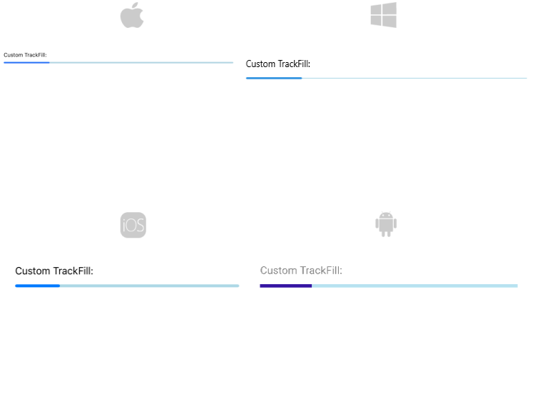
TrackFill(Brush)—Specifies the color of the background track. -
TrackThickness(double)—Specifies the thickness of the background track. - Define corners to the background track by setting the
TrackCornerRadius(Microsoft.Maui.CornerRadius) property.
-
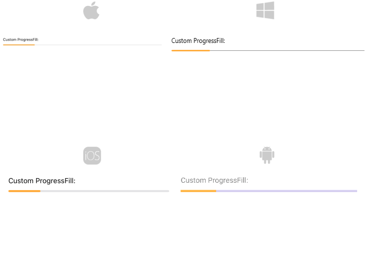
ProgressFill(Brush)—Specifies the color of the progress indicator. - Define corners of the progress indicator by setting the
ProgressCornerRadius(Microsoft.Maui.CornerRadius) property.
Styling the text
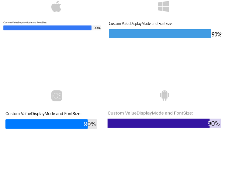
The following properties are related to the text displayed in the ProgressBar:
-
TextColor(Color)—Defines the color of the Text which displays the progress value. -
AlternateTextColor(Color)—Defines the text color when the progress indicator overlaps the label which displays the current progress. -
FontSize(double)—Defines the font size of the Text which displays the progress value
Styling the segments
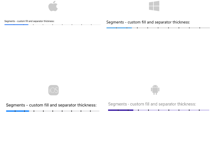
Style the ProgressBar segments using the following properties:
-
SegmentSeparatorFill(Brush)—Specifies the fill of the segments separators. -
SegmentSeparatorThickness(double)—Sets the thickness of the segments separators.
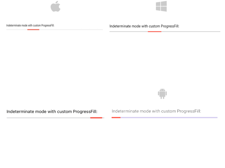
Styling the indeterminate mode
For indeterminate mode you can style the ProgressBar using the ProgressFill(Brush) property.
For the ProgressBar Styling example refer to the SDKBrowser Demo Application.