New to Telerik UI for .NET MAUI? Start a free 30-day trial

.NET MAUI NumericInput Styling

The Telerik UI for .NET MAUI NumericInput provides the following Style properties for customizing its look:

  • BackgroundColor(Color)—Defines the background color of the control.
  • BorderBrush(Brush)—Defines the color of the border.
  • BorderThickness(Thickness)—Defines the thickness of the border.
  • CornerRadius(CornerRadius)—Defines the corner radius of the NumericInput control.
  • IncreaseButtonStyle(of type Style with target type Telerik.Maui.Controls.RadTemplatedButton)—Defines the style for the increase button.
  • DecreaseButtonStyle(of type Style with target type Telerik.Maui.Controls.RadTemplatedButton)—Defines the style for the decrease button.
  • TextInputStyle(of type Style with target type Telerik.Maui.Controls.RadTextInput)—Defines the style of the inner RadTextInput control used when the NumericInput is not read-only.

In addition, you can change the visual appearance of the NumericInput by defining the following visual states through the .NET MAUI Visual State Manager:

  • Normal—Applied when the NumericInput is in its normal state.
  • Focused—Applied when the NumericInput receives focus.
  • (Desktop Only) MouseOver—Applied when the mouse cursor is hovering over the NumericInput.
  • ReadOnly—Applied when the NumericInput is in read-only mode.
  • ReadonlyFocused—Applied when the NumericInput is in read-only mode and receives the focus.
  • (Desktop Only) ReadOnlyMouseOver—Applied when the NumericInput is in read-only mode and the mouse cursor is hovering over it.
  • Disabled**—Applied when the NumericInput's IsEnabled is False.

Note that the use of the Background and Border properties in the control template varies by platform:

  • On Android, iOS and MacCatalyst—The BackgroundColor, BorderBrush, BorderThickness and CornerRadius are applied to the RadBorder containing the input control and not to the whole control template. This means if you set the BackgroundColor and CornerRadius, for example, they will be applied only to the text input and not in the space (gap) between the input area and the numeric buttons.
  • On WinUI—The BackgroundColor and CornerRadius are applied on the whole control (the top-most Grid in the control template); the CornerRadius, BorderBrush and BorderThickness properties are applied to a RadBorder that will also be visualized over the whole control. So visually, on WinUI, when BackgroundColor, BorderThickness and CornerRadius are applied, they will be visualized wrapping the whole control—the background will be visible under the input area, as well as the numeric buttons, the corner radius, and border will be visualized wrapping the input and buttons areas.

Example for NumericInput Styling

The example below demonstrates some of the styling capabilities of the NumericInput, such as custom IncreaseButtonStyle and DecreaseButtonStyle, TextInputStyle, BorderColor, and others. It also shows how to switch its appearance through the .NET MAUI Visual State Manager.

1. Add a style that targets the RadNumericInput to your page's resources and apply all needed styling properties and visual states:

<Style TargetType="telerik:RadTextInput" x:Key="TextInputStyle">
    <Setter Property="TextColor" Value="#00897B" />
</Style>

<Style x:Key="NumericButtonStyle" TargetType="telerik:RadTemplatedButton">
    <Setter Property="TextColor" Value="#00897B" />
    <Setter Property="FontAttributes" Value="Bold" />
    <Setter Property="VisualStateManager.VisualStateGroups">
        <VisualStateGroupList>
            <VisualStateGroup Name="CommonStates">
                <VisualState Name="Normal" />
                <VisualState Name="PointerOver">
                    <VisualState.Setters>
                        <Setter Property="telerik:RadTemplatedButton.TextColor" Value="#00BCA9" />
                    </VisualState.Setters>
                </VisualState>
                <VisualState Name="Pressed">
                    <VisualState.Setters>
                        <Setter Property="telerik:RadTemplatedButton.TextColor" Value="#00BCA9" />
                    </VisualState.Setters>
                </VisualState>
                <VisualState Name="Disabled" />
            </VisualStateGroup>
        </VisualStateGroupList>
    </Setter>
</Style>

<Style x:Key="NumericInputStyle" TargetType="telerik:RadNumericInput">
    <Setter Property="BorderBrush" Value="#00897B" />
    <Setter Property="BackgroundColor" Value="#FFFFFF" />
    <Setter Property="TextInputStyle" Value="{StaticResource TextInputStyle}" />
    <Setter Property="IncreaseButtonStyle" Value="{StaticResource NumericButtonStyle}" />
    <Setter Property="DecreaseButtonStyle" Value="{StaticResource NumericButtonStyle}" />
    <Setter Property="VisualStateManager.VisualStateGroups">
        <VisualStateGroupList>
            <VisualStateGroup Name="CommonStates">
                <VisualState Name="Normal" />
                <VisualState Name="Focused">
                    <VisualState.Setters>
                        <Setter Property="telerik:RadNumericInput.BorderBrush" Value="#00BCA9" />
                        <Setter Property="telerik:RadNumericInput.BorderThickness" Value="1" />
                    </VisualState.Setters>
                </VisualState>
                <VisualState Name="MouseOver">
                    <VisualState.Setters>
                        <Setter Property="telerik:RadNumericInput.BackgroundColor" Value="#F9F9F9" />
                    </VisualState.Setters>
                </VisualState>
                <VisualState Name="ReadOnly" />
                <VisualState Name="ReadOnlyMouseOver" />
                <VisualState Name="ReadOnlyFocused">
                    <VisualState.Setters>
                        <Setter Property="telerik:RadNumericInput.BorderBrush" Value="#B200BCA9" />
                        <Setter Property="telerik:RadNumericInput.BorderThickness" Value="1" />
                    </VisualState.Setters>
                </VisualState>
                <VisualState Name="Disabled">
                    <VisualState.Setters>
                        <Setter Property="Opacity" Value="0.6" />
                    </VisualState.Setters>
                </VisualState>
            </VisualStateGroup>
        </VisualStateGroupList>
    </Setter>
</Style>

2. Define the NumericInput in XAML:

<telerik:RadNumericInput x:Name="numericInput"
                         Style="{StaticResource NumericInputStyle}" />

Here is how the NumericInput looks when styling is applied on Android and Windows:
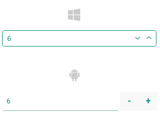
.NET MAUI NumericInput Styling

Here is how the NumericInput looks when focused:
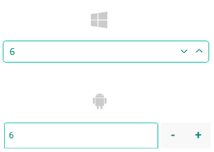
.NET MAUI NumericInput Focused Styling

See Also

In this article