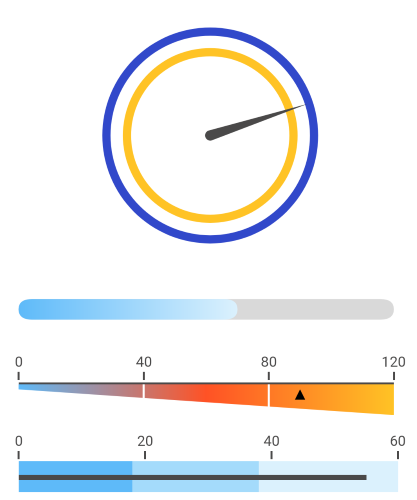
.NET MAUI Gauge Overview
The Telerik UI for .NET MAUI Gauges serve as instruments for indication and visual display of amount, level, or contents as part of a greater unit. These values are presented through indicators such as needles, arrows, and others.
To provide the indicated value or values with context, the Gauges use axes and ranges. Axes state minimum and maximum values, which determine the set ranges. The Gauge ranges denote some parts of the axis range and are usually displayed with different colors to provide additional information. For example, in a [0, 200] axis range, a red Gauge range of [180, 200] can be added to articulate that values within this range are high.
The Gauge is part of Telerik UI for .NET MAUI, the most comprehensive UI suite for .NET MAUI! To try it out, sign up for a free 30-day trial and kickstart your cross-platform app development today.
Key Features of the .NET MAUI Gauge
- Gauge types—The Gauge control comes in three individual types, which enable you to display the gauge scale through different layouts. Depending on the requirements of your project, you can choose between the Horizontal Gauge, Vertical Gauge, or Radial Gauge.
- Axis options—The supported axis options provide full control over the display of the Gauge axis including its ticks, labels, appearance, and axis range.
- Indicators—The Gauge delivers a set of built-in indicators such as needle, arrow, shape, and more. The control also provides configuration options, which allow you to further customize their appearance, including the fill, stroke, and shape.
- Ranges—The Gauge delivers a collection of ranges, which allow you to mark different parts of the scale in different colors thus indicating additional information.
- Animations—By default, all Gauge indicators are animated when the control initially load and when their value changes. In addition, the Gauge provides settings, which enable you to control their behavior.
- Positioning and offset—You can arrange the Gauge elements either according to the settings determining their position, or through the configuration options defining their offset.