.NET MAUI Gauge Animations
All Gauge indicators are animated upon initial load and upon value change. The animations are enabled by default.
To control the Gauge animations, use the AnimationSettings property by applying it either to the Gauge or separately to its indicators. By default, the property of the indicator is null and in this case the AnimationSettings property of the Gauge will be considered. This behavior allows you to control all animations by setting a single property, that of the Gauge. To animate an indicator differently, set its AnimationSettings property as it has a higher precedence than the Gauge property.
The AnimationSettings class contains the following properties:
-
Duration(int)—Defines the duration of the animation in milliseconds. -
Easing—Defines the easing of the animation. -
Enabled(bool)—Specifies whether the animation will be enabled or not. By default, theEnabledproperty istrue.
The following example demonstrates how to set the AnimationSettings property:
<telerik:RadRadialGauge x:Name="gauge1"
                        Grid.Row="1"
                        Grid.Column="1">
    <telerik:RadRadialGauge.AnimationSettings>
        <telerik:AnimationSettings x:Name="gauge1Animations" Easing="{Static Easing.CubicOut}" />
    </telerik:RadRadialGauge.AnimationSettings>
    <telerik:RadRadialGauge.Axis>
        <telerik:GaugeLinearAxis Maximum="200"
                                 Minimum="0"
                                 Step="25" />
    </telerik:RadRadialGauge.Axis>
    <telerik:RadRadialGauge.Indicators>
        <telerik:GaugeShapeIndicator Value="80" />
        <telerik:GaugeBarIndicator Offset="30" Value="100" />
        <telerik:GaugeNeedleIndicator Fill="Blue"
                                      Offset="30"
                                      Value="120" />
    </telerik:RadRadialGauge.Indicators>
    <telerik:RadRadialGauge.Ranges>
        <telerik:GaugeRangesDefinition>
            <telerik:GaugeRange Color="Green"
                                From="0"
                                To="150" />
            <telerik:GaugeGradientRange From="150" To="200">
                <telerik:RadGradientStop Offset="150" Color="Yellow" />
                <telerik:RadGradientStop Offset="200" Color="Red" />
            </telerik:GaugeGradientRange>
        </telerik:GaugeRangesDefinition>
    </telerik:RadRadialGauge.Ranges>
</telerik:RadRadialGauge>
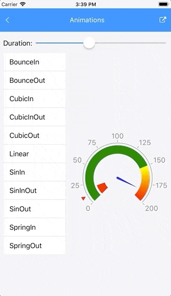
The following GIF animation shows all animations supported by the Gauge.