New to Telerik UI for .NET MAUI? Start a free 30-day trial

.NET MAUI Expander Styling

The purpose of this help article is to show you how to style the Telerik .NET MAUI Expander control.

Border Styling

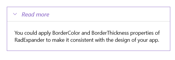
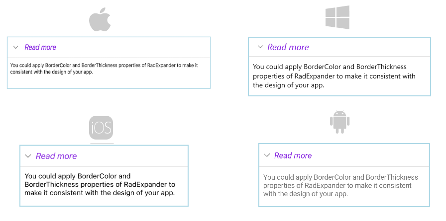
You can apply the BorderColor and BorderThickness properties of the RadExpander to make it match your app's design.

ExpanderHeader also provides means for customizing its border, you can learn more about this in the ExpanderHeader: Border Styling article.

Check the example below on how the border settings can be defined:

<telerik:RadExpander x:Name="expander"
                     HeaderText="Read more"
                     BorderColor="#8660C5"
                     BorderThickness="1">
    <telerik:RadExpander.Header>
        <telerik:ExpanderHeader IndicatorColor="#8660C5"/>
    </telerik:RadExpander.Header>
    <telerik:RadExpander.HeaderStyle>
        <Style TargetType="telerik:ExpanderHeader">
            <Setter Property="BorderThickness" Value="0,0,0,1"/>
            <Setter Property="BorderColor" Value="LightGray"/>
        </Style>
    </telerik:RadExpander.HeaderStyle>
    <telerik:RadExpander.HeaderTextStyle>
        <Style TargetType="Label">
            <Setter Property="TextColor" Value="#8660C5"/>
            <Setter Property="FontAttributes"  Value="Italic"/>
        </Style>
    </telerik:RadExpander.HeaderTextStyle>
    <telerik:RadExpander.Content>
        <VerticalStackLayout Margin="10">
            <Label Text="You could apply BorderColor and BorderThickness properties of RadExpander to make it consistent with the design of your app." HeightRequest="60"/>
        </VerticalStackLayout>
    </telerik:RadExpander.Content>
</telerik:RadExpander>

For a runnable example with the Expander Styling scenario, see the SDKBrowser Demo Application and go to Expander > Features category.

Header Styling

To style the header of the Expander control, use the HeaderStyle property (of type Style with target type Telerik.Maui.Controls.ExpanderHeader).

The following code shows how to declare the HeaderStyle property in the Expander:

<telerik:RadExpander.HeaderStyle>
    <Style TargetType="telerik:ExpanderHeader">
        <Setter Property="BorderThickness" Value="0,0,0,1"/>
        <Setter Property="BorderColor" Value="LightGray"/>
    </Style>
</telerik:RadExpander.HeaderStyle>

This is the result:

.NET MAUI Expander Header Styling

For a runnable example with the Expander Styling scenario, see the SDKBrowser Demo Application and go to Expander > Features category.

Header Text Styling

To customize the text inside the header, use the HeaderTextStyle property (Style with target type Label). If HeaderTextStyle is not set, the text inside is bold by default.

The following code shows how to declare the HeaderTextStyle property in the Expander:

<telerik:RadExpander.HeaderTextStyle>
    <Style TargetType="Label">
        <Setter Property="TextColor" Value="#8660C5"/>
        <Setter Property="FontAttributes"  Value="Italic"/>
    </Style>
</telerik:RadExpander.HeaderTextStyle>

This is the result:

.NET MAUI Expander Header Text Styling

For a runnable example with the Expander Styling scenario, see the SDKBrowser Demo Application and go to Expander > Features category.

See Also

In this article