.NET MAUI Expander Header Control
The ExpanderHeader class represents the Header of the Expander control and is used to show or hide the expandable container. The ExpanderHeader provides a customizable Indicator to mark the current state of the Expander as well as BorderColor and BorderThickness properties to style the Header.
Indicator Options
The indicator is the triangle that is rotated according to whether the Expander control is expanded or collapsed. The ExpanderHeader provides various options for customizing the look of the indicator through the following properties:
-
IndicatorText—The indicator is represented by a string symbol that can be changed throughIndicatorTextproperty; -
IndicatorFontFamily—Specifies the indicator textFontFamily; -
IndicatorFontSize—Defines the indicator text font size; -
IndicatorColor—This property sets the color of the indicator; -
IndicatorLocation—This property is of typeExpandCollapseIndicatorLocationand is used to place the indicator to the left or to the right inside the Header; -
IndicatorAnimationDuration—Specifies the duration of the rotation animation of the indicator; -
IndicatorAnimationEasing—Specifies the easing of the rotation animation of the indicator; -
IndicatorMargin—This property is of typeThicknessand sets the margin applied to the indicator;
Here is an example how to style the Indicator:
<telerik:RadExpander.Header>
    <telerik:ExpanderHeader IndicatorColor="#8660C5"/>
</telerik:RadExpander.Header>
Border styling
You can apply BorderColor and BorderThickness properties of the ExpanderHeader to make it compatible with the design of your app.
Example
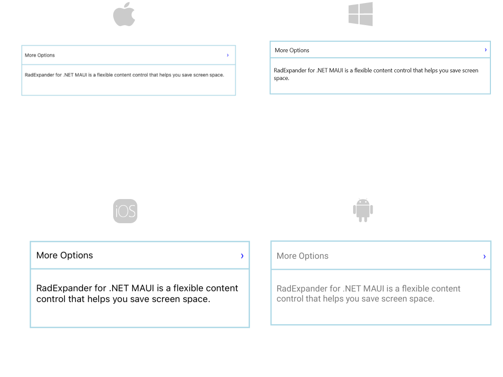
Check the example below on how the Indicator options and border properties can be applied:
<telerik:RadExpander x:Name="expander"
BorderColor="LightBlue"
BorderThickness="2">
<telerik:RadExpander.Header>
<telerik:ExpanderHeader IndicatorText="›"
IndicatorColor="Blue"
IndicatorFontFamily="Arial"
IndicatorFontSize="16"
IndicatorLocation="End"
IndicatorAnimationDuration="1000"
BorderColor="LightBlue"
BorderThickness="2">
<Label Text="More Options"
VerticalOptions="Center"
Margin="10" />
</telerik:ExpanderHeader>
</telerik:RadExpander.Header>
<telerik:RadExpander.Content>
<VerticalStackLayout Margin="10, 20, 10, 20">
<Label Text="RadExpander for .NET MAUI is a flexible content control that helps you save screen space." HeightRequest="50" />
</VerticalStackLayout>
</telerik:RadExpander.Content>
</telerik:RadExpander>
And the final result:

For a runnable example with the Expander Header scenario, see the SDKBrowser Demo Application and go to Expander > Features category.