.NET MAUI Entry Visual States
This article describes the visual states provided by the Entry control. You can use these visual states to change the appearance of the control based on its state—such as when it’s disabled, focused, hovered, and more.
The Entry provides the following CommonStates
visual states:
Visual State | Description |
---|---|
Normal |
Applies when the Entry is in normal state. |
Focused |
Applies when the Entry is focused. |
MouseOver |
(Desktop-only) Applies when the mouse pointer is over the Entry. |
Invalid |
Applies when there is a validation and the text entered inside the Entry is not valid (the IsValueValid property is set to false ). |
InvalidFocused |
Applies when the Entry is focused, there is validation, and the text entered inside the Entry is not valid (the IsValueValid property is set to false ). |
InvalidMouseOver |
(Desktop-only) Applies when the mouse is over the Entry and there is a validation and the text entered inside the Entry is not valid (the IsValueValid property is set to false ). |
ReadOnly |
Applies when the Entry is not editable (the IsReadOnly property is set to false ). |
ReadOnlyFocused |
Applies when the Entry is focused and not editable (the IsReadOnly property is set to false ). |
ReadOnlyMouseOver |
(Desktop-only) Applies when the mouse pointer is over the Entry, and the Entry is not editable (the IsReadOnly property is set to false ). |
ReadOnlyInvalid |
Applies when the Entry is not editable (the IsReadOnly property is set to false ), and not valid (the IsValueValid property is set to false ). |
ReadOnlyInvalidFocused |
Applies when the Entry is focused, not editable (the IsReadOnly property is set to false ) and not valid (the IsValueValid property is set to false ). |
ReadOnlyInvalidMouseOver |
(Desktop-only) Applies when the mouse pointer is over the Entry, and the Entry is not editable (the IsReadOnly property is set to false ), and not valid (the IsValueValid property is set to false ). |
Disabled |
Applies when the Entry is disabled. |
Using the Visual States
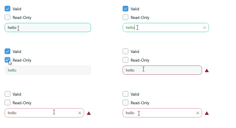
The following example demonstrates how to use the Entry's Visual States.
1. Define the Entry in XAML:
<telerik:RadEntry x:Name="entry"
Style="{StaticResource CustomEntryStyle}" />
2. Define the Entry's style in the page's resources:
<Style x:Key="CustomEntryStyle" TargetType="telerik:RadEntry">
<Setter Property="BackgroundColor" Value="#F4FAF9" />
<Setter Property="BorderBrush" Value="#00897B" />
<Setter Property="BorderThickness" Value="1" />
<Setter Property="CornerRadius" Value="10" />
<Setter Property="ClearButtonStyle" Value="{StaticResource CustomClearButtonStyle}" />
<Setter Property="ValidationErrorImageStyle" Value="{StaticResource CustomValidationErrorImageStyle}" />
<Setter Property="ValidationErrorLabelStyle" Value="{StaticResource CustomValidationLabelStyle}" />
<Setter Property="ValidationErrorMessage" Value="Entered text is not valid" />
<Setter Property="Placeholder" Value="Enter text here" />
<Setter Property="VisualStateManager.VisualStateGroups">
<VisualStateGroupList>
<VisualStateGroup Name="CommonStates">
<VisualState Name="Normal" />
<!-- Applicable for Desktop only -->
<VisualState Name="MouseOver">
<VisualState.Setters>
<Setter Property="BorderBrush" Value="#00BCA9" />
</VisualState.Setters>
</VisualState>
<VisualState Name="Focused">
<VisualState.Setters>
<Setter Property="BackgroundColor" Value="#FFFFFF" />
<Setter Property="BorderBrush" Value="#00BCA9" />
</VisualState.Setters>
</VisualState>
<VisualState Name="Invalid">
<VisualState.Setters>
<Setter Property="BorderBrush" Value="#A30111" />
</VisualState.Setters>
</VisualState>
<!-- Applicable for Desktop only -->
<VisualState Name="InvalidMouseOver">
<VisualState.Setters>
<Setter Property="BorderBrush" Value="#B53340" />
</VisualState.Setters>
</VisualState>
<VisualState Name="InvalidFocused">
<VisualState.Setters>
<Setter Property="BackgroundColor" Value="#FFFFFF" />
<Setter Property="BorderBrush" Value="#C76670" />
</VisualState.Setters>
</VisualState>
<VisualState Name="ReadOnly">
<VisualState.Setters>
<Setter Property="telerik:RadEntry.BackgroundColor" Value="#E5F6F6F6" />
<Setter Property="telerik:RadEntry.BorderBrush" Value="#EBEBEB" />
</VisualState.Setters>
</VisualState>
<!-- Applicable for Desktop only -->
<VisualState Name="ReadOnlyMouseOver">
<VisualState.Setters>
<Setter Property="BackgroundColor" Value="#B2F9F9F9" />
<Setter Property="BorderBrush" Value="#EBEBEB" />
</VisualState.Setters>
</VisualState>
<VisualState Name="ReadOnlyFocused">
<VisualState.Setters>
<Setter Property="BackgroundColor" Value="#FFFFFF" />
<Setter Property="BorderBrush" Value="#00BCA9" />
</VisualState.Setters>
</VisualState>
<VisualState Name="ReadOnlyInvalid">
<VisualState.Setters>
<Setter Property="BackgroundColor" Value="#E5F6F6F6" />
<Setter Property="telerik:RadEntry.BorderBrush" Value="#A30111" />
</VisualState.Setters>
</VisualState>
<!-- Applicable for Desktop only -->
<VisualState Name="ReadOnlyInvalidMouseOver">
<VisualState.Setters>
<Setter Property="telerik:RadEntry.BackgroundColor" Value="#B2F9F9F9" />
<Setter Property="telerik:RadEntry.BorderBrush" Value="#A30111" />
</VisualState.Setters>
</VisualState>
<VisualState Name="ReadOnlyInvalidFocused">
<VisualState.Setters>
<Setter Property="telerik:RadEntry.BackgroundColor" Value="#E5F6F6F6" />
<Setter Property="telerik:RadEntry.BorderBrush" Value="#C76670" />
</VisualState.Setters>
</VisualState>
<VisualState Name="Disabled">
<VisualState.Setters>
<Setter Property="Opacity" Value="0.6" />
</VisualState.Setters>
</VisualState>
</VisualStateGroup>
</VisualStateGroupList>
</Setter>
</Style>
3. Define the clear button style in the page's resources:
<Style x:Key="CustomClearButtonStyle" TargetType="telerik:RadTemplatedButton">
<Setter Property="TextColor" Value="#A30111" />
<Setter Property="VisualStateManager.VisualStateGroups">
<VisualStateGroupList>
<VisualStateGroup Name="CommonStates">
<VisualState Name="Normal" />
<!-- Applicable for Desktop only -->
<VisualState Name="PointerOver">
<VisualState.Setters>
<Setter Property="telerik:RadTemplatedButton.TextColor" Value="#B53340" />
</VisualState.Setters>
</VisualState>
<VisualState Name="Pressed">
<VisualState.Setters>
<Setter Property="telerik:RadTemplatedButton.TextColor" Value="#C76670" />
</VisualState.Setters>
</VisualState>
<VisualState Name="Disabled" />
</VisualStateGroup>
</VisualStateGroupList>
</Setter>
</Style>
4. Define the validation error label style in the page's resources:
<Style x:Key="CustomValidationLabelStyle" TargetType="Label">
<Setter Property="FontAttributes" Value="Italic" />
<Setter Property="TextColor" Value="#A30111" />
</Style>
5. Define the validation error image style in the page's resources:
<Style x:Key="CustomValidationErrorImageStyle" TargetType="Image">
<Setter Property="Source">
<FontImageSource Glyph=""
Color="#A30111"
Size="{OnPlatform Default=16, iOS=20, MacCatalyst=20}"
FontFamily="TelerikFontExamples" />
</Setter>
</Style>
6. Add the telerik
namespace:
xmlns:telerik="http://schemas.telerik.com/2022/xaml/maui"
This is the result on WinUI:
For a runnable example demonstrating the Entry's Visual States, see the SDKBrowser Demo Application and go to the Entry > Styling category.