.NET MAUI DatePicker Templates
The Telerik UI for .NET MAUI DatePicker provides a set of templates for customizing its elements.
Placeholder Template
The PlaceholderTemplate(ControlTemplate) defines the template visualized for the placeholder of the DatePicker. The following example demonstrates how to set the default placeholder template.
<ControlTemplate x:Key="Picker_PlaceholderView_ControlTemplate">
    <Grid>
        <Grid.GestureRecognizers>
            <TapGestureRecognizer Command="{TemplateBinding ToggleCommand}" />
        </Grid.GestureRecognizers>
        <Label Text="{TemplateBinding Placeholder}"
               Style="{TemplateBinding PlaceholderLabelStyle}"
               AutomationId="PickerPlaceholderLabel"/>
    </Grid>
</ControlTemplate>
You can also customize the placeholder template.
1. Define the DatePicker:
<telerik:RadDatePicker MinimumDate="2020,01,1"
                       MaximumDate="2025,12,31"
                       SpinnerFormat="MMM/dd/yyyy"
                       PlaceholderTemplate="{StaticResource placeholderTemplate}"
                       DisplayTemplate="{StaticResource displayTemplate}"
                       AutomationId="datePicker">
    <telerik:RadDatePicker.PopupSettings>
        <telerik:PickerPopupSettings HeaderTemplate="{StaticResource headerTemplate}"
                                     HeaderLabelText="This is the Header Template"
                                     FooterTemplate="{StaticResource footerTemplate}"/>
    </telerik:RadDatePicker.PopupSettings>
    <telerik:RadDatePicker.DropDownSettings>
        <telerik:PickerDropDownSettings FooterTemplate="{StaticResource footerTemplate}"/>
    </telerik:RadDatePicker.DropDownSettings>
</telerik:RadDatePicker>
2. Define the template.
<ControlTemplate x:Key="placeholderTemplate">
    <Button Text="{TemplateBinding Placeholder}"
            FontAttributes="Bold"
            TextColor="White"
            BackgroundColor="#B73562"
            HeightRequest="50"
            Command="{TemplateBinding ToggleCommand}" />
</ControlTemplate>
3. Add the following namespace:
xmlns:telerik="http://schemas.telerik.com/2022/xaml/maui"
The following image shows the end result.
Display Template
The DisplayTemplate(ControlTemplate) defines the template visualized when the picked date/time of the DatePicker is displayed. The following example demonstrates how to set the display template.
<ControlTemplate x:Key="Picker_DisplayView_ControlTemplate">
    <Grid>
        <Grid.GestureRecognizers>
            <TapGestureRecognizer Command="{TemplateBinding ToggleCommand}" />
        </Grid.GestureRecognizers>
        <Label Text="{TemplateBinding DisplayString}"
               Style="{TemplateBinding DisplayLabelStyle}"
               AutomationId="PickerDisplayLabel"/>
    </Grid>
</ControlTemplate>
You can also customize the display template.
1. Define the DatePicker:
<ControlTemplate x:Key="displayTemplate">
    <Button Text="{TemplateBinding DisplayString}"
            TextColor="White"
            BackgroundColor="#7BAEFF"
            HeightRequest="50"
            Command="{TemplateBinding ToggleCommand}" />
</ControlTemplate>
2. Define the template.
<ControlTemplate x:Key="placeholderTemplate">
    <Button Text="{TemplateBinding Placeholder}"
            FontAttributes="Bold"
            TextColor="White"
            BackgroundColor="#B73562"
            HeightRequest="50"
            Command="{TemplateBinding ToggleCommand}" />
</ControlTemplate>
1. Add the following namespace:
xmlns:telerik="http://schemas.telerik.com/2022/xaml/maui"
The following image shows the end result.

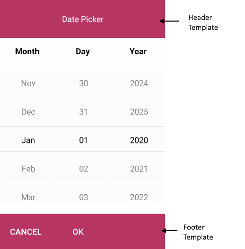
Header Template
The HeaderTemplate(ControlTemplate) defines what will be displayed inside the dialog (popup) header of the DatePicker. The following example demonstrates how to set the header template.
<ControlTemplate x:Key="PopupView_Header_ControlTemplate">
    <telerik:RadBorder BackgroundColor="{TemplateBinding BackgroundColor}"
                       BorderColor="{TemplateBinding BorderColor}"
                       BorderThickness="{TemplateBinding BorderThickness}"
                       CornerRadius="{TemplateBinding CornerRadius}"
                       HeightRequest="{TemplateBinding HeightRequest}">
        <Label Text="{TemplateBinding HeaderLabelText}"
               Style="{TemplateBinding HeaderLabelStyle}"
               AutomationId="PickerPopupHeaderLabel"/>
    </telerik:RadBorder>
</ControlTemplate>
You can also customize the header template.
1. Define the DatePicker:
<ControlTemplate x:Key="displayTemplate">
    <Button Text="{TemplateBinding DisplayString}"
            TextColor="White"
            BackgroundColor="#7BAEFF"
            HeightRequest="50"
            Command="{TemplateBinding ToggleCommand}" />
</ControlTemplate>
2. Define the template.
<ControlTemplate x:Key="headerTemplate">
    <Grid>
        <Label Text="Date Picker"
               Padding="20"
               TextColor="White"
               VerticalTextAlignment="Center"
               HorizontalTextAlignment="Center"
               BackgroundColor="#B73562"/>
    </Grid>
</ControlTemplate>
3. Add the following namespace:
xmlns:telerik="http://schemas.telerik.com/2022/xaml/maui"
Footer Template
The FooterTemplate(ControlTemplate) defines what will be displayed inside the dialog (popup) footer of the DatePicker. The following example demonstrates how to set the footer template.
<ControlTemplate x:Key="PopupView_Footer_ControlTemplate">
    <telerik:RadBorder BackgroundColor="{TemplateBinding BackgroundColor}"
                       BorderColor="{TemplateBinding BorderColor}"
                       BorderThickness="{TemplateBinding BorderThickness}"
                       CornerRadius="{TemplateBinding CornerRadius}">
        <OnPlatform x:TypeArguments="View">
            <On Platform="Android, iOS, MacCatalyst">
                <HorizontalStackLayout Spacing="0" HorizontalOptions="End">
                    <telerik:RadButton Text="{TemplateBinding CancelButtonText}"
                                       Style="{TemplateBinding CancelButtonStyle}"
                                       Command="{TemplateBinding CancelCommand}"
                                       AutomationId="PickerPopupCancelButton"/>
                    <telerik:RadButton Text="{TemplateBinding AcceptButtonText}"
                                       Style="{TemplateBinding AcceptButtonStyle}"
                                       Command="{TemplateBinding AcceptCommand}"
                                       AutomationId="PickerPopupOkButton"/>
                </HorizontalStackLayout>
            </On>
            <On Platform="WinUI">
                <HorizontalStackLayout Spacing="0" HorizontalOptions="End">
                    <Button Text="{TemplateBinding AcceptButtonText}"
                            Style="{TemplateBinding AcceptButtonStyle}"
                            Command="{TemplateBinding AcceptCommand}"
                            AutomationId="PickerPopupOkButton"/>
                    <Button Text="{TemplateBinding CancelButtonText}"
                            Style="{TemplateBinding CancelButtonStyle}"
                            Command="{TemplateBinding CancelCommand}"
                            AutomationId="PickerPopupCancelButton"/>
                </HorizontalStackLayout>
            </On>
        </OnPlatform>
    </telerik:RadBorder>
</ControlTemplate>
You can also customize the footer template.
1. Define the DatePicker:
<ControlTemplate x:Key="displayTemplate">
    <Button Text="{TemplateBinding DisplayString}"
            TextColor="White"
            BackgroundColor="#7BAEFF"
            HeightRequest="50"
            Command="{TemplateBinding ToggleCommand}" />
</ControlTemplate>
2. Define the template.
<ControlTemplate x:Key="footerTemplate">
    <HorizontalStackLayout Spacing="0" HorizontalOptions="FillAndExpand" BackgroundColor="#B73562">
        <telerik:RadButton Text="Cancel"
                           WidthRequest="80"
                           TextColor="White"
                           BackgroundColor="Transparent"
                           Command="{TemplateBinding CancelCommand}" />
        <telerik:RadButton Text="OK"
                           WidthRequest="80"
                           TextColor="White"
                           BackgroundColor="Transparent"
                           Command="{TemplateBinding AcceptCommand}" />
    </HorizontalStackLayout>
</ControlTemplate>
3. Add the following namespace:
xmlns:telerik="http://schemas.telerik.com/2022/xaml/maui"
The following image shows the end result.