.NET MAUI DatePicker Visual Structure
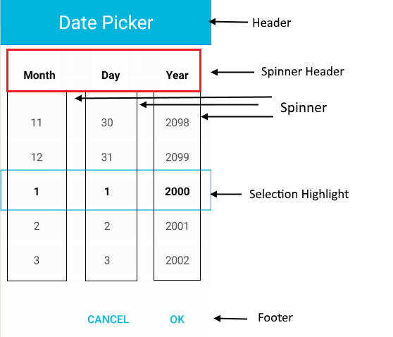
The DatePicker uses a set of visual elements when rendered.
Displayed Elements
-
Placeholder—The text that is visualized before picking a date. You can customize the placeholder through thePlaceholderTemplateproperty. -
DisplayStringFormat—The text that is visualized after a date/time is picked. -
Header—The text that is displayed in the popup header. You can set it to a text input through theHeaderLabelTextproperty, or customize it by using theHeaderTemplateproperty. -
SpinnerHeader—The text that is visualized for the spinner header depending on the values that are picked. For example, if theSpinnerFormatStringisd, the visualized text for the spinner header will beMonthDayYear. -
Spinner—Displays items in a list. -
SelectionHighlight—Highlights the current selected date when the popup is open. -
Footer—The footer of the popup. By default, it contains the OK and Cancel buttons. You can customize it through theFooterTemplateproperty.
DatePicker Structure
The following image shows the structure of the DatePicker before and after a date/time is selected.

Popup Structure
The following images show the visual structure of the DatePicker popup.
