.NET MAUI CheckBox Styling
The CheckBox provides a set of styling options by exposing properties for customizing its visual appearance.
You can set the color of the check mark as well as the control itself in each of the available states.
Background, Border, and Symbol Colors
To set the background and border colors of the CheckBox, use the following properties:
-
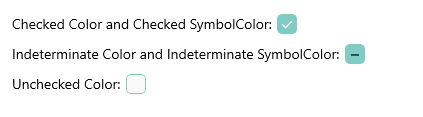
CheckedColor—Defines the Color applied to the control when its checked. This is both the border and background color. -
UncheckedColor—Defines the Color applied to the control when its unchecked. This is the border color only, the background is transparent when unchecked. -
IndeterminateColor—Defines the Color applied to the control when its in Indeterminate state. This is both the border and background color.
To set the symbol colors of the CheckBox, use the following properties:
-
CheckedSymbolColor—Defines the Color applied to the check symbol of the control when its in Checked state. -
IndeterminateSymbolColor—Defines the Color applied to the Indeterminate symbol of the control.
The following example demonstrates how to set the CheckedColor and CheckedSymbolColor properties:
<telerik:RadCheckBox CheckedColor="#80CBC4"
                     IsChecked="True"
                     CheckedSymbolColor="White" />
The following example demonstrates how to set the UncheckedColor property.
<telerik:RadCheckBox UncheckedColor="#80CBC4" />
The following example demonstrates how to set the IndeterminateColor and IndeterminateSymbolColor properties.
<telerik:RadCheckBox x:Name="checkbox"
                     IsThreeState="True"
                     IsChecked="{x:Null}"
                     IndeterminateColor="#80CBC4"
                     IndeterminateSymbolColor="Black" />
The image below shows the end result.
For a runnable example with the CheckBox Styling scenario, see the SDKBrowser Demo Application and go to CheckBox > Features category.