.NET MAUI CheckBox Styling
The CheckBox provides a set of properties for customizing its visual appearance.
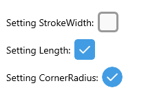
The image below shows a configuration of the CheckBox size, stroke and corner radius:
Size
To define the dimensions of the control (height and width), use the Length (double) property, which maintains a 1:1 aspect ratio. The default value is 18.
The following example demonstrates how to set the Length value.
<telerik:RadCheckBox x:Name="checkboxLength"
                     Length="30" />
For a runnable example with the CheckBox Size scenario, see the SDKBrowser Demo Application and go to CheckBox > Features category.
Stroke Thickness
The CheckBox exposes a StrokeWidth (double) property that specifies the width of the lines with which the Checkbox element is drawn. It affects the border of the control as well as the check mark. The default value is 2.
The following example demonstrates how to apply a StrokeWidth value.
<telerik:RadCheckBox x:Name="checkboxStrokeWidth"
                     StrokeWidth="3"
                     Length="30" />
The image below shows the result at runtime displaying the defined Indeterminate state together with the configured StrokeWidth and Length.
For a runnable example with the CheckBox Stroke scenario, see the SDKBrowser Demo Application and go to CheckBox > Features category.
Corner Radius
Apply corner radius to the Checkbox control using the CornerRadius (double?) property.
<telerik:RadCheckBox x:Name="checkbox" CornerRadius="3"/>
Remove the Animation
The CheckBox control exposes a IsAnimated (bool) property that allows to remove the animations during state transitions. The default value is True.
<telerik:RadCheckBox IsAnimated="False" />
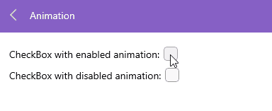
The video below shows two CheckBoxes with enabled and disabled animation:
For a runnable example with the CheckBox Animation scenario, see the SDKBrowser Demo Application and go to CheckBox > Features category.
Toggle State on Tap
The Checkbox control provides an attached property ToggleOnTap. when attaching this property to an UI element, you can change the CheckBox checked state.
<HorizontalStackLayout>
    <Label telerik:RadCheckBox.ToggleOnTap="{x:Reference checkBox}"
           Text="Tap this text to toggle CheckBox:"  />
    <telerik:RadCheckBox x:Name="checkBox"/>
</HorizontalStackLayout>
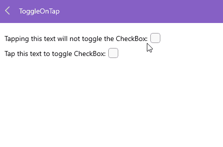
The video below shows how the CheckBox ToggleOnTap attached property works:
For a runnable example with the CheckBox
ToggleOnTapscenario, see the SDKBrowser Demo Application and go to CheckBox > Features category.