Check States for .NET MAUI CheckBox
The CheckBox enables you to define its state as Checked, Unchecked, or Indeterminate.
The state is controlled through the IsChecked(bool?) property. You can set all states either through the UI or programmatically. The Indeterminate state can be applied through the UI only for three-state checkboxes. IsChecked property binding mode is TwoWay.
Checkedstate—WhenIsCheckedistrue.(Default)
Uncheckedstate—WhenIsCheckedisfalse.Indeterminatestate—WhenIsCheckedisnull.IsThreeState(bool)—Defines whether you can apply the indeterminate state through the UI. WhenIsThreeStateistrue, it allows the end user to go to the indeterminate state along with theCheckedandUncheckedstates. By default,IsThreeStateisfalse.
The following example demonstrates how to set the IsChecked property.
Define the checked state of the CheckBox.
<telerik:RadCheckBox x:Name="checkboxIsChecked"
                     IsChecked="{Binding IsChecked}"
                     IsThreeState="True" />
Set the ViewModel.
public class ViewModel : NotifyPropertyChangedBase
{
    private bool? isChecked;

    public bool? IsChecked
    {
        get { return this.isChecked; }
        set
        {
            if (this.isChecked != value)
            {
                this.isChecked = value;
                OnPropertyChanged();
            }
        }
    }
}
Events
-
IsCheckedChanged—Occurs when theRadCheckBox.IsCheckedproperty is changed. TheIsCheckedChangedevent handler receives two parameters:- The
Senderwhich is of typeTelerik.Maui.Controls.RadCheckBox. - and
IsCheckedChangedEventArgs. TheIsCheckedChangedEventArgsprovides the following properties:-
NewValue(bool?)—Gets the new value from the CheckBox state. -
OldValue(bool?)—Gets the old value of the CheckBox state.
-
- The
Commands
The Telerik .NET MAUI CheckBox allows you to attach a command that executes when the IsChecked property changes.
-
Command(ICommand)—Defines the command, which executes when theIsCheckedproperty of the checkbox changes. UseCommandParameterto pass a parameter to the command execute method. TheCommandis available in .NET 8.
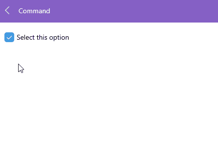
Here is an example with the CheckBox.Command
1. Define the CheckBox in XAML:
<HorizontalStackLayout Spacing="5" VerticalOptions="Start">
    <telerik:RadCheckBox x:Name="checkBox"
                         IsThreeState="False"
                         Command="{Binding MyCheckBoxCommand}"
                         CommandParameter="{Binding IsChecked, Source={x:Reference checkBox}}"/>
    <Label Text="Select this option" />
    <HorizontalStackLayout.BindingContext>
        <local:ViewModel />
    </HorizontalStackLayout.BindingContext>
</HorizontalStackLayout>
2. Define the ViewModel:
public class ViewModel
{
    public ViewModel()
    {
        this.MyCheckBoxCommand = new Command(this.CommandExecute, this.CommandCanExecute);
    }

    public ICommand MyCheckBoxCommand { get; set; }

    private bool CommandCanExecute(object p)
    {
        return true;
    }
    private void CommandExecute(object p)
    {
        var context = (bool)p;
        if (context == true)
        {
            Application.Current.MainPage.DisplayAlert("Message", "You have selected this option!", "OK");
        }
        else
        {
            Application.Current.MainPage.DisplayAlert("Message", "You have unselected the option", "OK");
        }
    }
}
Here is the result: