.NET MAUI Button Styling
The Button provides a set of styling options by exposing properties for customizing its visual appearance.
Styling the Button
To style the Button, you can use the following properties:
-
Background
(Brush
)—Specifies the background brush of the control. -
BackgroundColor
(Color
)—Specifies the background color of the control. -
BorderColor
(Color
)—Specifies the border color of the control. -
BorderThickness
(Thickness
)—Specifies the border thickness of the control. IfBorderWidth
property is set, it will be used with higher precedence and will override the value of theBorderThickness
. -
BorderWidth
(double
)—Specifies the width of the border, in device-independent units. -
CornerRadius
(CornerRadius
)—Specifies the corner radius of the control. -
TextColor
(Color
)—Specifies the color of theButton.Text
.
Example
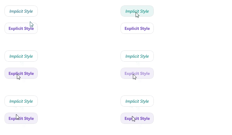
The following example demonstrates how to apply styling to the RadButton
.
1. Define the Button in XAML:
<VerticalStackLayout Spacing="20" HorizontalOptions="{OnPlatform Default=Start, Android=Center, iOS=Center}">
<telerik:RadButton Text="Implicit Style" />
<telerik:RadButton Text="Explicit Style"
Style="{StaticResource ButtonStyle}" />
</VerticalStackLayout>
2. Add the telerik
namespace:
xmlns:telerik="http://schemas.telerik.com/2022/xaml/maui"
3. Define the resources for explicit button style:
<Style x:Key="ButtonStyle" TargetType="telerik:RadButton">
<Setter Property="Padding" Value="12, 8" />
<Setter Property="CornerRadius" Value="12" />
<Setter Property="FontAttributes" Value="Bold" />
<Setter Property="TextColor" Value="#8660C5" />
<Setter Property="VerticalContentAlignment" Value="Center" />
<Setter Property="HorizontalContentAlignment" Value="Center" />
<Setter Property="BorderColor" Value="#DFDFDF" />
<Setter Property="BorderThickness" Value="1" />
<Setter Property="Background" Value="White" />
<Setter Property="VisualStateManager.VisualStateGroups">
<Setter.Value>
<VisualStateGroupList>
<VisualStateGroup Name="CommonStates">
<VisualState Name="Normal" />
<VisualState Name="PointerOver">
<VisualState.Setters>
<Setter Property="Background" Value="#F2EFF9" />
</VisualState.Setters>
</VisualState>
<VisualState Name="Pressed">
<VisualState.Setters>
<Setter Property="TextColor" Value="#998660C5" />
<Setter Property="Background" Value="#F2EFF9" />
</VisualState.Setters>
</VisualState>
<VisualState Name="Disabled">
<VisualState.Setters>
<Setter Property="TextColor" Value="#618660C5" />
</VisualState.Setters>
</VisualState>
</VisualStateGroup>
</VisualStateGroupList>
</Setter.Value>
</Setter>
</Style>
4. Define the resources for implicit button style:
<Style TargetType="telerik:RadButton">
<Setter Property="Padding" Value="12, 8" />
<Setter Property="CornerRadius" Value="12" />
<Setter Property="FontAttributes" Value="Italic" />
<Setter Property="VerticalContentAlignment" Value="Center" />
<Setter Property="HorizontalContentAlignment" Value="Center" />
<Setter Property="TextColor" Value="#00897B" />
<Setter Property="BorderColor" Value="#DFDFDF" />
<Setter Property="BorderThickness" Value="1" />
<Setter Property="Background" Value="White" />
<Setter Property="VisualStateManager.VisualStateGroups">
<Setter.Value>
<VisualStateGroupList>
<VisualStateGroup Name="CommonStates">
<VisualState Name="Normal" />
<VisualState Name="PointerOver">
<VisualState.Setters>
<Setter Property="Background" Value="#E8F5F4" />
</VisualState.Setters>
</VisualState>
<VisualState Name="Pressed">
<VisualState.Setters>
<Setter Property="TextColor" Value="#9900897B" />
<Setter Property="Background" Value="#E8F5F4" />
</VisualState.Setters>
</VisualState>
<VisualState Name="Disabled">
<VisualState.Setters>
<Setter Property="TextColor" Value="#6100897B" />
</VisualState.Setters>
</VisualState>
</VisualStateGroup>
</VisualStateGroupList>
</Setter.Value>
</Setter>
</Style>
This is the result on WinUI:
For a runnable example demonstrating the Button Styling, see the SDKBrowser Demo Application and go to the Button > Features category.