.NET MAUI Button Content Configuration
The Button control provides configuration options that let you align its content, add images, and adjust the fonts.
Setting an Image
Use the following properties to add images to the button:
-
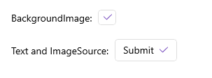
BackgroundImage(Microsoft.Maui.Controls.ImageSource)—Defines an image as a background of the button. -
ImageSource(Microsoft.Maui.Controls.ImageSource)—Defines an image as a part of the button's content.
Use the ContentLayout (Microsoft.Maui.Controls.ButtonContentLayout) property to control the position of the image and the spacing between the button's image and text.
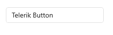
The following XAML shows how to apply an image as a background of the button by using the BackgroundImage property.
The following XAML shows how to apply an image as part of the button content by using the ImageSource property.
This is the end result:
For a runnable example with the Button Images scenario, see the SDKBrowser Demo Application and go to Button > Features.
Content Alignment
Use the following properties to align the content in the button when text and image are set.
-
HorizontalContentAlignment(Microsoft.Maui.TextAlignment)—Specifies the horizontal alignment of the text and image. -
VerticalContentAlignment(Microsoft.Maui.TextAlignment)—Specifies the vertical alignment of the text and image.
The following example demonstrates how to apply the HorizontalContentAlignment and the VerticalContentAlignment.
1. Define the Button in XAML:
2. Add the telerik namespace:
The following image shows the end result.
For a runnable example with the Button Content Alignment scenario, see the SDKBrowser Demo Application and go to Button > Features.
Font Options
The following properties specify the font options that apply to the content when Content is string and ContentTemplate is not set:
-
FontFamily(string)—Specifies the font family of theButton.Text. -
FontSize(double)—Specifies the font size of theButton.Textin pixels. -
FontAttributes(Microsoft.Maui.Controls.FontAttributes)—Specifies the font attributes of theButton.Text.