Styling the Components
This article describes the steps to style the Kendo UI components and match them with the design.
- One approach is to copy the styles from the design and paste them into the desired Kendo UI component.
- Another possible method is to manually edit the properties of the UI components. The manual way gives you more control but also requires more time.
Each Unite UX project contains the 30 most used Kendo UI components. You can preview the available Kendo UI components even if the designer hasn't exported the frames with the design yet. This allows you to explore and experiment with the styles that you can apply to the UI components. If your project doesn't need all UI components, you can customize only the components you need.
General Guidelines
The frames of the Kendo UI components in Unite UX were created by following the rules below that save a considerable amount of time and that are advisable for you to follow:
- From common to individual—Start with the most common form of the component, for example, the Button component in its
normalstate. Continue with the Button component with an added icon. - From left to right—Start with a component on the left side of the frame. Then continue with the component on its right.
- From top to bottom—Start with the component that is on the first row of the frame, then move to the second row, and so on.
These recommended rules will allow you to take advantage of the CSS inheritance Unite UX uses. The inheritance is one-way. This means that if you change the normal state color of the Button, the change will propagate not only to all the states of the Button, but also to the UI components that are located in other frames which are below the frame with the buttons. If you change the hover state color of the Button, the change will propagate only to a few other Button forms in the hover state.

Previewing the Components
To preview the Kendo UI components, open an existing Unite UX project:
- Navigate to the Unite UX dashboard.
- Select a frame in the COMPONENTS pane, and then zoom in to see the available Kendo UI components.
When you open the project, the COMPONENTS pane with the Kendo UI components appears on the right. If the project already has design assets, they will appear in the DESIGN pane on the left.
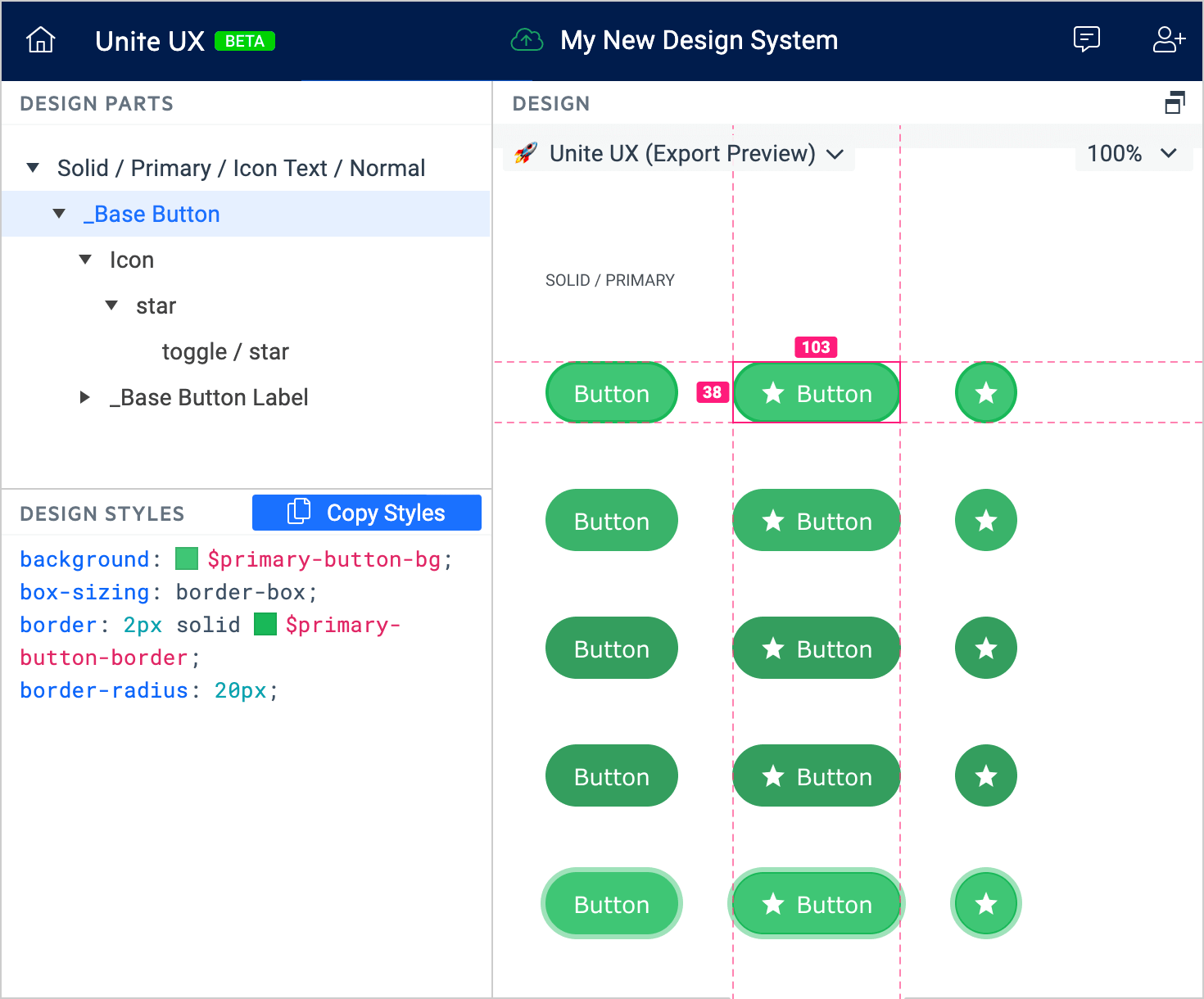
Copying Styles from the Design
Unite UX allows you to inspect the style of the components in the design, and then copy and transfer the style from the design to the components.
To transfer the style from the design to the Kendo UI components:
Open a Unite UX project that already has design assets.
In the DESIGN pane, select a page from the drop-down on the left.
Select a frame, and zoom in to see the components in the design.
Select a component from the design.
-
In the DESIGN PARTS pane, select the desired layer, and then select Copy Styles.
Many components are complex and include multiple layers. You must copy the styles from each layer individually and then paste them to the corresponding part of the Kendo UI component.
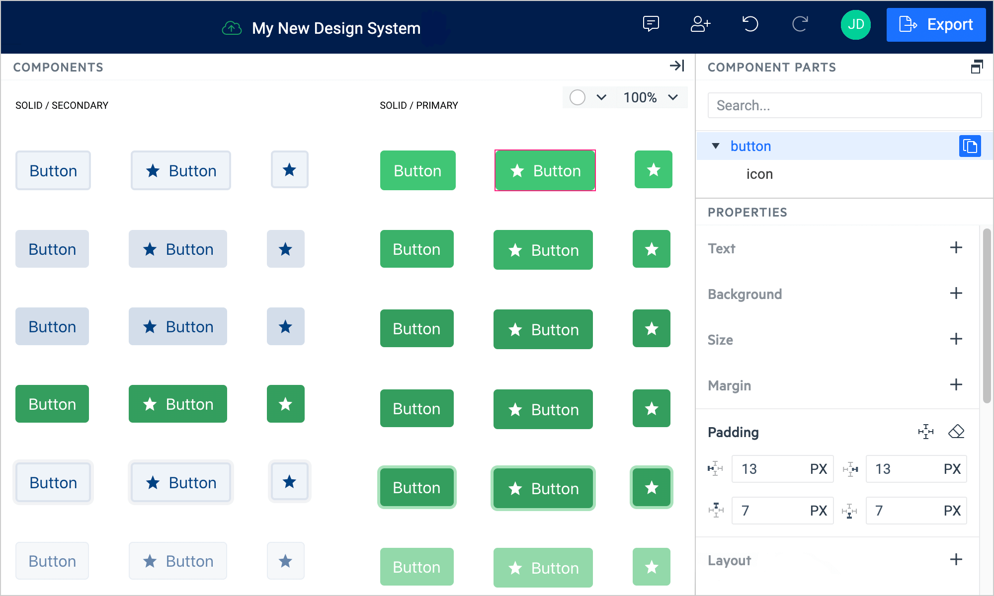
In the COMPONENTS pane, find the frame with the desired Kendo UI component. Zoom in on the frame, and then select the component.
Note the COMPONENT PARTS pane on the right. If the pane is hidden, select the Show Properties hamburger button to un-hide it.
-
Select the desired component part in the navigation tree, and then select the button with the Paste symbol.
Some browsers (Firefox, for example) limit the clipboard permissions, and you cannot paste content that you copy from other browser tabs or windows. As a result, when you use such browsers, you can copy styles from Unite UX and paste them there, but you cannot paste CSS copied from another browser tab or window.
Editing the Styles Manually
You can also manually edit the UI component properties without copying the styles from the design. Unite UX offers a complete set of editors that allow you to change the CSS properties of the Kendo UI components. To edit these properties:
- Open an existing Unite UX project.
- In the COMPONENTS pane, find the frame with the desired Kendo UI component. Zoom in on the frame, and then select the component.
- In the COMPONENT PARTS pane, select the desired component part.
- Use the editors in the PROPERTIES pane to manually enter the desired values.
If you set any non-default values through an editor, the editor will automatically expand when you select the modified UI component. You can use the Reset button of the editor to revoke these modifications.
The background color editor in the PROPERTIES pane supports solid colors and linear gradients. Conic and radial gradients are not supported.
Comparing the Components
Whether you copy the styles from the design or edit the components manually, you can use the COMPARISON pane to track your progress towards matching the UI Components with the design:
Select a component from the DESIGN pane, and then select the matching UI component from the COMPONENTS pane.
Use either the Swipe or Opacity mode to compare both components.
(Optional) Use the drop-down menu to adjust the zoom level.
Video Instructions
This video demonstrates how to apply the styles from the design to the components and make them match.