Theming
By applying a Telerik Theme to your Telerik controls you can easily propagate a common look and feel throughout your application. The RadTreeView makes no exception and supports the theming mechanism which is really straightforward to set.
As a first step, make sure that you have familiarized yourself with the Themes Overview topic. As a next step, you can proceed with merging the required ResourceDictionaries into your application's resources as explained in the Setting a Theme article.
Once you have completed the above steps, all you need to do is set the StyleClass property of the RadTreeView so that the TelerikTheme is applied:
<telerikDataControls:RadTreeView  x:Name="treeView"
                                  ItemsSource="{Binding Source}"
                                  StyleClass="TelerikTheme">
    <telerikDataControls:TreeViewDescriptor DisplayMemberPath="Name"
                                            ItemsSourcePath="Children"
                                            TargetType="{x:Type local:Item}"/>
</telerikDataControls:RadTreeView>
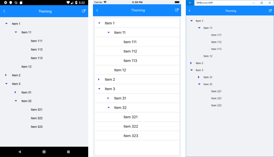
You could check how RadTreeView looks below:
You can always modify the default theme resources in order to style the control so that it perfectly fits the tone of your application. For more information, check the Create a Custom Theme topic.