Custom Item Template
RadTreeView can be populated with various types of objects (string, any business objects, etc.). You can customize the visualization of the views in the ItemsSource of the control using the ItemTemplate property of the TreeViewDescriptors. The template could contain any view that you can use to display the data.
You can take the default TreeView ItemTemplate and use it as base for further customizations.
The following example shows how to populate the ItemsSource with business items and customize their appearance.
First, create the needed business objects that will be the items of the TreeView. For the example there will be Country type with subitems of City type:
- Country definition:
public class Country
{
    public string Name { get; set; }
    public string Icon { get; set; }
    public ObservableCollection<City> Cities { get; set; }
}
- City definition:
public class City
{
    public string Name { get; set; }
}
Then, create a ViewModel where the items are defined:
public class ViewModel
{
    public ObservableCollection<Country> Source { get; set; }

    public ViewModel()
    {
        this.Source = new ObservableCollection<Country>();
        this.Source.Add(new Country()
        {
            Name = "Italy",
            Icon = "TreeView_Flag_Italy.png",
            Cities = new ObservableCollection<City>()
            {
                new City() { Name = "Rome"},
                new City() { Name = "Milano"}
            }
        });
        this.Source.Add(new Country()
        {
            Name = "Germany",
            Icon = "TreeView_Flag_Germany.png",
            Cities = new ObservableCollection<City>()
            {
                new City() { Name = "Berlin"},
                new City() { Name = "Frankfurt"}
            }
        });
        this.Source.Add(new Country()
        {
            Name = "India",
            Icon = "TreeView_Flag_India.png",
            Cities = new ObservableCollection<City>()
            {
                new City() { Name = "Mumbai"}
            }
        });
        this.Source.Add(new Country()
        {
            Name = "Argentina",
            Icon = "TreeView_Flag_Argentina.png",
            Cities = new ObservableCollection<City>()
            {
                new City() { Name = "Buenos Aires"}
            }
        });
        this.Source.Add(new Country()
        {
            Name = "USA",
            Icon = "TreeView_Flag_USA.png",
            Cities = new ObservableCollection<City>()
            {
                new City() { Name = "Miami"},
                new City() { Name = "New York"},
                new City() { Name = "Los Angeles"}
            }
        });
    }
}
Add the TreeView definition to your page. Since there are two types of items (Country and City), two TreeViewDescriptors should be added. For the Country item there is a separate ItemTemplate defined, so that the Country.Icon is visualized as well:
<telerikDataControls:RadTreeView  x:Name="treeView"
                                  ItemsSource="{Binding Source}">
    <telerikDataControls:TreeViewDescriptor DisplayMemberPath="Name"
                                            ItemsSourcePath="Cities"
                                            TargetType="{x:Type local:Country}">
        <telerikDataControls:TreeViewDescriptor.ItemTemplate>
            <DataTemplate>
                <Grid Margin="{Binding Path=Level, Converter={StaticResource levelToMarginConverter}}"
                      HeightRequest="40">
                    <Grid.ColumnDefinitions>
                        <ColumnDefinition Width="Auto"/>
                        <ColumnDefinition Width="Auto" />
                        <ColumnDefinition Width="*"/>
                    </Grid.ColumnDefinitions>
                    <telerikTreeView:ExpandCollapseIndicator FontSize="Medium"
                                                             WidthRequest="10"
                                                             Margin="15,0"
                                                             VerticalTextAlignment="Center"
                                                             IsLoading="{Binding Path=IsLoading}"
                                                             IsLoadOnDemandEnabled="{Binding Path=IsLoadOnDemandEnabled}"
                                                             IsExpanded="{Binding Path=IsExpanded}"
                                                             IsLeaf="{Binding Path=IsLeaf}" />
                    <Image Grid.Column="1"
                           VerticalOptions="Center"
                           Source="{Binding Item.Icon, Converter={StaticResource ImageSourceConverter}}" />
                    <telerikTreeView:ItemText Grid.Column="2"
                                       Margin="8,0,0,0"
                                       VerticalOptions="Center"
                                       Text="{Binding Item.Name}" />
                </Grid>
            </DataTemplate>
        </telerikDataControls:TreeViewDescriptor.ItemTemplate>
    </telerikDataControls:TreeViewDescriptor>
    <telerikDataControls:TreeViewDescriptor DisplayMemberPath="Name"
                                            TargetType="{x:Type local:City}" />
</telerikDataControls:RadTreeView>
Here is the ImageSourceConverter class which basically maps the icon's path according to the target platform:
public class ImageSourceConverter : IValueConverter
{
    public object Convert(object value, Type targetType, object parameter, CultureInfo culture)
    {
        if (value == null)
        {
            return string.Empty;
        }

        if (Device.RuntimePlatform == Device.UWP)
        {
            return "Assets/" + value;
        }

        if (Device.RuntimePlatform == Device.iOS)
        {
            return ((string)value).Replace(".png", string.Empty);
        }

        return value;
    }
    public object ConvertBack(object value, Type targetType, object parameter, CultureInfo culture)
    {
        throw new NotImplementedException();
    }
}
In the ItemTemplate there is a reference to the levelToMarginConverter StaticResource - this is an inner TreeView converter used to calculate the item's offset according to its Level.
Both converters should be defined as Resources like this:
<ResourceDictionary>
    <local:ImageSourceConverter x:Key="ImageSourceConverter" />
    <telerikTreeView:LevelToMarginConverter x:Key="levelToMarginConverter" />
</ResourceDictionary>
Where the telerikTreeView namespace is the following:
xmlns:telerikTreeView="clr-namespace:Telerik.XamarinForms.DataControls.TreeView;assembly=Telerik.XamarinForms.DataControls"
All that is left, is to set the BindingContext to the ViewModel:
this.BindingContext = new ViewModel();
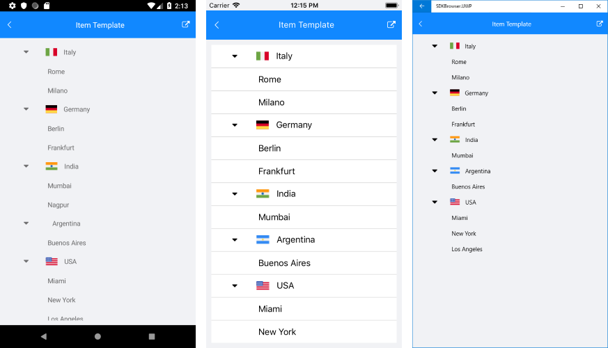
Here is how the TreeView looks with custom ItemTemplate:
You can check a runnable demo in the Features section of the RadTreeView component in the SDK Samples Browser application(can be found in the Examples folder of your local Telerik UI for Xamarin installation)