CheckBox elements
RadTreeView supports showing CheckBox elements and checking specific items from its ItemsSource. The checked items are added to the CheckedItems property of the control. You can also control the Visibility of the CheckBox elements as well as their state propagation.
CheckBox State Propagation
You can control the state propagation by setting the CheckBoxMode property of the RadTreeView. The CheckBoxModes enum consists of the following values:
- None: The CheckBox would not be present.
- Individual: The CheckBox state will affect only the individual item.
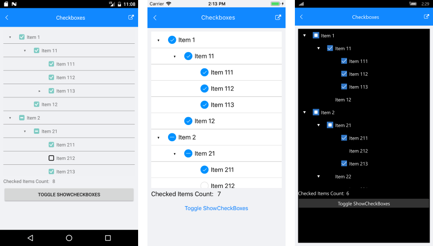
- Propagate: The CheckBox state of the children items will affect the parent item. In case all items within a parent nodes are checked - it will be with checked state as well. If all items are not checked, the parent item will not be checked. If only some of the children items are checked, the parent item will be shown with an indeterminate state.
When adding items to the items source of the TreeView, the checked state will propagate according to the parent item.
Here is an example of how you can set the property:
<telerikDataControls:RadTreeView x:Name="treeView"
                                 ItemsSource="{Binding Source}"
                                 CheckBoxMode="Propagate">
    <telerikDataControls:TreeViewDescriptor DisplayMemberPath="Name"
                                            ItemsSourcePath="Children"
                                            TargetType="{x:Type local:Item}" />
</telerikDataControls:RadTreeView>
Here is a picture that show the different states of the CheckBox:

Programmatic Check and Uncheck
The RadTreeView exposes two methods to programmatically check or uncheck an item.
- CheckItem(object item): Adds an item to CheckedItems collection
- UncheckItem(object item): Removes an item from the CheckedItems collection
private void CheckFirstItem()
{
    var firstItem = (treeView.ItemsSource as IList<Item>)[0];
    treeView.CheckItem(firstItem);
}

private void UncheckFirstItem()
{
    var firstItem = (treeView.ItemsSource as IList<Item>)[0];
    treeView.UncheckItem(firstItem);
}
CheckedItems collection
The control exposes a collection of all the checked items. CheckedItems is a read-only collection of type Telerik.XamarinForms.DataControls.TreeView.CheckedItemsCollection, so you can add/remove items to it only through the TreeView CheckItem and UncheckItem methods. To keep track of the checked items subscribe to its CollectionChanged event:
treeView.CheckedItems.CollectionChanged += CheckedItems_CollectionChanged;
And here is the CollectionChanged event handler:
private void CheckedItems_CollectionChanged(object sender, System.Collections.Specialized.NotifyCollectionChangedEventArgs e)
{
    var ci = this.treeView.CheckedItems as CheckedItemsCollection;
    this.CheckedItemsCount.Text = ci.Count.ToString();
}
CheckBoxes Visibility
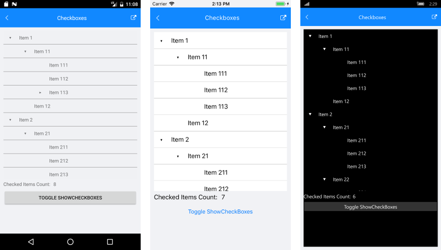
The CheckBox visibility can be controlled through the CheckBoxMode property. Setting it to "None" would remove the appearance of these elements. Here is the appearance of the control when the CheckBoxMode is set to None:

You can check a runnable demo in the Features section of the RadTreeView component in the SDK Samples Browser application(can be found in the Examples folder of your local Telerik UI for Xamarin installation)