Multi-Level Grouping
This article provides an overview on how you could enable multi-level grouping in RadListView.
Before proceeding please go through Grouping Overview topic.
First, let's create the following business object:
public class City
{
    public string Continent { get; set; }
    public string Name { get; set; }
    public string Country { get; set; }
}
The next example demonstrates how RadListView could be bound to a collection of City objects and grouped hieararchically by Continent and Country.
To accomplish the task, create a ViewModel class as shown below:
public class ViewModel
{
    public ObservableCollection<City> Cities { get; set; }

    public ViewModel()
    {
        this.Cities = new ObservableCollection<City>()
        {
            new City() { Name = "Barcelona", Country = "Spain", Continent = "Europe"},
            new City() { Name = "Madrid", Country = "Spain", Continent = "Europe" },
            new City() { Name = "Rome", Country = "Italy", Continent = "Europe" },
            new City() { Name = "Florence", Country = "Italy", Continent = "Europe" },
            new City() { Name = "London", Country = "England", Continent = "Europe" },
            new City() { Name = "Manchester", Country = "England", Continent = "Europe"},
            new City() { Name = "New York", Country = "USA", Continent = "North America" },
            new City() { Name = "Boston", Country = "USA",  Continent = "North America" }
         };
    }
}
Then, in order to visualize the hierarchical relation between groups, add a custom GroupHeaderTemplate (of type DataTemplate) to the Resources of your page:
<ResourceDictionary>
<local:LevelToMarginConverter x:Key="LevelToMarginConverter" />
<DataTemplate x:Key="ListViewItemTemplate">
<telerikListView:ListViewTemplateCell>
<telerikListView:ListViewTemplateCell.View>
<Grid Padding="50, 0, 0, 0" BackgroundColor="#F1F2F5">
<Label Text="{Binding Name}" TextColor="#6F6F70" FontSize="Small" />
</Grid>
</telerikListView:ListViewTemplateCell.View>
</telerikListView:ListViewTemplateCell>
</DataTemplate>
<DataTemplate x:Key="ListViewMultiLevelGroupHeaderTemplate">
<Grid>
<Grid.ColumnDefinitions>
<ColumnDefinition Width="Auto" />
<ColumnDefinition />
</Grid.ColumnDefinitions>
<Label Text="▸" Margin="{Binding Level, Converter={StaticResource LevelToMarginConverter}}"
TextColor="DarkGray" FontSize="Medium">
<Label.Triggers>
<DataTrigger TargetType="Label" Binding="{Binding IsExpanded}" Value="True">
<Setter Property="Text" Value="▾" />
</DataTrigger>
</Label.Triggers>
</Label>
<Label Margin="0, 12, 0, 6" Text="{Binding }" Grid.Column="1" TextColor="DarkGray" FontSize="Medium" HorizontalOptions="Start" />
</Grid>
</DataTemplate>
<telerikListView:ListViewGroupStyle x:Key="ListViewGroupHeaderStyle" BackgroundColor="Transparent" />
</ResourceDictionary>
where LevelToMarginConverter just calculates the margin of each group header according to its Level:
<ResourceDictionary>
<local:LevelToMarginConverter x:Key="LevelToMarginConverter" />
<DataTemplate x:Key="ListViewItemTemplate">
<telerikListView:ListViewTemplateCell>
<telerikListView:ListViewTemplateCell.View>
<Grid Padding="50, 0, 0, 0" BackgroundColor="#F1F2F5">
<Label Text="{Binding Name}" TextColor="#6F6F70" FontSize="Small" />
</Grid>
</telerikListView:ListViewTemplateCell.View>
</telerikListView:ListViewTemplateCell>
</DataTemplate>
<DataTemplate x:Key="ListViewMultiLevelGroupHeaderTemplate">
<Grid>
<Grid.ColumnDefinitions>
<ColumnDefinition Width="Auto" />
<ColumnDefinition />
</Grid.ColumnDefinitions>
<Label Text="▸" Margin="{Binding Level, Converter={StaticResource LevelToMarginConverter}}"
TextColor="DarkGray" FontSize="Medium">
<Label.Triggers>
<DataTrigger TargetType="Label" Binding="{Binding IsExpanded}" Value="True">
<Setter Property="Text" Value="▾" />
</DataTrigger>
</Label.Triggers>
</Label>
<Label Margin="0, 12, 0, 6" Text="{Binding }" Grid.Column="1" TextColor="DarkGray" FontSize="Medium" HorizontalOptions="Start" />
</Grid>
</DataTemplate>
<telerikListView:ListViewGroupStyle x:Key="ListViewGroupHeaderStyle" BackgroundColor="Transparent" />
</ResourceDictionary>
Lastly, add the RadListView definition with two PropertyGroupDescriptors as shown in the next snippet:
<telerikDataControls:RadListView x:Name="listView" ItemsSource="{Binding Cities}"
                                 ItemTemplate="{StaticResource ListViewItemTemplate}"
                                 GroupHeaderTemplate="{StaticResource ListViewMultiLevelGroupHeaderTemplate}"
                                 GroupHeaderStyle="{StaticResource ListViewGroupHeaderStyle}">
    <telerikDataControls:RadListView.GroupDescriptors>
        <telerikListView:PropertyGroupDescriptor PropertyName="Continent"/>
        <telerikListView:PropertyGroupDescriptor PropertyName="Country"/>
    </telerikDataControls:RadListView.GroupDescriptors>
</telerikDataControls:RadListView>
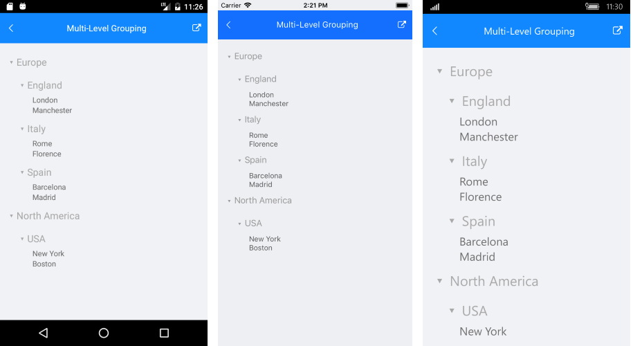
Here is the final result: