Badge Styling
Use the following properties to style the look of the badge:
- BadgeText(string): Defines the badge text.
- BadgeTextColor(Xamarin.Forms.Color): Defines the badge text color.
- BadgeTextMargin(Xamarin.Forms.Thickness): Defines the mergin of the badge text.
- BadgeFontSize(double): Defines the font size of the badge text.
- BadgeFontFamily(string): Defines the badge text font family.
- BadgeFontAttributes(FontAttributes): Defines the badge text font attributes.
- BadgeBackgroundColor(Xamarin.Forms.Color): Defines the background color of the badge.
- BadgeBorderColor(Xamarin.Forms.Color): Defines the badge border color.
- BadgeBorderThickness(Xamarin.Forms.Thickness): Defines the thickness of the badge border.
- BadgeCornerRadius(Xamarin.Forms.Thickness): Defines the corner radius of the badge border.
- BadgeMinimumWidth(double): Defines the minimum width of tha badge.
- BadgeMinimumHeight(double): Defines the minimum height of the badge.
Use
BadgeTypefor predefined types for the badge. If you set theBadgeTextit will override the predefined icon for the badge type.
Example
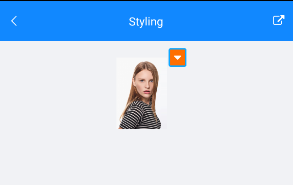
The BadgeView definition with some of the above properties set.
<telerikPrimitives:RadBadgeView BadgeText="{StaticResource ExpandedIconText}"
                                BadgeFontFamily="{StaticResource IconsFontFamily}"
                                BadgeTextColor="White"
                                BadgeBorderThickness="2"
                                BadgeCornerRadius="3"
                                BadgeMinimumHeight="25"
                                BadgeMinimumWidth="25"
                                BadgeFontSize="18"
                                BadgeBorderColor="#0DA6FF"
                                HorizontalOptions="Center"
                                BadgeBackgroundColor="#FF6F00"
                                x:Name="badgeView">
    <telerikPrimitives:RadBadgeView.Content>
        <Image WidthRequest="100"
               HeightRequest="100">
            <Image.Source >
                <OnPlatform x:TypeArguments="ImageSource" Default="custom_toolbar.png">
                    <On Platform="UWP">Assets\custom_toolbar.png</On>
                </OnPlatform>
            </Image.Source>
        </Image>
    </telerikPrimitives:RadBadgeView.Content>
</telerikPrimitives:RadBadgeView>
Use the following namespace:
xmlns:telerikPrimitives="clr-namespace:Telerik.XamarinForms.Primitives;assembly=Telerik.XamarinForms.Primitives"
The final Result::
Badge Styling Example can be found inside the FeaturesCategory folder in SDK Browser Application/Examples/BadgeViewControl.