Badge Customization
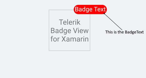
You can use te following property to specify different text inside the badge
-
BadgeText(string): Defines the badge text. You can set the
BadgeTextproperty for example if you want to customize the text inside the badge. If you don't want to use one of the predefined badges, etc.
<telerikPrimitives:RadBadgeView BadgeText="Badge Text">
    <telerikPrimitives:RadBadgeView.Content>
        <telerikPrimitives:RadBorder WidthRequest="80"
                                     HeightRequest="80"
                                     BorderThickness="1"
                                     BorderColor="LightGray">
            <Label Text="Telerik Badge View for Xamarin"
                   FontSize="14"
                   VerticalTextAlignment="Center"
                   HorizontalTextAlignment="Center"/>
        </telerikPrimitives:RadBorder>
    </telerikPrimitives:RadBadgeView.Content>
</telerikPrimitives:RadBadgeView>
The final result:
Badge Control Template
The Badge has a default ControlTemplate which you can customize.
In order to override the default control template you will need to set implicit style with TargetType="telerikPrimitives:Badge"
Default ControlTemplate
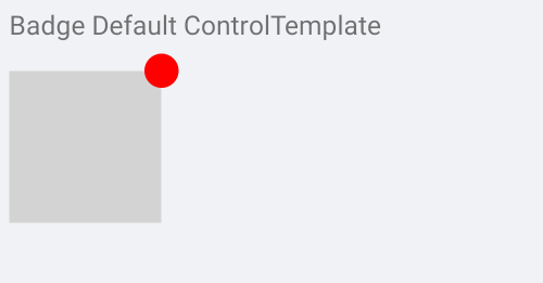
Default ControlTemplate definition
<Style TargetType="telerikPrimitives:Badge">
    <Setter Property="ControlTemplate">
        <Setter.Value>
            <ControlTemplate>
                <!-- you can change the control tempalte in order to customize the bage default look  -->
                <telerikPrimitives:RadBorder BorderThickness="{TemplateBinding BorderThickness}"
                                             BorderColor="{TemplateBinding BorderColor}"
                                             CornerRadius="{TemplateBinding CornerRadius}"
                                             BackgroundColor="{TemplateBinding BackgroundColor}">
                    <Label x:Name="PART_BadgeContent"
                           Text="{TemplateBinding Text}"
                           TextColor="{TemplateBinding TextColor}"
                           Margin="{TemplateBinding TextMargin}"
                           FontSize="{TemplateBinding FontSize}"
                           FontFamily="{TemplateBinding FontFamily}"
                           FontAttributes="{TemplateBinding FontAttributes}"
                           HorizontalTextAlignment="Center"
                           VerticalTextAlignment="Center" />
                </telerikPrimitives:RadBorder>
            </ControlTemplate>
        </Setter.Value>
    </Setter>
</Style>
BadgeView definition
<telerikPrimitives:RadBadgeView VerticalOptions="Start"
                                HorizontalOptions="Start">
    <telerikPrimitives:RadBadgeView.Content>
        <BoxView BackgroundColor="LightGray"
                 VerticalOptions="Center"
                 WidthRequest="80"
                 HeightRequest="80"
                 HorizontalOptions="Center"/>
    </telerikPrimitives:RadBadgeView.Content>
</telerikPrimitives:RadBadgeView>
Add the following namespace:
xmlns:telerikPrimitives="clr-namespace:Telerik.XamarinForms.Primitives;assembly=Telerik.XamarinForms.Primitives"
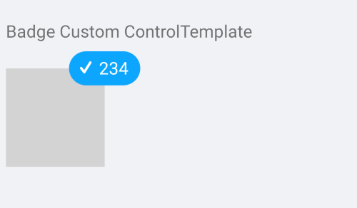
Custom ControlTemplate
BadgeView definition
<telerikPrimitives:RadBadgeView VerticalOptions="Start"
                                HorizontalOptions="Start">
    <telerikPrimitives:RadBadgeView.Content>
        <BoxView BackgroundColor="LightGray"
                 VerticalOptions="Center"
                 HorizontalOptions="Center"
                 WidthRequest="80"
                 HeightRequest="80"/>
    </telerikPrimitives:RadBadgeView.Content>
</telerikPrimitives:RadBadgeView>
Custom ControlTemplate definition
<Style TargetType="telerikPrimitives:Badge">
    <Setter Property="ControlTemplate">
        <Setter.Value>
            <ControlTemplate>
                <!-- you can change the control tempalte in order to customize the bage default look  -->
                <telerikPrimitives:RadBorder HeightRequest="30"
                                             WidthRequest="60"
                                             BackgroundColor="#0DA6FF"
                                             CornerRadius="15">
                    <StackLayout Orientation="Horizontal"
                                 VerticalOptions="Center"
                                 HorizontalOptions="Center">
                        <Label Text="{StaticResource CheckIconText}"
                               TextColor="White"
                               VerticalOptions="Center"
                               FontFamily="{StaticResource IconsFontFamily}"/>
                        <Label Text="234"
                               TextColor="White"/>
                    </StackLayout>
                </telerikPrimitives:RadBorder>
            </ControlTemplate>
        </Setter.Value>
    </Setter>
</Style>
Add the following namespace:
xmlns:telerikPrimitives="clr-namespace:Telerik.XamarinForms.Primitives;assembly=Telerik.XamarinForms.Primitives"
The final result:
ControlTemplate Example can be found inside the FeaturesCategory folder in SDK Browser Application/Examples/BadgeViewControl.