Badge Control
Badge vs BadgeView
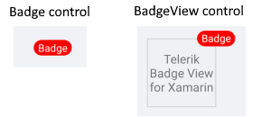
Badge is the marker which is displayed to show notifications, statuses, etc. The BadgeView is the control in which you can add a content and position the badge based on this content.
We recommend you use the BadgeView control
Badge Getting Started
<telerikPrimitives:Badge/>
Badge Features
Badge has the following properties:
- Text(string): Defines the badge text.
- TextColor(Xamarin.Forms.Color): Defines the text color of the badge.
- TextMargin(Xamarin.Forms.Thickness): Defines the margin of the badge text.
- FontSize(double): Defines the badge text font size.
- FontFamily(string): Defines the badge text font family.
- FontAttributes(FontAttributes): Defines the badge text font attributes.
- BorderColor(Xamarin.Forms.Color): Defines the badge border color.
- CornerRadius(Xamarin.Forms.Thickness): Defines the corner radius of the badge border.
- BorderThickness(Xamarin.Forms.Thickness): Defines the badge border thickness.
-
AnimationType(Telerik.XamarinForms.Primitives.BadgeAnimationType). You can choose between
ScaleandNone. The default value isScale. -
AnimationEasing(Xamarin.Forms.Easing): Defines the animation easing. For more details about different easing options check the Xamarin.Forms.Easing article. The default value is
SinInOut. - AnimationDuration in milliseconds(int) Defines the animation duration in milliseconds. The default value is 300.
- ControlTemplate(Xamarin.Forms.ControlTemplate): Specifies the Badge control template.
Badge ControlTemplate
Default ControlTemplate definition
<Style TargetType="telerikPrimitives:Badge">
    <Setter Property="ControlTemplate">
        <Setter.Value>
            <ControlTemplate>
                <!-- you can change the control tempalte in order to customize the bage default look  -->
                <telerikPrimitives:RadBorder BorderThickness="{TemplateBinding BorderThickness}"
                                             BorderColor="{TemplateBinding BorderColor}"
                                             CornerRadius="{TemplateBinding CornerRadius}"
                                             BackgroundColor="{TemplateBinding BackgroundColor}">
                    <Label x:Name="PART_BadgeContent"
                           Text="{TemplateBinding Text}"
                           TextColor="{TemplateBinding TextColor}"
                           Margin="{TemplateBinding TextMargin}"
                           FontSize="{TemplateBinding FontSize}"
                           FontFamily="{TemplateBinding FontFamily}"
                           FontAttributes="{TemplateBinding FontAttributes}"
                           HorizontalTextAlignment="Center"
                           VerticalTextAlignment="Center" />
                </telerikPrimitives:RadBorder>
            </ControlTemplate>
        </Setter.Value>
    </Setter>
</Style>
Define the Badge:
<telerikPrimitives:Badge/>
Add the following namespace:
xmlns:telerikPrimitives="clr-namespace:Telerik.XamarinForms.Primitives;assembly=Telerik.XamarinForms.Primitives"