Key Features
The purpose of this help article is to show you the key features of the RadBadgeView control.
Content
The BadgeView will be visualized only if its
Contentproperty is set.
- Content(of type Xamarin.Formd.View): Defines the content of the RadBadgeView.
You must define a content. The Badge marker/indicatior is positioned based on the content inside the RadBadgeView. Without a content the Badge won't be visualized.
<telerikPrimitives:RadBadgeView>
    <telerikPrimitives:RadBadgeView.Content>
        <!-- add the content of the RadBadgeView. For exmaple: Label, Image, Frame, Border, Button, etc -->
    </telerikPrimitives:RadBadgeView.Content>
</telerikPrimitives:RadBadgeView>
Example
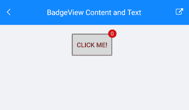
There is a Button inside the Content. The BadgeText is updated on a ButtonClick.
<telerikPrimitives:RadBadgeView BadgeText="0"
                                VerticalOptions="Center"
                                HorizontalOptions="Center"
                                x:Name="badgeView">
    <telerikPrimitives:RadBadgeView.Content>
        <Button Text="Click me!"
                Clicked="Button_Clicked"
                BorderColor="Gray"
                BorderWidth="2"
                Padding="3"
                VerticalOptions="Center"
                HorizontalOptions="Center"/>
    </telerikPrimitives:RadBadgeView.Content>
</telerikPrimitives:RadBadgeView>
and the page's code behind where is the button click implementation:
public partial class BadgeViewContent : ContentView
{
    private int badgeCounter = 0;

    public BadgeViewContent()
    {
        InitializeComponent();
    }

    private void Button_Clicked(object sender, EventArgs e)
    {
        badgeCounter++;
        badgeView.BadgeText = badgeCounter.ToString();
    }
}
And the result
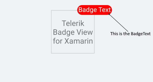
Badge Text
With BadgeText property(string) you can define a text. The text will be displayed in the badge marker.
Example
<telerikPrimitives:RadBadgeView BadgeText="Badge Text">
    <telerikPrimitives:RadBadgeView.Content>
        <telerikPrimitives:RadBorder WidthRequest="80"
                                     HeightRequest="80"
                                     BorderThickness="1"
                                     BorderColor="LightGray">
            <Label Text="Telerik Badge View for Xamarin"
                   FontSize="14"
                   VerticalTextAlignment="Center"
                   HorizontalTextAlignment="Center"/>
        </telerikPrimitives:RadBorder>
    </telerikPrimitives:RadBadgeView.Content>
</telerikPrimitives:RadBadgeView>
You can fully customize the look & feel of the BadgeView, for detailed information check the Badge Styling and Badge Customization articles.
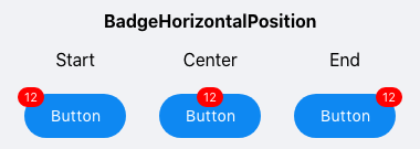
Badge Position
BadgeHorizontalPosition
BadgeVerticalPosition
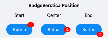
Use the BadgeHorizontalPositon and BadgeVerticalPosition properties to position the badge marker based on the content inside the RadBadgeView. The properties are of type Telerik.XamarinForms.Primitives.BadgePosition and the available options are Start, Center and End.
For more details about this check the Badge Position section.
Badge Alignment
BadgeHorizontalAlignment
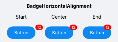
BadgeVerticalAlignment
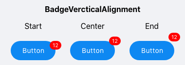
Specify the alignment of the badge based on the content inside the RadBadgeView using the BadgeHorizontalAlignment and BadgeVerticalAlignment properties. The properties are of type Telerik.XamarinForms.Primitives.BadgeAlignment and the available options are Start, Center and End.
For more details about this check the Badge Alignment section.
Badge Offset
Specify the horizontal/vertical distance between the content of the Badge and its alignment point using the BadgeOffsetX and BadgeOffsetY properties.
For more details please visit our Badge Offset section.
Badge Animation
You can choose whether the badge marker/indicator will be displayed with animation. In addition you can define the antimation duration and easing.
For more details please visit our Badge Animation article.
Badge Types
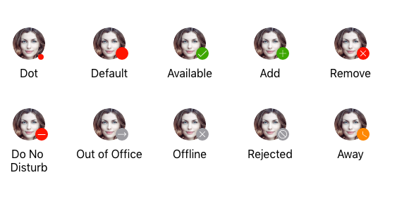
You can choose what will be the type of the badge by setting the BadgeType property(enumeration of type Telerik.XamarinForms.Primitives.BadgeType).
For more details please visit our Badge Types article.
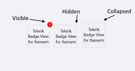
Badge Visibility
Change the Badge visibility state using the BadgeVisibility property (enum of type Telerik.XamarinForms.Common.Visibility).
The available options are:
- Visible - The badge marker/indicator is visualized.
- Hidden - The badge marker/indicator is hidden.
- Collapsed - The badge marker/indicator is collapsed.
The default value of BadgeVisibility is Visible.
Example with BadgeVisibility Hidden
<telerikPrimitives:RadBadgeView BadgeText="1" BadgeVisibility="Hidden">
    <telerikPrimitives:RadBadgeView.Content>
        <telerikPrimitives:RadBorder WidthRequest="80"
                                    HeightRequest="80"
                                    BorderThickness="1"
                                    BorderColor="LightGray">
            <Label Text="Telerik Badge View for Xamarin"
                FontSize="14"
                VerticalTextAlignment="Center"
                HorizontalTextAlignment="Center"/>
        </telerikPrimitives:RadBorder>
    </telerikPrimitives:RadBadgeView.Content>
</telerikPrimitives:RadBadgeView>
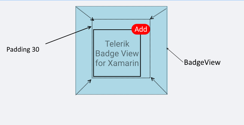
Padding
- Padding(Xamarin.Forms.Thickness): Defines the inner padding of the BadgeView.
 <telerikPrimitives:RadBadgeView BadgeText="Add" Padding="30">
     <telerikPrimitives:RadBadgeView.Content>
     <!-- add your content here -->
     </telerikPrimitives:RadBadgeView.Content>
 </telerikPrimitives:RadBadgeView>
Integration with other Controls
BadgeView control can be integrated with other controls like ListView, SideDrawer, TabView, Button, Label, Image, etc. It depends on the scenario you want to achieve.
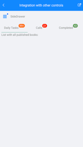
Sample Integration Example can be found in our Telerik UI for Xamarin Sample application and SDK Browser application.