WPF TabControl Overview
Thank you for choosing RadTabControl!
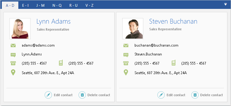
RadTabControl is a flexible navigation component, used to build tabbed interfaces in WPF applications. Thanks to the related RadTabItem control, you can organize your controls into different content pages, thus improving the overall user experience (UX) of your applications.
RabTabControl is part of the powerful UI for WPF navigation controls framework, which includes components as RadToolBar, RadTreeView, RadPanelBar, RadWindow, RadMenu and more.
The RadTabControl is part of Telerik UI for WPF, a
professional grade UI library with 160+ components for building modern and feature-rich applications. To try it out sign up for a free 30-day trial.

As every control from UI for WPF, RadTabControl comes with a set of pre-defined themes or you can design your own templates for a completely custom look using Expression Blend.
Key Features
Templates and Template Selectors: The control allows you advanced customizations of the look and feel of its items. Read more about this in the Appearance section of the documentation.
Powerful Data Binding: You can bind the control and its components to different sources as Objects, Collections, XML and WCF services. Read more about this in the Data Binding section of the documentation.
Flexible Header Content: Customize your headers any way you want using direct content or data templates.
Styling and Appearance: RadTabControl comes with a variety of themes and properties that allows you customizing the control's appearance.
Group tab items: You can group items in multiple lines for better user experience. Read more about this in the Create Multi-line Tabs article.
Two possible tab orientations: Horizontal and vertical. Read more about this in the Getting Started article.
Multiple tab strip placement: Left, Top, Right and Bottom. Read more about this in the Change Position of the Tab Strip article.
UI Automation Support: Check the UI Automation Support common article.
Enhanced Routed Events Framework: The events system of the control will help your code become even more elegant and concise.
Pin and Close: The tab items of the RadTabControl allows pin and close out of the box.
Get started with the control with its Getting Started help article that shows how to use it in a basic scenario.
Check out the online demo at demos.telerik.com
Telerik UI for WPF Support and Learning Resources
- Telerik UI for WPF TabControl Homepage
- Get Started with the Telerik UI for WPF TabControl
- Telerik UI for WPF API Reference
- Getting Started with Telerik UI for WPF Components
- Telerik UI for WPF Virtual Classroom (Training Courses for Registered Users)
- Telerik UI for WPF TabControl Forums
- Telerik UI for WPF Knowledge Base