Customizing Tab Items
This article shows how to customize the appearance of the RadTabControl's tab items.
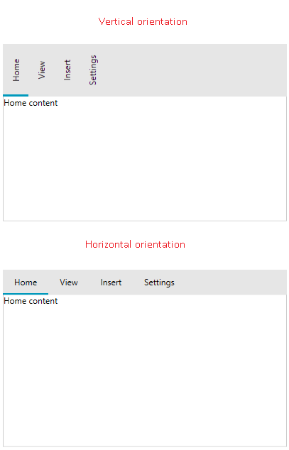
Tab Orientation
The orientation of the tab items can be switched using the TabOrientation property of RadTabControl. The supported orientations are Horizontal and Vertical. The tabs are oriented horizontally by default.
Example 1: Setting tab orientation
<telerik:RadTabControl TabOrientation="Vertical">
    <telerik:RadTabItem Header="Home" Content="Home content" />
    <telerik:RadTabItem Header="View" Content="View content"/>
    <telerik:RadTabItem Header="Insert" Content="Insert content"/>
    <telerik:RadTabItem Header="Settings" Content="Settings content" />
</telerik:RadTabControl>
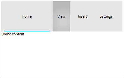
Items Size
The size and spacing of the RadTabItem elements can be modified using the Width, Height, Margin and Padding properties inherited from the FrameworkElement base class.
Example 2: Setting sizing and spacing of tab items
<telerik:RadTabControl>
    <telerik:RadTabItem Header="Home" Content="Home content" Margin="10 0 0 0" Width="150" Height="100"/>
    <telerik:RadTabItem Header="View" Content="View content" Margin="10 0 0 0"/>
    <telerik:RadTabItem Header="Insert" Content="Insert content" Margin="10 0 0 0"/>
    <telerik:RadTabItem Header="Settings" Content="Settings content" Margin="10 0 0 0"/>
</telerik:RadTabControl>
The Height setting of the RadTabItem will stretch the entire tabstrip area.
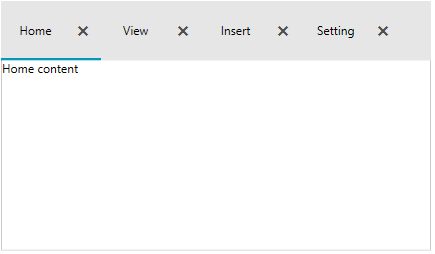
Item Container Style
The RadTabItem elements can be customized using a single Style object. The Style is applied using the ItemContainerStyle property of RadTabControl.
Example 3: Setting ItemContainerStyle
<telerik:RadTabControl>
    <telerik:RadTabControl.ItemContainerStyle>
        <Style TargetType="telerik:RadTabItem">
            <Setter Property="Width" Value="100" />
            <Setter Property="Height" Value="60" />
            <Setter Property="CloseButtonVisibility" Value="Visible" />
        </Style>
    </telerik:RadTabControl.ItemContainerStyle>
    <telerik:RadTabItem Header="Home" Content="Home content" />
    <telerik:RadTabItem Header="View" Content="View content"/>
    <telerik:RadTabItem Header="Insert" Content="Insert content"/>
    <telerik:RadTabItem Header="Settings" Content="Settings content"/>
</telerik:RadTabControl>
The control also provides style selector support via the ItemContainerStyleSelector property of RadTabControl. Read how to implement a StyleSelector in the corresponding MSDN article.
Item Template
The template of the RadTabItems can be customized using the ItemTemplate property of RadTabControl. The property is useful in case the ItemsSource of the control is used (data binding scenario).
The following example shows how to setup a basic model, populate RadTabControl with data and customize the template of the tabs.
Example 4: Defining tab model
public class TabInfo
{
    public string Header { get; set; }
    public string Content { get; set; }
}
Example 5: Populating the control with data
public MyUserControl()
{
    InitializeComponent();

    this.DataContext = new ObservableCollection<TabInfo>()
    {
       new TabInfo() { Header = "Home", Content="Home content" },
       new TabInfo() { Header = "Insert", Content="Insert content" },
       new TabInfo() { Header = "Settings", Content="Settings content" }
    };
}
Example 6: Setting up the ItemTemplate
<telerik:RadTabControl ItemsSource="{Binding}">
    <telerik:RadTabControl.ItemTemplate>
        <DataTemplate>
          <TextBlock Text="{Binding Header}" FontWeight="Bold" FontStyle="Italic" Foreground="#0099BC"/>
        </DataTemplate>
    </telerik:RadTabControl.ItemTemplate>
    <telerik:RadTabControl.ContentTemplate>
        <DataTemplate>
            <Border>
                <TextBlock Text="{Binding Content}" VerticalAlignment="Center" TextAlignment="Center"/>
            </Border>
        </DataTemplate>
    </telerik:RadTabControl.ContentTemplate>
</telerik:RadTabControl>
The ItemTemplate is inherited by the HeaderTemplate property of each RadTabItem. The HeaderTemplate property can be used as an alternative of the ItemTemplate.
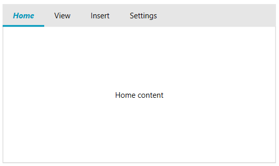
Example 7: Setting HeaderTemplate
<Grid>
    <Grid.Resources>
        <DataTemplate x:Key="TabHeaderTemplate">
            <TextBlock Text="{Binding}" FontWeight="Bold" FontStyle="Italic" Foreground="#0099BC"/>
        </DataTemplate>
    </Grid.Resources>
    <telerik:RadTabControl>
        <telerik:RadTabItem Header="Home" Content="Home content" HeaderTemplate="{StaticResource TabHeaderTemplate}" />
        <telerik:RadTabItem Header="View" Content="View content"/>
        <telerik:RadTabItem Header="Insert" Content="Insert content"/>
        <telerik:RadTabItem Header="Settings" Content="Settings content"/>
    </telerik:RadTabControl>
</Grid>
The ItemTemplate and HeaderTemplate have corresponding DataTemplateSelector alternatives - the ItemTemplateSelector and HeaderTemplateSelector properties - that allow you to choose the DataTemplate based on a custom condition. Read how to implement a DataTemplateSelector in the corresponding MSDN article.
The template of the selected tab content can be customized using the ContentTemplate property of RadTabControl.
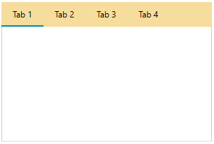
Tabstrip Background
To change the background of the area behind the tab items (the tabstrip), set the HeaderBackground property of RadTabControl.
Example 8: Setting HeaderBackground
<telerik:RadTabControl HeaderBackground="#F6DC9D" />