Getting Started with WPF ProgressBar
This tutorial will walk you through the creation of a sample application that contains RadStepProgressBar.
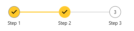
The following picture shows the final result produced by the code of this tutorial.
Adding Telerik Assemblies Using NuGet
To use RadStepProgressBar when working with NuGet packages, install the Telerik.Windows.Controls.for.Wpf.Xaml package. The package name may vary slightly based on the Telerik dlls set - Xaml or NoXaml
Read more about NuGet installation in the Installing UI for WPF from NuGet Package article.
With the 2025 Q1 release, the Telerik UI for WPF has a new licensing mechanism. You can learn more about it here.
Adding Assembly References Manually
If you are not using NuGet packages, you can add a reference to the following assemblies:
- Telerik.Licensing.Runtime
- Telerik.Windows.Controls
You can find the required assemblies for each control from the suite in the Controls Dependencies help article.
Defining RadStepProgressBar
To start using the RadStepProgressBar control, you can just populate its Items collection with RadStepProgressBarItem objects. Each RadStepProgressBar will produce a step visual element with track bar rendered between the steps. The following example shows how to add 3 steps along with text to each step added via the Content property of the RadStepProgressBarItem elements. In the example, the second step is selected.
<telerik:RadStepProgressBar SelectedIndex="1">
    <telerik:RadStepProgressBarItem Content="Step 1" />
    <telerik:RadStepProgressBarItem Content="Step 2" />
    <telerik:RadStepProgressBarItem Content="Step 3" />
</telerik:RadStepProgressBar>
Telerik UI for WPF Learning Resources
- Telerik UI for WPF StepProgressBar Component
- Getting Started with Telerik UI for WPF Components
- Telerik UI for WPF Installation
- Telerik UI for WPF and WinForms Integration
- Telerik UI for WPF Visual Studio Templates
- Setting a Theme with Telerik UI for WPF
- Telerik UI for WPF Virtual Classroom (Training Courses for Registered Users)
- Telerik UI for WPF License Agreement