Step Item Contents
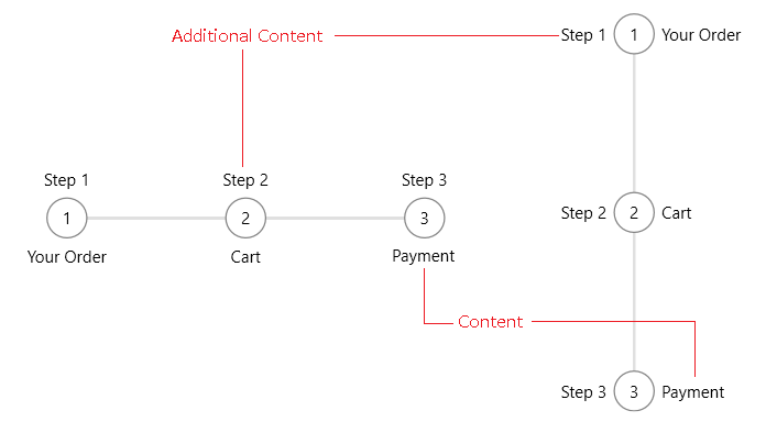
The RadStepProgressBarItem elements allows you to add steps into the control. This renders a step visual for each RadStepProgressBarItem. Additionally, text or any other UI can be included for each step.
To set additional contents, use the Content and AdditionalContent properties of RadStepProgressBarItem. The Content renders a presenter on bottom of the step in horizontal orientation or on the right side in vertical orientation. The AdditionalContent renders a presenter on top of the step in horizontal and on the left in vertical orientation.
<telerik:RadStepProgressBar>
    <telerik:RadStepProgressBarItem AdditionalContent="Step 1" Content="Your Order" />
    <telerik:RadStepProgressBarItem AdditionalContent="Step 2" Content="Cart" />
    <telerik:RadStepProgressBarItem AdditionalContent="Step 3" Content="Payment" />
</telerik:RadStepProgressBar>
Also, the content and the additional content templates can be determined using DataTemplateSelectors. To do so, use the ContentTemplateSelector and AdditionalContentTemplateSelector properties of RadStepProgressBarItem.
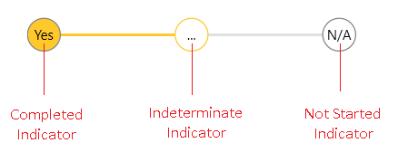
Indicator Contents
The contents inside the step item shapes can be customized using the corresponding content properties - NotStartedIndicatorContent, IndeterminateIndicatorContent and CompletedIndicatorContent. Additionally, each indicator content property has a associated template property - NotStartedIndicatorContentTemplate, IndeterminateIndicatorContentTemplate and CompletedIndicatorContentTemplate.
The different properties are used based on the current state of the step item - NotStarted, Indeterminate or Completed.
In order to replace the indicator content when the step item is in Completed and Indeterminate state, you will need to set the the CompletedIndicatorContentTemplate and IndeterminateIndicatorContentTemplate properties.
<telerik:RadStepProgressBar Width="500" SelectedItemStatus="Indeterminate">
    <telerik:RadStepProgressBar.Resources>
        <DataTemplate x:Key="IndicatorContentTemplate">
            <TextBlock Text="{Binding}" />
        </DataTemplate>
    </telerik:RadStepProgressBar.Resources>
    <telerik:RadStepProgressBarItem NotStartedIndicatorContent="N/A"
                                    CompletedIndicatorContent="Yes"
                                    IndeterminateIndicatorContent="..."
                                    CompletedIndicatorContentTemplate="{StaticResource IndicatorContentTemplate}"
                                    IndeterminateIndicatorContentTemplate="{StaticResource IndicatorContentTemplate}" />
    <telerik:RadStepProgressBarItem NotStartedIndicatorContent="N/A"
                                    CompletedIndicatorContent="Yes"
                                    IndeterminateIndicatorContent="..."
                                    CompletedIndicatorContentTemplate="{StaticResource IndicatorContentTemplate}"
                                    IndeterminateIndicatorContentTemplate="{StaticResource IndicatorContentTemplate}"/>
</telerik:RadStepProgressBar>