Printing
This tutorial describes the Diagramming framework printing functionality.
The RadDiagram exposes a method and command that allow you to print its content.
RadDiagram Print Support
RadDiagram.Print() method
The RadDiagram.Print() method allows you to print the content of the Diagramming canvas. The Print() method has one optional argument of type RadDiagramPrintSettings, which exposes the following members:
Title—this property is of typestringand it determines the name of the printing job in the print queue of a printer-
PageMargin—this property is of typeThicknessand it provides control over the size of the document's page margins when printed.You can take advantage of the
RadDiagramPrintPreviewto see the RadDiagram print document's page margins before printing. -
DiagramPosition—this property allows to customize the position of the RadDiagram over the print pages. The property is of typeDiagramPrintPosition, which is enumeration with the following values:DefaultTopLeftBottomLeftCenterTopRightBottomRight
ScaleFactor—this property gets the value that indicates the scale that is applied to the printed RadDiagram element.PageHorizontalCount—this property gets the value that indicates the columns' count of the printed pages.PageVerticalCount—this property gets the value that indicates the rows' count of the printed pages.
If you don't define any RadDiagramPrintSettings when invoking the Print() method, by default the Diagramming framework will name your printing job "RadDiagram Print Document" and it will set the PageMargin to 15.
The RadDiagramPrintSettings's constructor have an optional parameter that defines the resolution (DPI) used during printing. The default DPI is 96. If you need better quality of the print result you can pass bigger value in the settings' constructor.
Print() Method Example
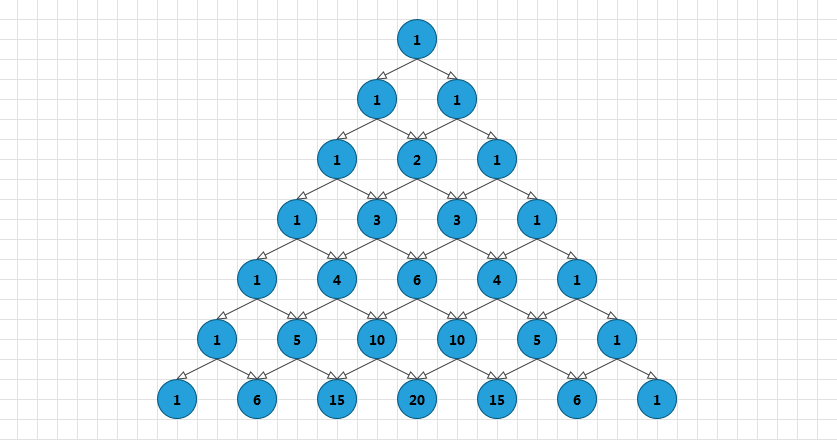
For the purpose of this tutorial we will try to print the sample Diagramming solution demonstrated in the DataBinding section of this documentation:
Please note that the examples in this tutorial are showcasing Telerik Windows8 theme. In the Setting a Theme article you can find more information on how to set an application-wide theme.
Now let's add a Print RadButton in our layout and handle its Click event to invoke the RadDiagram.Print() method:
Now if you run your solution and hit the Print button:
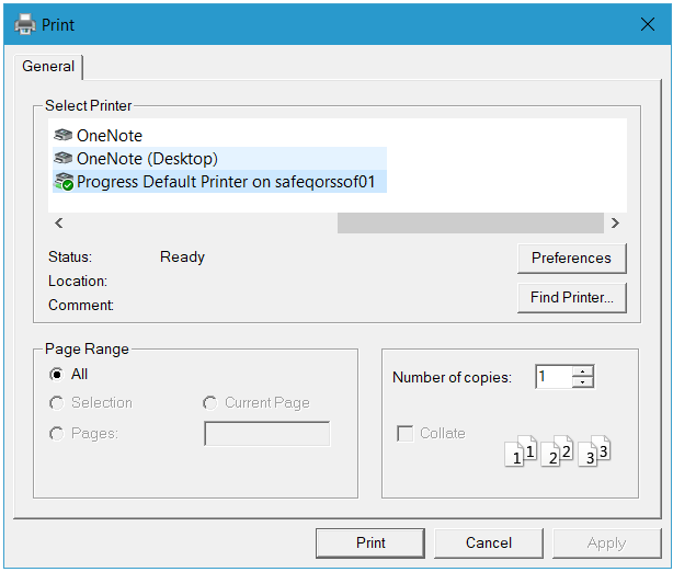
A PrintDialog will be opened, allowing you to set up the printing operation:
Print Command
Telerik Diagramming Framework provides a Print command as well. It is part of the DiagramExtensionCommands class implementation defined in the Telerik.Windows.Controls.Diagrams.Extensions namespace and you can apply it on your buttons and use it to invoke the print dialog:
You need to keep in mind that the Print command can only be executed on a
RadDiagram, populated withDiagramItems.
Pages Preview Canvas
The RadDiagram supports pages preview canvas. The pages background is enabled by default but you can control its visibility and appearance through the following set of attached properties:
BackgroundPageGrid.IsGridVisible—this is aBooleanproperty that controls the visibility of the page preview canvas. Its default value isTrue.BackgroundPageGrid.PageSize—this property is of typeSizeand it determines the size that describes a single page in theRadDiagramsurface. The default value of the property is a size of 1092x763 units - the size of an A4 page format.BackgroundPageGrid.LineStroke—this property is of typeBrushand it specifies how the pages outline is painted.BackgroundPageGrid.LineStrokeDashArray—this property gets or sets a collection ofdoublevalues that indicate the pattern of dashes and gaps that is used to outline the pages.BackgroundPageGrid.LineStrokeThickness—this property is of typedoubleand it gets or sets the thickness of the lines that visualize the pages.
The
BackgroundPageGridattached properties are defined in theTelerik.Windows.Controls.Diagrams.Primitivesnamespace. This is why in order to use them you need to add a using statement for that namespace in code-behind or define an alias in XAML:xmlns:primitives="clr-namespace:Telerik.Windows.Controls.Diagrams.Primitives;assembly=Telerik.Windows.Controls.Diagrams"
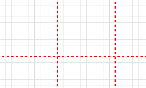
The default look and size of the page preview canvas is demonstrated in the next snapshot:
The PagesPreview canvas in a zoomed RadDiagram
And in order to modify it, you can change some or all of the previously described properties:
Customized PagesPreview canvas
The
RadDiagramexposes anIsBackgroundSurfaceVisibleproperty that determines the visibility of the background surface and the pages preview canvas at the same time. It is important to have this in mind when considering whether to set theIsBackgroundSurfaceVisibletoFalse.
RadDiagramPrintPreview
With the official release of the RadDiagrams, Telerik an Extensions assembly to the diagrams assembly. The purpose of this assembly is to provide predefined Diagramming tools and controls to facilitate your efforts when creating Diagramming solution. One of the controls provided by the Telerik.Windows.Controls.Diagrams.Extensions assembly is the RadDiagramPrintPreview control.
You can find more information about the
Extensionsprovided byTelerik RadDiagramshere. Also, please keep in mind that in order to take advantage of the controls provided in the assembly, you have to reference the following dlls in your project as well:
- Telerik.Windows.Controls.Navigation
- Telerik.Windows.Controls.Input
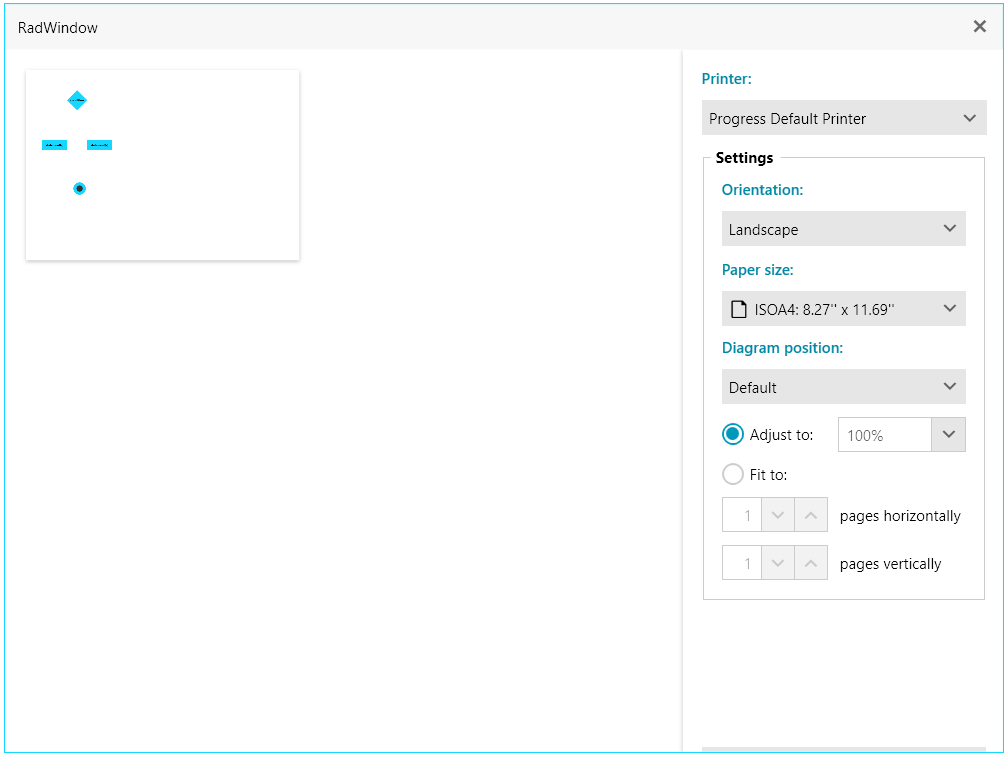
The RadDiagramPrintPreview is a stand-alone control which you can use to preview your RadDiagram print document before printing it. You can also use it to choose the printer and the settings of the pages. Usually the control is used in a Window dialog and this is why the next example illustrates how to wrap the control in a RadWindow dialog.
If you run this sample and hit the PrintPreview button, the following PrintPreview dialog will open:
RadDiagramPrintPreview Properties
The RadDiagramPrintPreview control exposes the following properties:
Diagram—this property is of typeRadDiagramand it determines the Diagramming object that should be printed-
ItemStyle—this property allows you to create a custom style for theRadDiagramPrintPreviewItemwhich basically represents a page of the diagram print document. You can edit its default settings in Blend, if you select the RadDiagramPrintPreview object in the Objects and Timeline pane and then choose from the Object menu *Edit AdditionalStyles->Edit ItemStyle->Eit a Copy.... * The default structure of theRadDiagramPrintPreviewItem ControlTemplateis as follows:
PrintScaleFactor—this property allows you to get or set the scale factor. The default value of this property is1.
RadDiagramPrintPreview Methods and Events
The RadDiagramPrintPreview control exposes the following events:
PreviewPrint—occurs when a print operation is about to beginPrinted—occurs when the print operation is over
The control also exposes a Print(string title) method which has one required attribute - the name of the printing job.