Customizing Filtering Control
RadCardView filtering control can be customized in order to match the expected design or functionality.
Read the Filtering article to see how to use the filtering feature.
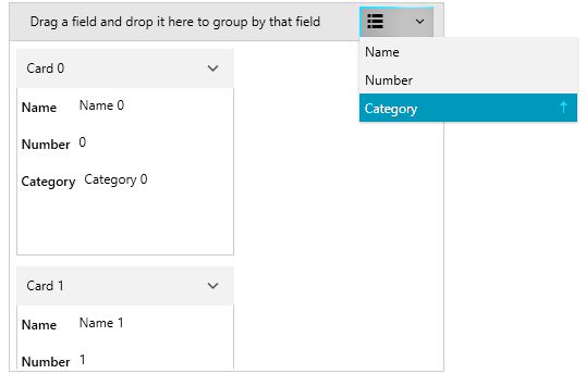
To hide the button that opens the filtering control popup, set the IsFilteringAllowed property to False.
Example 1: Setting the IsFilteringAllowed property
<telerik:RadCardView IsFilteringAllowed="False" />
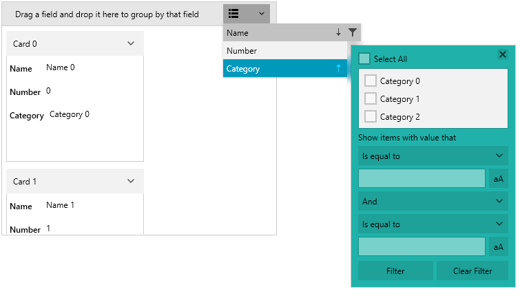
Figure 1: Hidden filtering control icon
To keep the filtering control popup open when you click outside of it, set the FilteringDropDownStaysOpen property to True.
Example 2: Setting the FilteringDropDownStaysOpen property
<telerik:RadCardView FilteringDropDownStaysOpen="True" />
Example 3: Setting the ShowFilterButton property
<telerik:RadCardView.DataFieldDescriptors>
    <telerik:CardDataFieldDescriptor DataMemberBinding="{Binding Name}" ShowFilterButton="False"/>
</telerik:RadCardView.DataFieldDescriptors>
Figure 2: Hidden filtering button
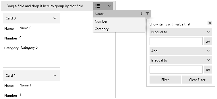
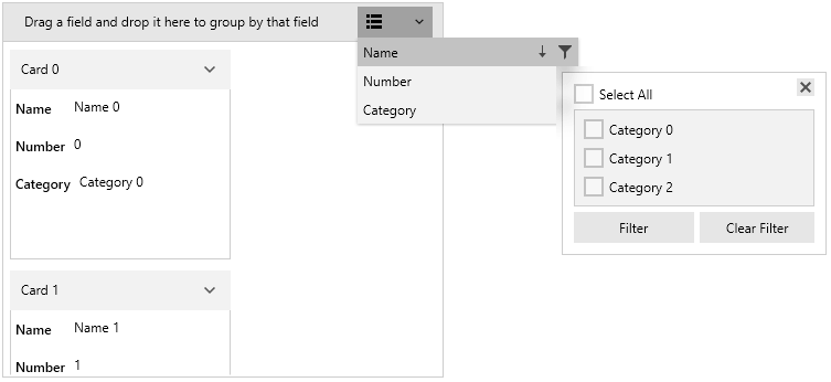
To change the visibility of the distinct values list from the popup, set the ShowDistinctFilters property of the associated CardDataFieldDescriptor.
Example 4: Setting the ShowDistinctFilters property
<telerik:RadCardView.DataFieldDescriptors>
    <telerik:CardDataFieldDescriptor DataMemberBinding="{Binding Name}" ShowDistinctFilters="False"/>
</telerik:RadCardView.DataFieldDescriptors>
Figure 3: Hidden the distinct values list
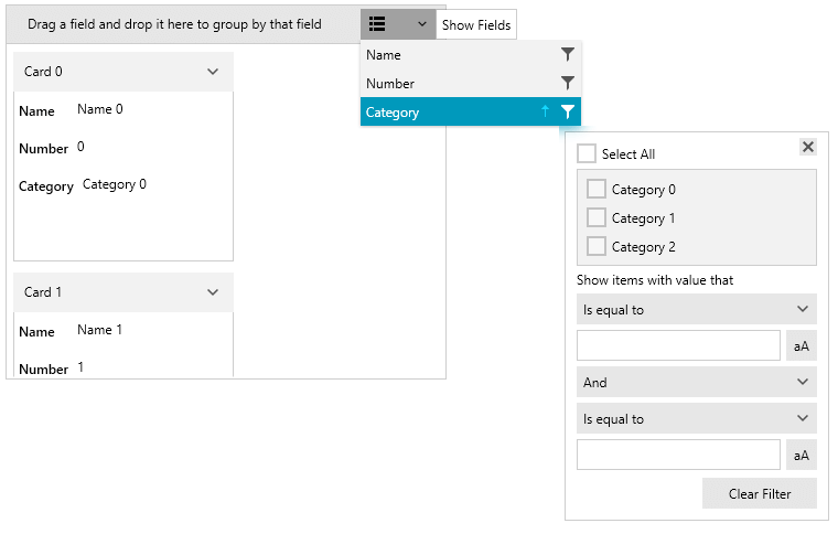
To change the visibility of the field filters in the popup, set the ShowFieldFilters property of the associated CardDataFieldDescriptor.
Example 5: Setting the ShowFieldFilters property
<telerik:RadCardView.DataFieldDescriptors>
    <telerik:CardDataFieldDescriptor DataMemberBinding="{Binding Name}" ShowFieldFilters="False"/>
</telerik:RadCardView.DataFieldDescriptors>
Figure 4: Hidden the field filters
Custom Filtering Control
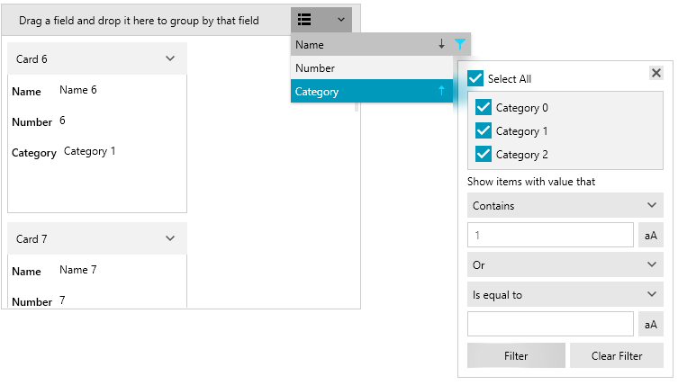
The UI filters are hosted in a FilteringControl element. To get or replace the control, use the FilteringControl property of the associated CardDataFieldDescriptor. The value assigned to the property should implement the IFilteringControl interface or alternatively the FilteringControl class can be used as a base for the implementation.
Example 6: Creating custom FilteringControl and changing few of the default settings
public class CustomFilteringControl : FilteringControl
{
    public CustomFilteringControl(CardDataFieldDescriptor cardDataFieldDescriptor)
        : base(cardDataFieldDescriptor)
    {
    }

    public override void Prepare(CardDataFieldDescriptor cardDataFieldDescriptorToPrepare)
    {
        base.Prepare(cardDataFieldDescriptorToPrepare);
        var viewModel = (FilteringViewModel)this.DataContext;
        viewModel.FieldFilterLogicalOperator = FilterCompositionLogicalOperator.Or;
        viewModel.Filter1.Operator = FilterOperator.Contains;
        viewModel.Filter1.Value = "1";
        viewModel.SelectAll = true;
    }
}
Example 7: Setting the custom FilteringControl
public MainWindow()
{
    InitializeComponent();

    var descriptor = this.cardView.DataFieldDescriptors[0];
    descriptor.FilteringControl = new CustomFilteringControl(descriptor);
}
Figure 5: Customized FiltertingControl
The UI of the FilteringControl can be customized using the FilteringControlStyle property of the CardDataFieldDescriptor.
Example 8: Setting the custom FilteringControlStyle
<telerik:CardDataFieldDescriptor.FilteringControlStyle>
    <Style TargetType="cardView:FilteringControl">
        <Setter Property="Background" Value="LightSeaGreen" />
    </Style>
</telerik:CardDataFieldDescriptor.FilteringControlStyle>
xmlns:cardView="clr-namespace:Telerik.Windows.Controls.Data.CardView;assembly=Telerik.Windows.Controls.Data"
Figure 6: Customized FiltertingControlStyle