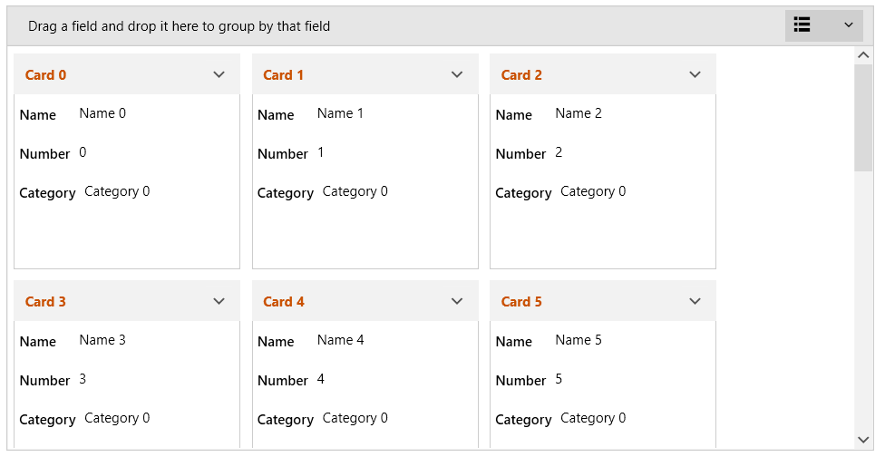
Customizing Cards
RadCardView cards can be customized in order to match the expected design or functionality.
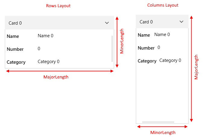
Card Size
The card's size is determined by the MajorLength and MinorLength properties of RadCardView. Each property relates to a different dimension (width or height) based on the applied layout (rows or columns).
When the CardLayout property is set to Rows the MajorLength is applied to the card's width and the MinorLength to the card's height. When the CardLayout is Columns the MajorLength is applied to the card's height and the MinorLength to the card's width.
Figure 1: MajorLength and MinorLength examples
Additionally, you can set the CollapsedLength property in order to change the size of the cards while in collapsed state.
Example 1: Setting cards sizes
<telerik:RadCardView MinorLength="200"
                     MajorLength="210"
                     CollapsedLength="150"/>
Example 2: Setting CardMargin
<telerik:RadCardView CardMargin="5 10 0 5"/>
Card Header
The header content of a card is determined by the CardHeaderBinding property. Read the Data Binding article to see how to use this. Additionally, the header UI can be customized using the CardHeaderTemplate property of RadCardView.
Example 3: Setting card header template
<telerik:RadCardView CardHeaderBinding="{Binding MyHeaderProperty}">
    <telerik:RadCardView.CardHeaderTemplate>
        <DataTemplate>
            <TextBlock Text="{Binding}" Foreground="#CA5100" FontWeight="Bold"/>
        </DataTemplate>
    </telerik:RadCardView.CardHeaderTemplate>
</telerik:RadCardView>
Figure 2: Custom card header
The data context in the CardHeaderTemplate comes from the property bound to the CardHeaderBinding.
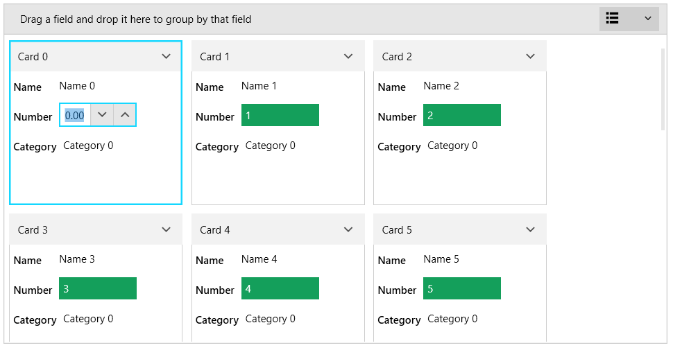
Card Data Field
To toggle the visibility of a data field, set the IsVisible property of the associated CardDataFieldDescriptor.
Example 4: Setting CardDataFieldDescriptor IsVisible property
<telerik:RadCardView.DataFieldDescriptors>
    <telerik:CardDataFieldDescriptor DataMemberBinding="{Binding Name}" IsVisible="False"/>
</telerik:RadCardView.DataFieldDescriptors>
Example 5: Setting EditorTemplate and ReadOnlyTemplate
<telerik:RadCardView.DataFieldDescriptors>
    <telerik:CardDataFieldDescriptor DataMemberBinding="{Binding Number}">
        <telerik:CardDataFieldDescriptor.ReadOnlyTemplate>
            <DataTemplate>
                <Border Padding="5" Background="#149F5B">
                    <TextBlock Text="{Binding Number}" Foreground="White"/>
                </Border>
            </DataTemplate>
        </telerik:CardDataFieldDescriptor.ReadOnlyTemplate>
        <telerik:CardDataFieldDescriptor.EditorTemplate>
            <DataTemplate>
                <telerik:RadNumericUpDown Value="{Binding Number, Mode=TwoWay}" />
            </DataTemplate>
        </telerik:CardDataFieldDescriptor.EditorTemplate>
    </telerik:CardDataFieldDescriptor>
</telerik:RadCardView.DataFieldDescriptors>
Figure 3: Custom read only and editor templates for one of the data fields
Card Contents
The default visual content of the cards can be replaced using the CardReadOnlyTemplate and CardEditTemplate of RadCardView.
CardReadOnlyTemplate allows you to define the content while the card is in normal state.
CardEditTemplate allows you to define the content while the card is in edit state.
To enter edit state, execute the RadCardViewCommands.BeginEdit command. This affects the currently selected card.
To commit or cancel the edit, call execute RadCardViewCommands.CommitEdit or RadCardViewCommands.CancelEdit commands.
Read more about RadCardView's commanding support in the Commands article.
Example 5: Defining CardReadOnlyTemplate and CardEditTemplate
<telerik:RadCardView x:Name="cardView" CardHeaderBinding="{Binding Header}" MinorLength="150">
<telerik:RadCardView.CardReadOnlyTemplate>
<DataTemplate>
<Border Background="#7A7574">
<Grid VerticalAlignment="Center">
<Grid.RowDefinitions>
<RowDefinition Height="Auto" />
<RowDefinition Height="Auto"/>
</Grid.RowDefinitions>
<telerik:RadGlyph Glyph="" Foreground="White" FontSize="32"/>
<StackPanel Orientation="Horizontal" Grid.Row="1" HorizontalAlignment="Center" >
<TextBlock Text="{Binding Name}" Foreground="White" VerticalAlignment="Center"/>
<telerik:RadGlyph Glyph="" Foreground="White" Cursor="Hand"
Margin="4 0 0 0" MouseLeftButtonDown="OnCardBeginEdit"
IsEnabled="{Binding RelativeSource={RelativeSource AncestorType=telerik:RadCardViewItem}, Path=IsSelected}"/>
</StackPanel>
</Grid>
</Border>
</DataTemplate>
</telerik:RadCardView.CardReadOnlyTemplate>
<telerik:RadCardView.CardEditTemplate>
<DataTemplate>
<Border Background="#7A7574">
<Grid VerticalAlignment="Center" HorizontalAlignment="Center" TextElement.Foreground="White">
<Grid.RowDefinitions>
<RowDefinition Height="Auto" />
<RowDefinition Height="Auto"/>
<RowDefinition Height="Auto"/>
<RowDefinition Height="Auto"/>
</Grid.RowDefinitions>
<Grid.ColumnDefinitions>
<ColumnDefinition Width="Auto" />
<ColumnDefinition Width="Auto" />
</Grid.ColumnDefinitions>
<TextBlock Text="Header: " VerticalAlignment="Center"/>
<TextBox Text="{Binding Header, Mode=TwoWay, UpdateSourceTrigger=PropertyChanged}" Margin="5 0 0 0" Padding="5 3 5 3" Grid.Column="1"/>
<TextBlock Text="Name: " VerticalAlignment="Center" Grid.Row="1" />
<TextBox Text="{Binding Name, Mode=TwoWay, UpdateSourceTrigger=PropertyChanged}" Margin="5 2 0 0" Padding="5 3 5 3" Grid.Row="1" Grid.Column="1"/>
<TextBlock Text="Number: " VerticalAlignment="Center" Grid.Row="2" />
<TextBox Text="{Binding Number, Mode=TwoWay, UpdateSourceTrigger=PropertyChanged}" Margin="5 2 0 0" Padding="5 3 5 3" Grid.Row="2" Grid.Column="1"/>
<telerik:RadGlyph Glyph="" Foreground="White" Cursor="Hand" Grid.Row="3"
Grid.ColumnSpan="2" HorizontalAlignment="Right"
Margin="4 4 0 0" MouseLeftButtonDown="OnCardCommitEdit"/>
</Grid>
</Border>
</DataTemplate>
</telerik:RadCardView.CardEditTemplate>
</telerik:RadCardView>
Example 6: Execute RadCardView commands
private void OnCardBeginEdit(object sender, MouseButtonEventArgs e)
{
    // start editing
    this.cardView.PendingCommands.Add(Telerik.Windows.Controls.RadCardViewCommands.BeginEdit);
    this.cardView.ExecutePendingCommand();
}

private void OnCardCommitEdit(object sender, MouseButtonEventArgs e)
{
    // commit edit
    this.cardView.PendingCommands.Add(Telerik.Windows.Controls.RadCardViewCommands.CommitEdit);
    this.cardView.ExecutePendingCommand();
}
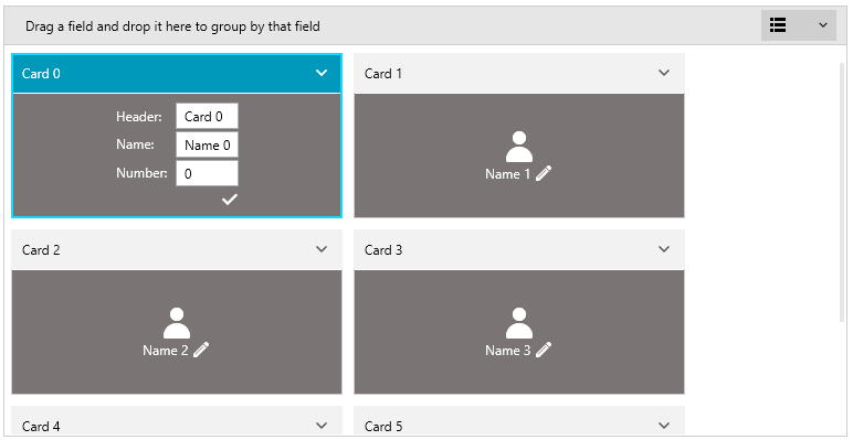
Figure 4: Custom card contents in read-only state
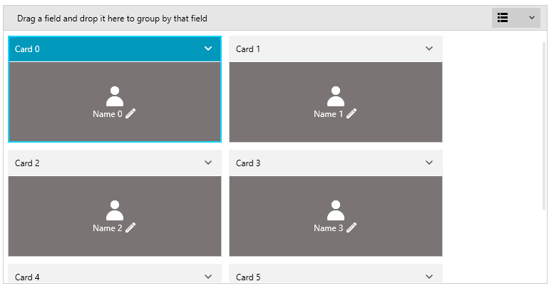
Figure 5: Custom card contents in edit state
Always use both CardReadOnlyTemplate and CardEditTemplate properties together.