Getting Started with WinUI SideDrawer
This tutorial will walk you through the creation of a sample application that contains RadSideDrawer.
Assembly References
In order to use the RadSideDrawer control, you will need to add references to the following assemblies:
Telerik.WinUI.ControlsTelerik.Licensing.Runtime.dll
Adding RadSideDrawer to the Project
You can add a RadSideDrawer manually in XAML as demonstrated in Example 1.
You can access the RadSideDrawer control through an alias pointing to the Telerik.UI.Xaml.Controls.Primitives namespace:
xmlns:telerik="using:Telerik.UI.Xaml.Controls.Primitives"
Example 1: Adding a SideDrawer in XAML
<telerik:RadSideDrawer />
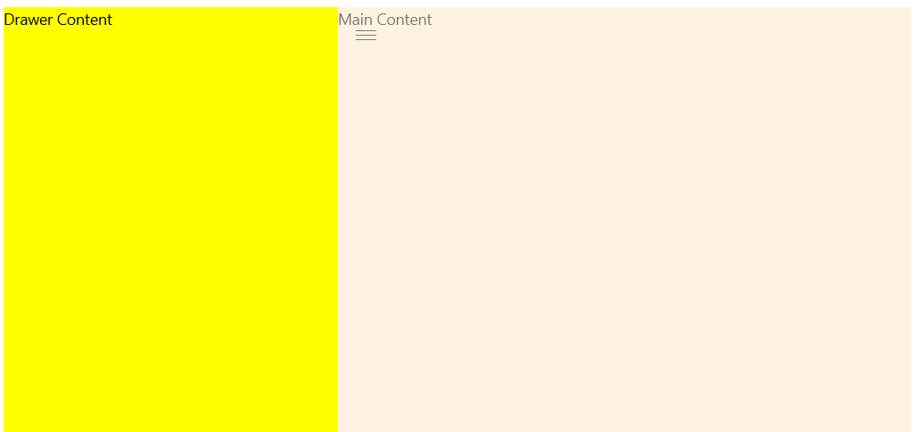
Example 2: Set MainContent and DrawerContent
<telerik:RadSideDrawer>
    <telerik:RadSideDrawer.MainContent>
        <Grid Background="Bisque">
            <TextBlock Text="Main Content" />
        </Grid>
    </telerik:RadSideDrawer.MainContent>
    <telerik:RadSideDrawer.DrawerContent>
        <Grid Width="300" Background="Yellow">
            <TextBlock Text="Drawer Content" />
        </Grid>
    </telerik:RadSideDrawer.DrawerContent>
</telerik:RadSideDrawer>
Figure 1: This figure is generated by the code in Example 2. The SideDrawer is in an expanded state.

Telerik UI for WinUI Learning Resources
- Telerik UI for WinUI SideDrawer Component
- Getting Started with Telerik UI for WinUI Components
- Telerik UI for WinUI Installation
- Telerik UI for WinUI Examples
- Telerik UI for WinUI Accessibility
- Telerik UI for WinUI License Agreement