Visual Structure
This section defines the terms and the concepts used in the scope of SideDrawer which you have to get familiar with before you continue reading this help.
Below you can see a snapshots and explanation of the main visual elements of the RadSideDrawer control.
Figure 1: Collapsed State
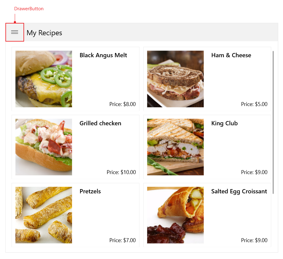
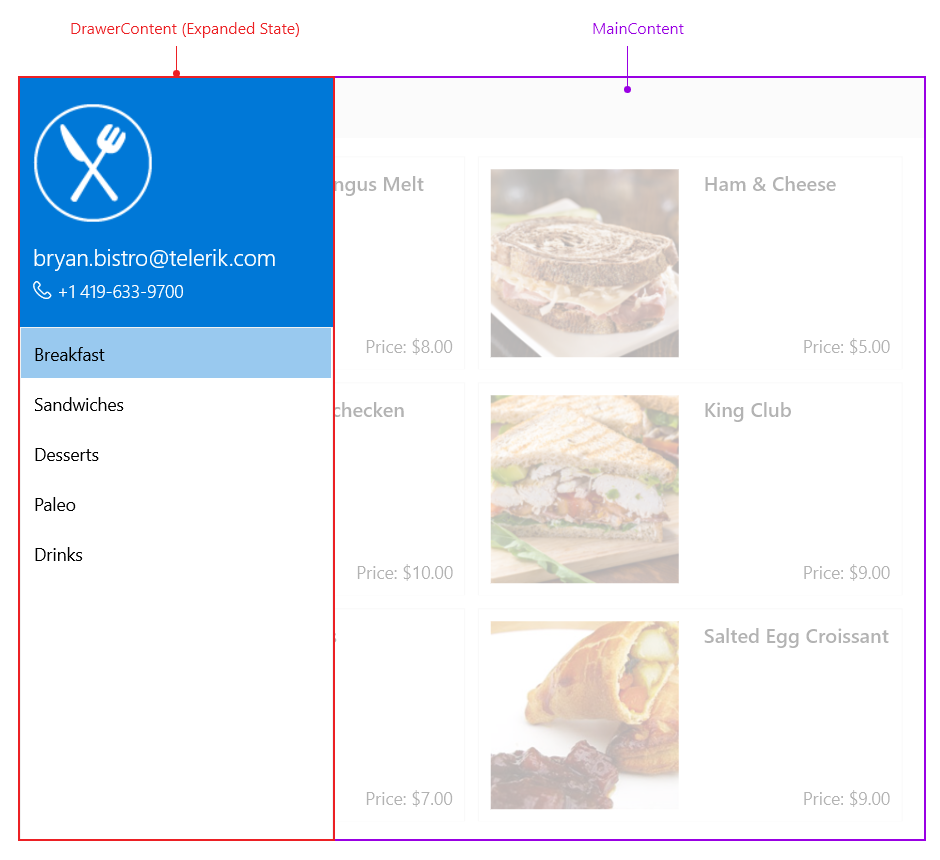
Figure 1: Expanded State
The structure of a RadSideDrawer consists of the following main elements:
Drawer Button: The Drawer content is accessible through the Drawer Button on the top-left side.
Drawer Content: The content of the Drawer.
Main Content: The main content of the RadSideDrawer control.