Creating Linear Gauge
One of the gauges you can create with the RadGauge suite, is a linear gauge. It is represented by a rectangular container with a linear scale in it. Additionally, it can display various indicators that point to a certain value on the scale. This topic will walk you through the creation of a sample application that contains a linear RadGauge.
Assembly References
In order to use the controls from the RadGauge suite in your projects, you have to add references to the following assemblies:
Telerik.WinUI.Controls.dllTelerik.Licensing.Runtime.dll
Defining a Linear Gauge
The linear gauge type is represented by the RadLinearGauge class. It is a linear scale, which can display multiple scales and ranges.
Example 1: Creating RadLinearGauge
<Grid xmlns:dataVisualization="using:Telerik.UI.Xaml.Controls.DataVisualization">
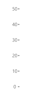
    <dataVisualization:RadLinearGauge Height="200" MaxValue="50" LabelOffset="-10" telerik:RadLinearGauge.Orientation="Vertical" />
</Grid>
Image 1: Result from Example 1

Properties
RadLinearGauge class inherits from the RadGauge class - See the inherited properties.
- LabelOffset (double): Gets or sets an offset that is used to nudge the labels to the right or left (top/bottom if Orientation is horizontal) of the ticks. This is an attached property.
Telerik UI for WinUI Learning Resources
- Telerik UI for WinUI Gauge Component
- Getting Started with Telerik UI for WinUI Components
- Telerik UI for WinUI Installation
- Telerik UI for WinUI Examples
- Telerik UI for WinUI Accessibility
- Telerik UI for WinUI License Agreement