Overview
The RadDataGrid control has a built-in Grouping UI and also provides support for programmatic grouping.
Grouping Actions
The Grouping UI supports the following actions:
- Reorder—You can reorder the elements in the Grouping UI and thus change the priority of the corresponding group descriptors.
- Sort—You can sort the group headers in an ascending or descending order by the group key.
- Remove—You can remove groups.
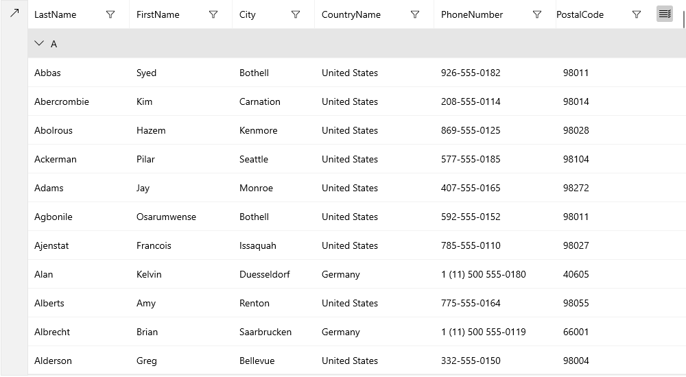
You can also expand and collapse groups by a click/tap on the group header.
Dragging a column header to the Grouping UI adds a PropertyGroupDescriptor to the GroupDescriptors collection of the RadDataGrid.
UserGroupMode
The grouping UI is enabled by design. You can control its visibility through the UserGroupMode property.
Example 1: Disable grouping UI
<dataGrid:RadDataGrid UserGroupMode="Disabled" />
GroupPanelPosition
You can also control the position of the grouping UI with the GroupPanelPosition property that supports the following options
- Left—Displays the grouping UI on the left side of the control. This is the default value for an UWP application.
- Bottom—Displays the grouping UI on the bottom side of the control.
- Top—Displays the grouping UI on the top side of the control.
- TopInline—Displays the grouping UI on the top side of the control with the group items displayed inline. This is the default value for a Windows application.
Example 2: Display grouping UI at the bottom
<dataGrid:RadDataGrid GroupPanelPosition="Bottom" />
GroupHeaderDisplayMode
You can choose whether the group headers will be frozen at the top or are scrollable together with the content through the GroupHeaderDisplayMode property.
Example 3: Scroll group headers together with the content
<dataGrid:RadDataGrid GroupHeaderDisplayMode="Scrollable" />
Programmatic Grouping
Programmatic grouping can be done by adding group descriptors to the GroupDescriptors collection. There are two types of descriptors:
- PropertyGroupDescriptor—Uses a property from the model as a group key.
- DelegateGroupDescriptor—Creates a custom group key.
Each GroupDescriptor adds a new level of grouping.