Color Indication
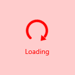
The BusyIndicator allows you to change the text and shape colors if its indicator.
To change the brush color of the animated indicator shape, define a Brush element in the Resources of RadBusyIndicator with an x:Key set to TelerikBusyIndicator_IndicatorBackground.
To change the brush color of the background behind the indicator, define a Brush element in the Resources of RadBusyIndicator with an x:Key set to TelerikBusyIndicator_OverlayBackground.
To change the color of the text, define with the Content property of the control and set the Foreground property of RadBusyIndicator.
Set custom colors
<primitives:RadBusyIndicator IsActive="True" Foreground="Red">
    <primitives:RadBusyIndicator.Resources>
        <SolidColorBrush x:Key="TelerikBusyIndicator_IndicatorBackground" Color="Red" />
        <SolidColorBrush x:Key="TelerikBusyIndicator_OverlayBackground" Color="#33FF0000" />
    </primitives:RadBusyIndicator.Resources>
</primitives:RadBusyIndicator>