Animations
The BusyIndicator comes with a set of predefined animations and also enables you to create custom ones.
Predefined Animations
To change the default animation of the BusyIndicator, set its AnimationStyle property. The primitives namespace in the following example points to xmlns:primitives="using:Telerik.UI.Xaml.Controls.Primitives".
Set the AnimationStyle
<primitives:RadBusyIndicator IsActive="True" AnimationStyle="AnimationStyle1"/>
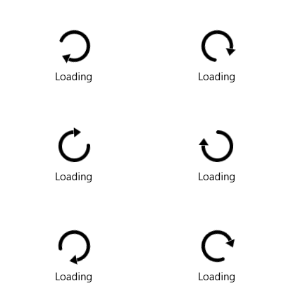
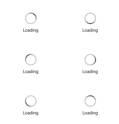
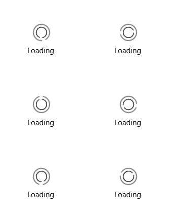
The AnimationStyle property is of type enum with the same name and provides the following values:
-
(Default)
AnimationStyle1
-
AnimationStyle2
-
AnimationStyle3
-
AnimationStyle4
-
AnimationStyle5
-
AnimationStyle6
-
AnimationStyle7
-
AnimationStyle8
-
AnimationStyle9
Custom Animations
To implement a custom animation:
Ceate a custom
ControlTemplatefor theBusyIndicatorAnimationcontrol.In the
ControlTemplate, define whatever elements and animations you need.Use the
IndicatorAnimationStyleproperty of theRadBusyIndicatorto apply the customized template.
To ensure that the customized ControlTemplate won't break the internal logic of the BusyIndicatorAnimation control, you will need to preserve the elements from the default template with "PART_" in their x:Name settings. Based on this statement, you have to set the x:Name of the root element in the template to PART_LayoutRoot. Make sure that the Resources of the panel contain a Storyboard with an x:Name set to PART_Animation.
The following example shows how to create a custom animation using a customized template.
Create a custom animation
<primitives:RadBusyIndicator IsActive="True" x:Name="indicator">
    <primitives:RadBusyIndicator.IndicatorAnimationStyle>
        <Style TargetType="indicator:BusyIndicatorAnimation">
            <Setter Property="Template">
                <Setter.Value>
                    <ControlTemplate>
                        <Grid VerticalAlignment="Center" x:Name="PART_LayoutRoot">
                            <Grid.Resources>
                                <Storyboard x:Name="PART_Animation">
                                    <DoubleAnimation From="0" To="359" Duration="0:0:1" RepeatBehavior="Forever" Storyboard.TargetName="LoadingVisualAngleTransform" Storyboard.TargetProperty="Angle" />
                                </Storyboard>
                            </Grid.Resources>
                            <Grid.RowDefinitions>
                                <RowDefinition />
                            </Grid.RowDefinitions>
                            <Grid Width="45" Height="45" Grid.Row="0" x:Name="LoadingVisual" RenderTransformOrigin="0.5,0.5" HorizontalAlignment="Center">
                                <Grid.RenderTransform>
                                    <TransformGroup>
                                        <RotateTransform x:Name="LoadingVisualAngleTransform" Angle="0" CenterX="0.5" CenterY="0.5" />
                                    </TransformGroup>
                                </Grid.RenderTransform>
                                <Path Stretch="Fill" Stroke="Red" StrokeThickness="5" StrokeStartLineCap="Round" Data="M1,0 A1,1,90,1,1,0,-1" />
                                <Path Margin="0,-5,0,0" HorizontalAlignment="Center" VerticalAlignment="Top" Width="10" Height="15" Stretch="Fill" Fill="#00BDD2" Data="M0,-1.1 L0.1,-1 L0,-0.9" StrokeThickness="1" />
                            </Grid>
                        </Grid>
                    </ControlTemplate>
                </Setter.Value>
            </Setter>
        </Style>
    </primitives:RadBusyIndicator.IndicatorAnimationStyle>
</primitives:RadBusyIndicator>
indicator namespace points to xmlns:indicators="using:Telerik.UI.Xaml.Controls.Primitives.BusyIndicator".
The following image shows the result.
