Month View
Overview
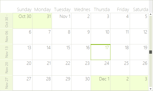
The Month view shows one month at a time, or a preset number of weeks. To move to the next day or previous month, you can use the back and forward keyboard arrows, or the SchedulerNavigator control.
Structure of Month View
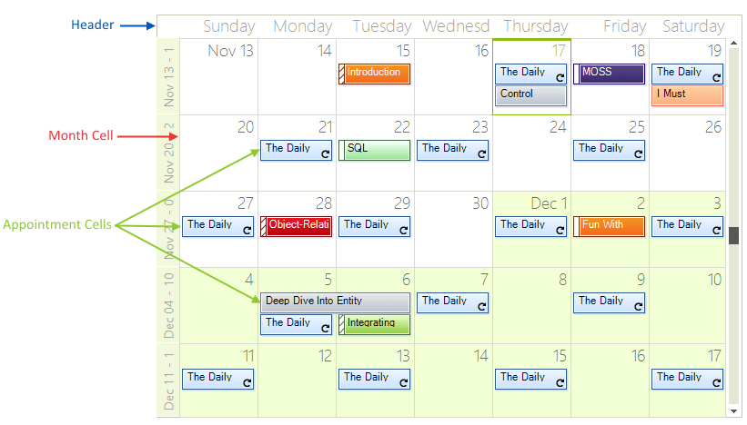
The Month View of the scheduler simply has a Header, Month Cells for every day in the month and zero or more Appointment Cells in each month cell.
Figure 1: Month View
Set the Month View
The Week View can be set it to be the default view which the user sees:
ActiveViewType Property
this.radScheduler1.ActiveViewType = Telerik.WinControls.UI.SchedulerViewType.Month;
Me.RadScheduler1.ActiveViewType = Telerik.WinControls.UI.SchedulerViewType.Month
Get Month View
To get the instance to the SchedulerMonthView from the RadScheduler object:
- use the GetMonthView method:
GetMonthView Method
SchedulerMonthView monthView = this.radScheduler1.GetMonthView();
Dim monthView As SchedulerMonthView = Me.RadScheduler1.GetMonthView()
Showing/Hiding The Weekend
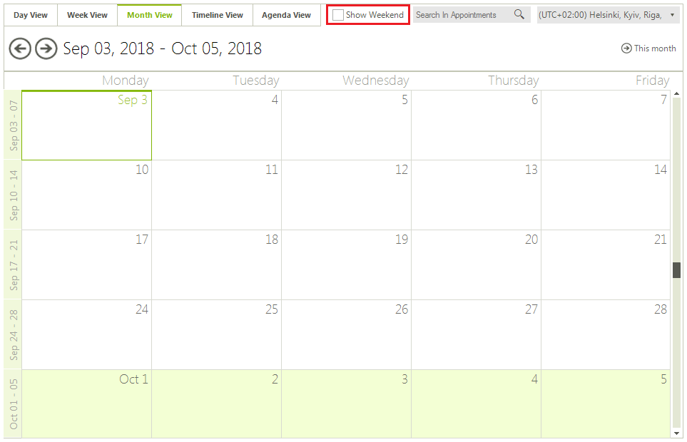
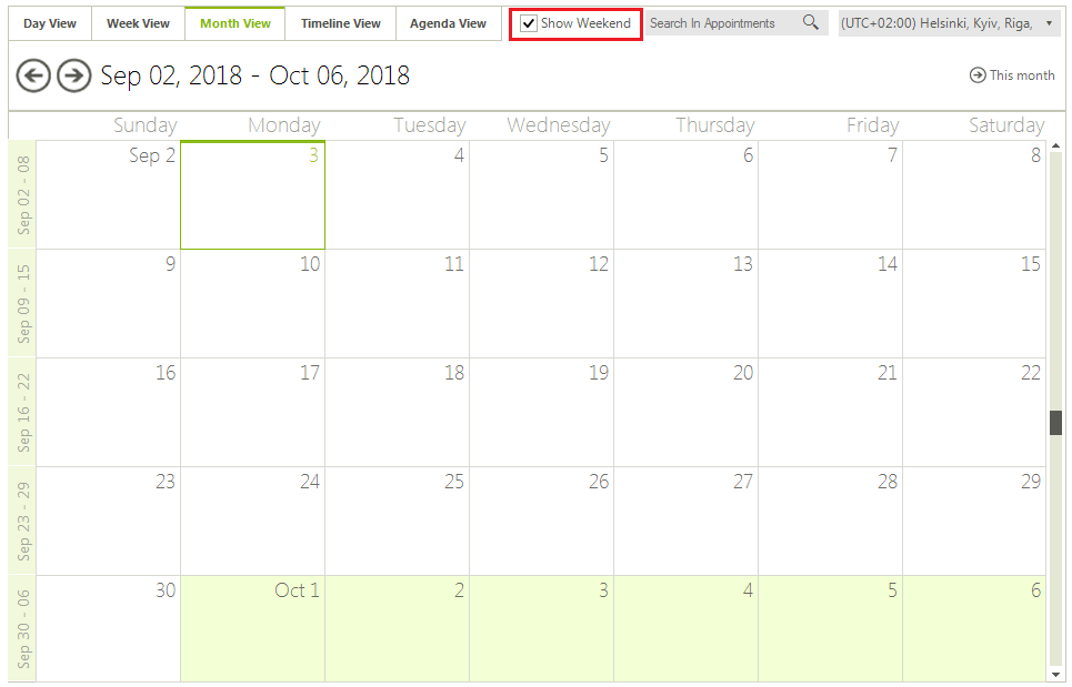
By default the weekends are shown, but you can hide them by using the ShowWeekend property:
Show Weekend
monthView.ShowWeekend = true;
monthView.ShowWeekend = False
You can also specify which days to be considered weekends. The WorkWeekStart and WorkWeekEnd properties allow you to achieve this:
Set Work Week Start
monthView.WorkWeekStart = DayOfWeek.Tuesday;
monthView.WorkWeekEnd = DayOfWeek.Thursday;
monthView.WorkWeekStart = DayOfWeek.Tuesday
monthView.WorkWeekEnd = DayOfWeek.Thursday
Change The Start/End Work Days
The work days determine the start and end days for the work week. All days outside the work days range are part of the weekend.
Start/End Work Days
monthView.WorkWeekStart = DayOfWeek.Wednesday;
monthView.WorkWeekEnd = DayOfWeek.Saturday;
monthView.WorkWeekStart = DayOfWeek.Wednesday
monthView.WorkWeekEnd = DayOfWeek.Saturday
Figure 2: Shown Weekends
Setting The Number Of Weeks
By default the Month view shows 3 weeks at a time, but this can be changed by using the WeekCount property (the minimum value is 1 week):
Set Number of Weeks
monthView.WeekCount = 5;
monthView.WeekCount = 5
Getting The Week Days Displayed
Get Week Days
int weekDaysCount = monthView.WeekDaysCount;
Dim weekDaysCount As Integer = monthView.WeekDaysCount
Showing Full Month
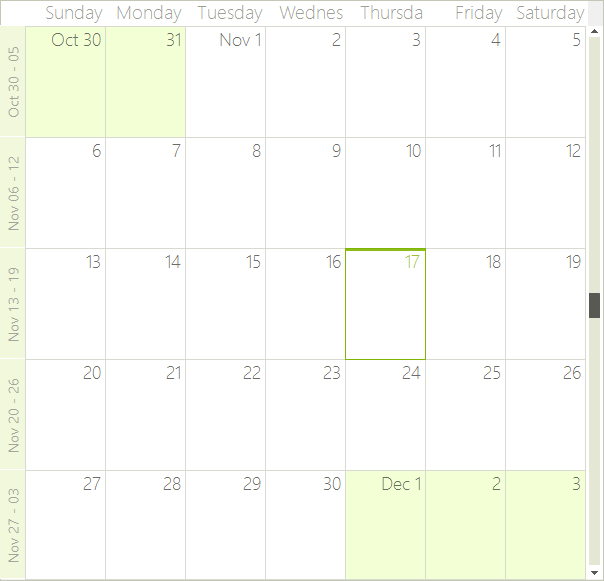
It is possible to indicate whether the month view should always display exactly one month with the respective number of weeks.
Full Month
monthView.ShowFullMonth = true;
monthView.ShowFullMonth = True
Figure 3: Show Full Month
Showing/Hiding The Vertical Navigator
Hiding The Vertical Indicator
monthView.ShowVerticalNavigator = false;
monthView.ShowVerticalNavigator = False
Setting The Vertical Navigator Range
Navigator Range
monthView.RangeStartDate = new DateTime(2016, 6, 10);
monthView.RangeEndDate = new DateTime(2016, 7, 20);
monthView.RangeStartDate = New DateTime(2016, 6, 10)
monthView.RangeEndDate = New DateTime(2016, 7, 20)
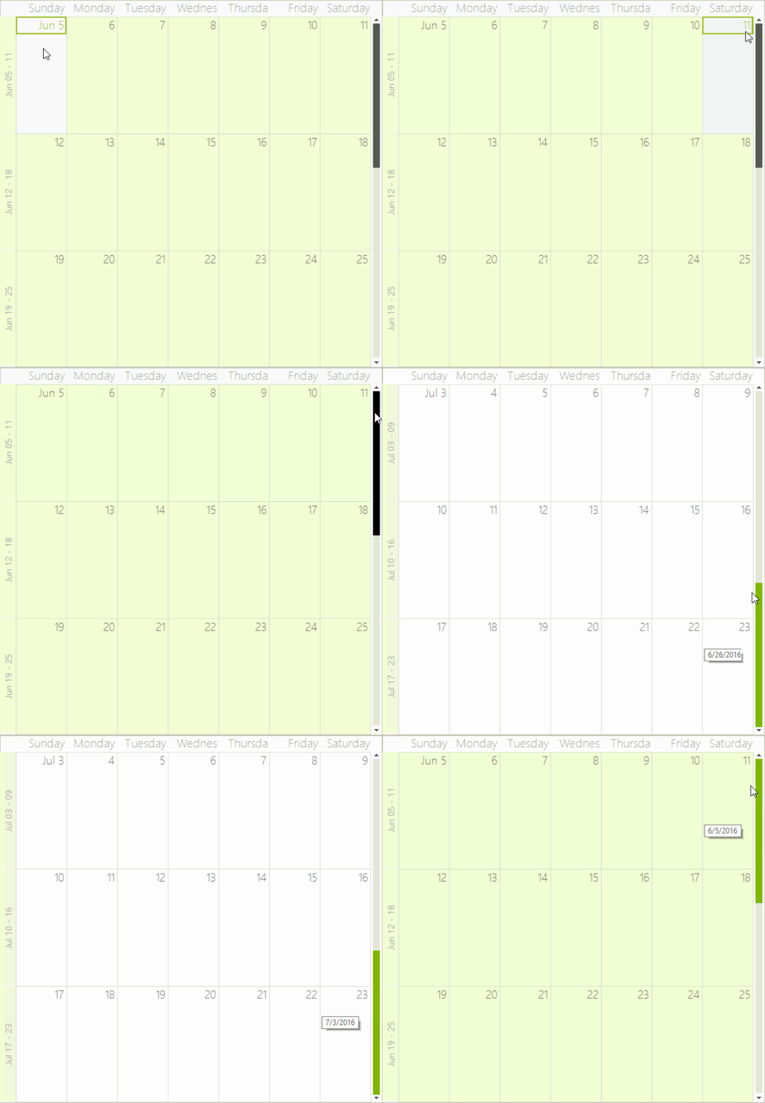
Figure 4: Navigator Range
Showing And Hiding The Week (Row) Headers
The week (row) headers display the date range presented by the respective row. By clicking on them, the user can navigate to WeekView with the specified range. Showing/hiding the week (row) headers is done through the ShowWeeksHeader property (the default setting is True). To allow or disallow navigating to WeekView on click, you can set the EnableWeeksHeader property (which also defaults to True)
Showing Weeks Headers
monthView.ShowWeeksHeader = true;
monthView.EnableWeeksHeader = false;
monthView.ShowWeeksHeader = True
monthView.EnableWeeksHeader = True
Customizing The Week (Row) Header Format
RadScheduler uses the .NET Standard DateTime Format Strings, which can be set through the HeaderFormat property (either in design time or through code). The default value is "MMMM dd":
Setting A Header Format
radScheduler1.HeaderFormat = "MMMM dd";
RadScheduler1.HeaderFormat = "MMMM dd"
Showing An Exact Month
You can set the ShowFullMonth property to force the SchedulerMonthView to always display exactly one month no matter how many weeks it contains. When this property is enabled, the view will always navigate to the beginning of the previous/next month and the WeekCount will automatically be updated according to the number of weeks in the target month.
Full Month
monthView.ShowFullMonth = true;
monthView.ShowFullMonth = True
Vertical Scrolling
The vertical scrollbar in MonthView allows for quick navigation in large date ranges. To show or hide the vertical scrollbar you can use the ShowVerticalNavigator property. When the vertical scrollbar is displayed it can navigate through the date range defined by the RangeStartDate and RangeEndDate properties. These properties do not limit keyboard navigation outside this range but only stand for specifying the range of the vertical scrollbar.
Verical Scrolling Range
monthView.ShowVerticalNavigator = true;
monthView.RangeStartDate = DateTime.Today.AddYears(-1);
monthView.RangeEndDate = DateTime.Today.AddYears(1);
monthView.ShowVerticalNavigator = True
monthView.RangeStartDate = DateTime.Today.AddYears(-1)
monthView.RangeEndDate = DateTime.Today.AddYears(1)
Handling Overflown Cells
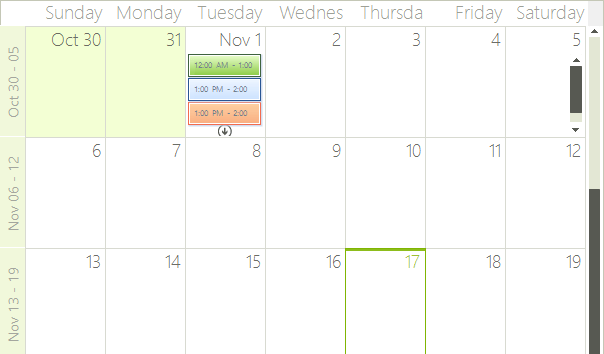
RadScheduler handles the overflown cells in month view in two ways. The first one is by displaying a cell overflow button at the bottom of each cell that has more appointments than it can display. Clicking on this button opens a DayView set to the same date the cell represents. This way the user can scroll through and preview all appointments. The second way to handle overflown cells is by displaying a scrollbar at the end of each row if this row contains overflown cells. Using the scrollbar the end user can scroll directly through the appointments. Both of these features can be disabled or enabled using the following properties:
Appointments Scrolling
monthView.EnableCellOverflowButton = true;
monthView.EnableAppointmentsScrolling = true;
monthView.EnableCellOverflowButton = True
monthView.EnableAppointmentsScrolling = True
Figure 5: Appointments Scrolling
Modifying The Size Of Rows And Columns In MonthView
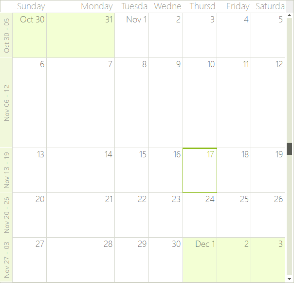
The SchedulerMonthViewElement allows you to specify different size for the different columns. To manipulate the size of the columns, you can use the SetColumnWidth, GetColumnWidth, SetRowHeight, GetRowHeight methods. The values passed to the SetColumnWidth and SetRowHeight methods are proportional and the actual width of the columns is calculated based on them. By default all columns have a value of 1 and therefore if you set a value of 2 to any column, it will stay twice as bigger compared to the others.
Setting Row Height
SchedulerMonthViewElement monthViewElement = (SchedulerMonthViewElement)this.radScheduler1.ViewElement;
monthViewElement.SetRowHeight(1, 2);
monthViewElement.SetColumnWidth(1, 2);
Dim monthViewElement As SchedulerMonthViewElement = DirectCast(Me.RadScheduler1.ViewElement, SchedulerMonthViewElement)
monthViewElement.SetRowHeight(1, 2)
monthViewElement.SetColumnWidth(1, 2)
Figure 6: Row Height
Modifying The Size Of The Headers In MonthView
The month view of RadScheduler contains two headers – the horizontal MonthViewHeader, which displays the weekdays on top of the columns, and the vertical MonthViewVerticalHeader, which displays the date ranges for each row. You can modify the size of these headers by accessing the respective element and its properties:
Headers Size
monthViewElement.VerticalHeader.HeaderWidth = 50;
monthViewElement.Header.HeaderHeight = 50;
monthViewElement.VerticalHeader.HeaderWidth = 50
monthViewElement.Header.HeaderHeight = 50
Figure 7: Headers Size
