Working With Panels
RadPictureBox offers a set of predefind panels TopPanel, BottomPanel, LeftPanel, and RightPanel that allows adding different elements to its item's collections in order to achieve a better user experience.
TopPanel and BottomPanel have RightItems, CenterItems, and LeftItems collections.
LeftPanel and RightPanel have TopItems, BottomItems, and CenterItems collectios.
Adding Buttons to Panels
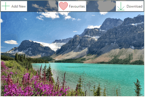
RadButtonElement button = new RadButtonElement("Add New");
button.SvgImage = RadSvgImage.FromFile(@"..//..//PictureBox//symbol-add.svg");
button.TextImageRelation = TextImageRelation.ImageBeforeText;
this.radPictureBox1.TopPanel.LeftItems.Add(button);

button = new RadButtonElement("Download");
button.SvgImage = RadSvgImage.FromFile(@"..//..//PictureBox//symbol-download.svg");
button.TextImageRelation = TextImageRelation.ImageBeforeText;
this.radPictureBox1.TopPanel.RightItems.Add(button);

button = new RadButtonElement("Favourites");
button.SvgImage = RadSvgImage.FromFile(@"..//..//PictureBox//heart-filled.svg");
button.TextImageRelation = TextImageRelation.ImageBeforeText;
this.radPictureBox1.TopPanel.CenterItems.Add(button);
Dim button As RadButtonElement = New RadButtonElement("Add New")
button.SvgImage = RadSvgImage.FromFile("..//..//PictureBox//symbol-add.svg")
button.TextImageRelation = TextImageRelation.ImageBeforeText
Me.RadPictureBox1.TopPanel.LeftItems.Add(button)

button = New RadButtonElement("Download")
button.SvgImage = RadSvgImage.FromFile("..//..//PictureBox//symbol-download.svg")
button.TextImageRelation = TextImageRelation.ImageBeforeText
Me.RadPictureBox1.TopPanel.RightItems.Add(button)

button = New RadButtonElement("Favourites")
button.SvgImage = RadSvgImage.FromFile("..//..//PictureBox//heart-filled.svg")
button.TextImageRelation = TextImageRelation.ImageBeforeText
Me.RadPictureBox1.TopPanel.CenterItems.Add(button)
Panel Display Mode
PictureBoxPanelDisplayMode enumeration defines three ways of displaying the panels:
- Always: The panels will be displayed always.
- OnMouseHover: The panels will be displayed only when the mouse is over the picture box. When the mouse moves out of the control the panels will auto hide.
- None: The panels will not be displayed. Suitable to manually manage when the panels will be displayed.
The display mode can be changed through PanelDisplayMode property.
Setting PanelDisplayMode to be always visible
this.radPictureBox1.PanelDisplayMode = PictureBoxPanelDisplayMode.Always;
Me.RadPictureBox1.PanelDisplayMode = PictureBoxPanelDisplayMode.Always
When PanelDisplayMode is set to OnMouseHover, the AllowPanelAnimations property indicates whether to show animations when showing and hiding panels.
Panel Overflow Mode
If you have horizontal as well as vertical panel displayed in RadPictureBox you can define which one to overflow. This can be done by setting the PanelOverflowMode property to PictureBoxPanelOverflowMode.HorizontalOverVertical or PictureBoxPanelOverflowMode.VerticalOverHorizontal.
Setting PanelOverflowMode
this.radPictureBox1.PanelOverflowMode = PictureBoxPanelOverflowMode.HorizontalOverVertical;
Me.RadPictureBox1.PanelOverflowMode = PictureBoxPanelOverflowMode.HorizontalOverVertical