Custom items
RadListView allows you to create and use your own custom visual items. This article demonstrates how to achieve it.
Custom items in ListView ViewType
This can be done by making use of the VisualItemCreating event. The following example demonstrates creating a visual item with two buttons in it.
Figure 1: Custom SimpleListViewVisualItem
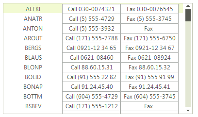
First let's create a custom visual item by inheriting from the SimpleListViewVisualItem class:
Creating custom item
public class MyCustomVisualItem : SimpleListViewVisualItem
{
    private RadButtonElement buttonElement1;
    private RadButtonElement buttonElement2;
    private LightVisualElement contentElement;
    private StackLayoutPanel stackLayout;

    protected override void CreateChildElements()
    {
        base.CreateChildElements();

        this.stackLayout = new StackLayoutPanel();
        this.stackLayout.Orientation = Orientation.Horizontal;
        this.stackLayout.EqualChildrenWidth = true;
        this.stackLayout.ShouldHandleMouseInput = false;
        this.stackLayout.NotifyParentOnMouseInput = true;

        this.contentElement = new LightVisualElement();
        this.contentElement.StretchHorizontally = true;
        this.contentElement.MinSize = new Size(120, 0);
        this.contentElement.ShouldHandleMouseInput = false;
        this.contentElement.NotifyParentOnMouseInput = true;
        this.stackLayout.Children.Add(this.contentElement);

        this.buttonElement1 = new RadButtonElement();
        this.buttonElement1.Text = "Button1";
        this.stackLayout.Children.Add(this.buttonElement1);

        this.buttonElement2 = new RadButtonElement();
        this.buttonElement2.Text = "Button2";
        this.stackLayout.Children.Add(this.buttonElement2);

        this.Children.Add(this.stackLayout);
    }

    protected override void SynchronizeProperties()
    {
        base.SynchronizeProperties();

        this.Text = "";
        this.contentElement.Text = Convert.ToString(this.Data["Name"]);
        this.buttonElement1.Text = "Call " + Convert.ToString(this.Data["Phone"]);
        this.buttonElement2.Text = "Fax " + Convert.ToString(this.Data["Fax"]);
    }

    protected override Type ThemeEffectiveType
    {
        get
        {
            return typeof(SimpleListViewVisualItem);
        }
    }
}
Public Class MyCustomVisualItem
Inherits SimpleListViewVisualItem
    Private buttonElement1 As RadButtonElement
    Private buttonElement2 As RadButtonElement
    Private contentElement As LightVisualElement
    Private stackLayout As StackLayoutPanel
    Protected Overrides Sub CreateChildElements()
        MyBase.CreateChildElements()
        Me.stackLayout = New StackLayoutPanel()
        Me.stackLayout.Orientation = Orientation.Horizontal
        Me.stackLayout.EqualChildrenWidth = True
        Me.stackLayout.ShouldHandleMouseInput = False
        Me.stackLayout.NotifyParentOnMouseInput = True
        Me.contentElement = New LightVisualElement()
        Me.contentElement.StretchHorizontally = True
        Me.contentElement.MinSize = New Size(120, 0)
        Me.contentElement.ShouldHandleMouseInput = False
        Me.contentElement.NotifyParentOnMouseInput = True
        Me.stackLayout.Children.Add(Me.contentElement)
        Me.buttonElement1 = New RadButtonElement()
        Me.buttonElement1.Text = "Button1"
        Me.stackLayout.Children.Add(Me.buttonElement1)
        Me.buttonElement2 = New RadButtonElement()
        Me.buttonElement2.Text = "Button2"
        Me.stackLayout.Children.Add(Me.buttonElement2)
        Me.Children.Add(Me.stackLayout)
    End Sub
    Protected Overrides Sub SynchronizeProperties()
        MyBase.SynchronizeProperties()
        Me.Text = ""
        Me.contentElement.Text = Convert.ToString(Me.Data("Name"))
        Me.buttonElement1.Text = "Call " + Convert.ToString(Me.Data("Phone"))
        Me.buttonElement2.Text = "Fax " + Convert.ToString(Me.Data("Fax"))
    End Sub
    Protected Overrides ReadOnly Property ThemeEffectiveType() As Type
        Get
            Return GetType(SimpleListViewVisualItem)
        End Get
    End Property
End Class
To use the newly created items, you should handle the VisualItemCreating event as shown below:
Use the Custom Item
void radListView1_VisualItemCreating(object sender, ListViewVisualItemCreatingEventArgs e)
{
    if (this.radListView1.ViewType == ListViewType.ListView)
    {
        e.VisualItem = new MyCustomVisualItem();
    }
}
Private Sub radListView1_VisualItemCreating(ByVal sender As Object, ByVal e As ListViewVisualItemCreatingEventArgs)
    If Me.RadListView1.ViewType = ListViewType.ListView Then
        e.VisualItem = New MyCustomVisualItem()
    End If
End Sub
Custom items in IconsView ViewType
Figure 2: Custom IconListViewVisualItem
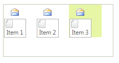
We should create a custom visual item inheriting the IconListViewVisualItem. The following example demonstrates how to add custom elements to the IconListViewVisualItem.Children collection:
Creating custom item
public class MyCustomIconListViewVisualItem :IconListViewVisualItem
{
    protected override Type ThemeEffectiveType
    {
        get
        {
            return typeof(IconListViewVisualItem);
        }
    }

    LightVisualElement imageElement = new LightVisualElement();
    RadButtonElement buttonElement = new RadButtonElement();
    StackLayoutElement stack = new StackLayoutElement();

    protected override void CreateChildElements()
    {
        base.CreateChildElements();

        stack.Orientation = Orientation.Vertical;
        imageElement.Image = Image.FromFile(@"..\..\Resources\email.png");
        buttonElement.Image = Image.FromFile(@"..\..\Resources\file.png");
        buttonElement.TextImageRelation = System.Windows.Forms.TextImageRelation.ImageAboveText;

        stack.Children.Add(imageElement);
        stack.Children.Add(buttonElement);
        this.Children.Add(stack);
    }

    protected override void SynchronizeProperties()
    {
        base.SynchronizeProperties();
        this.Text = string.Empty;
        this.buttonElement.Text = this.Data.Text;
    }
}
Public Class MyCustomIconListViewVisualItem
Inherits IconListViewVisualItem
    Protected Overrides ReadOnly Property ThemeEffectiveType() As Type
        Get
            Return GetType(IconListViewVisualItem)
        End Get
    End Property
    Private imageElement As LightVisualElement
    Private buttonElement As RadButtonElement
    Private stack As StackLayoutElement
    Protected Overrides Sub CreateChildElements()
        MyBase.CreateChildElements()
        stack = New StackLayoutElement()
        imageElement = New LightVisualElement()
        buttonElement = New RadButtonElement()
        stack.Orientation = Orientation.Vertical
        imageElement.Image = Image.FromFile("..\..\Resources\email.png")
        buttonElement.Image = Image.FromFile("..\..\Resources\file.png")
        buttonElement.TextImageRelation = System.Windows.Forms.TextImageRelation.ImageAboveText
        stack.Children.Add(imageElement)
        stack.Children.Add(buttonElement)
        Me.Children.Add(stack)
    End Sub
    Protected Overrides Sub SynchronizeProperties()
        MyBase.SynchronizeProperties()
        Me.Text = String.Empty
        Me.buttonElement.Text = Me.Data.Text
    End Sub
End Class
To use the newly created item, you should subscribe to the VisualItemCreating event and replace the default item with your custom one:
void VisualItemCreating(object sender, ListViewVisualItemCreatingEventArgs e)
{
    if (this.radListView1.ViewType == ListViewType.IconsView)
    {
        e.VisualItem = new MyCustomIconListViewVisualItem();
    }
}
Private Sub VisualItemCreating(sender As Object, e As ListViewVisualItemCreatingEventArgs)
    If Me.RadListView1.ViewType = ListViewType.IconsView Then
        e.VisualItem = New MyCustomIconListViewVisualItem()
    End If
End Sub
Custom Items in DetailsView ViewType
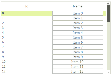
Since the DetailsView provides a grid-like interface, it displays a cell for each data field. In order to create custom cells you need to subscribe to the CellCreating event and replace the default DetailListViewDataCellElement with your own cell implementation.
Figure 3: Custom DetailListViewDataCellElement
First let's populate RadListView with items and set its ViewType property to DetailsView:
radListView1.ViewType = ListViewType.DetailsView;
DataTable dt = new DataTable();
dt.Columns.Add("Id", typeof(int));
dt.Columns.Add("Name", typeof(string));
for (int i = 0; i < 50; i++)
{
    dt.Rows.Add(i, "Item " + i);
}
this.radListView1.DataSource = dt;
RadListView1.ViewType = ListViewType.DetailsView
Dim dt As New DataTable()
dt.Columns.Add("Id", GetType(Integer))
dt.Columns.Add("Name", GetType(String))
For i As Integer = 0 To 49
    dt.Rows.Add(i, "Item " & i.ToString())
Next
Me.RadListView1.DataSource = dt
Now let`s create our custom cell element containing a RadButtonElement. Additionally, we should inherit the DetailListViewDataCellElement class:
public class CustomDetailListViewDataCellElement : DetailListViewDataCellElement
{
    private RadButtonElement button;

    public CustomDetailListViewDataCellElement(DetailListViewVisualItem owner,
        ListViewDetailColumn column) : base(owner, column)
    {
    }

    protected override void CreateChildElements()
    {
        base.CreateChildElements();

        this.button = new RadButtonElement();
        this.Children.Add(this.button);
    }

    protected override Type ThemeEffectiveType
    {
        get
        {
            return typeof(DetailListViewHeaderCellElement);
        }
    }

    public override void Synchronize()
    {
        base.Synchronize();
        this.Text = "";
        DataRowView rowView = this.Row.DataBoundItem as DataRowView;
        this.button.Text = rowView.Row["Name"].ToString();
    }

    public override bool IsCompatible(ListViewDetailColumn data, object context)
    {
        if (data.Name != "Name")
        {
            return false;
        }
        return base.IsCompatible(data, context);
    }
}
Public Class CustomDetailListViewDataCellElement
Inherits DetailListViewDataCellElement
    Private button As RadButtonElement
    Public Sub New(owner As DetailListViewVisualItem, column As ListViewDetailColumn)
        MyBase.New(owner, column)
    End Sub
    Protected Overrides Sub CreateChildElements()
        MyBase.CreateChildElements()
        Me.button = New RadButtonElement()
        Me.Children.Add(Me.button)
    End Sub
    Protected Overrides ReadOnly Property ThemeEffectiveType() As Type
        Get
            Return GetType(DetailListViewHeaderCellElement)
        End Get
    End Property
    Public Overrides Sub Synchronize()
        MyBase.Synchronize()
        Me.Text = ""
        Dim rowView As DataRowView = TryCast(Me.Row.DataBoundItem, DataRowView)
        Me.button.Text = rowView.Row("Name").ToString()
    End Sub
    Public Overrides Function IsCompatible(data As ListViewDetailColumn, context As Object) As Boolean
        If data.Name <> "Name" Then
            Return False
        End If
        Return MyBase.IsCompatible(data, context)
    End Function
End Class
Due to the virtualization mechanism of the RadListView control, the default cell of the control is compatible with all columns. When the control is scrolled, the default cell could override the custom one. To apply the custom cell when the control is scrolled is necessary to create another DetailListViewDataCellElement which is not compatible with your custom item.
public class DefaultCell : DetailListViewDataCellElement
{
    public DefaultCell(DetailListViewVisualItem owner, ListViewDetailColumn column) : base(owner, column)
    {
    }
    protected override Type ThemeEffectiveType
    {
        get
        {
            return typeof(DetailListViewHeaderCellElement);
        }
    }
    public override bool IsCompatible(ListViewDetailColumn data, object context)
    {
        if (data.Name != "Name")
        {
            return true;
        }
        return false;
    }
}
Public Class DefaultCell
    Inherits DetailListViewDataCellElement

    Public Sub New(ByVal owner As DetailListViewVisualItem, ByVal column As ListViewDetailColumn)
        MyBase.New(owner, column)
    End Sub

    Protected Overrides ReadOnly Property ThemeEffectiveType As Type
        Get
            Return GetType(DetailListViewHeaderCellElement)
        End Get
    End Property

    Public Overrides Function IsCompatible(ByVal data As ListViewDetailColumn, ByVal context As Object) As Boolean
        If data.Name <> "Name" Then
            Return True
        End If

        Return False
    End Function
End Class
Finally, we should handle the CellCreating event and substitute the default cell element with our own or return the default cell for the other columns:
private void radListView1_CellCreating(object sender, ListViewCellElementCreatingEventArgs e)
{
    DetailListViewDataCellElement cell = e.CellElement as DetailListViewDataCellElement;
    if (cell != null && cell.Data.Name == "Name")
    {
        e.CellElement = new CustomDetailListViewDataCellElement(cell.RowElement, e.CellElement.Data);
    }
    else if (cell != null && cell.Data.Name != "Name")
    {
        e.CellElement = new DefaultCell(cell.RowElement, e.CellElement.Data);
    }
}
Private Sub radListView1_CellCreating(ByVal sender As Object, ByVal e As ListViewCellElementCreatingEventArgs)
    Dim cell As DetailListViewDataCellElement = TryCast(e.CellElement, DetailListViewDataCellElement)

    If cell IsNot Nothing AndAlso cell.Data.Name = "Name" Then
        e.CellElement = New CustomDetailListViewDataCellElement(cell.RowElement, e.CellElement.Data)
    ElseIf cell IsNot Nothing AndAlso cell.Data.Name <> "Name" Then
        e.CellElement = New DefaultCell(cell.RowElement, e.CellElement.Data)
    End If
End Sub