DropDown Resizing
DropDownSizingMode
RadDropDownList supports different sizing modes, based on the DropDownSizingMode property of the control.
The SizingMode enumeration has the following members:
- None: no sizing is allowed.
Figure 1: SizingMode.None

SizingMode.None
this.radDropDownList1.DropDownSizingMode = SizingMode.None;
Me.radDropDownList1.DropDownSizingMode = SizingMode.None
- RightBottom: allows sizing in horizontal direction.
Figure 2: SizingMode.RightBottom

SizingMode.RightBottom
this.radDropDownList1.DropDownSizingMode = SizingMode.RightBottom;
Me.radDropDownList1.DropDownSizingMode = SizingMode.RightBottom
- UpDown: allows sizing in vertical direction.
Figure 3: SizingMode.UpDown

SizingMode.UpDown
this.radDropDownList1.DropDownSizingMode = SizingMode.UpDown;
Me.radDropDownList1.DropDownSizingMode = SizingMode.UpDown
- UpDownAndRightBottom: allows sizing in both directions.
Figure 4: SizingMode.UpDownAndRightBottom

SizingMode.UpDownAndRightBottom
this.radDropDownList1.DropDownSizingMode = SizingMode.UpDownAndRightBottom;
Me.radDropDownList1.DropDownSizingMode = SizingMode.UpDownAndRightBottom
Fixed size
You can specify a fixed height or width of the drop-down by setting the DropDownHeight and DropDownWidth properties.
Figure 5: DropDownHeight

DropDownHeight
this.radDropDownList1.DropDownListElement.DropDownHeight = 400;
Me.radDropDownList1.DropDownListElement.DropDownHeight = 400
Figure 6: DropDownWidth

DropDownWidth
this.radDropDownList1.DropDownListElement.DropDownWidth = 400;
Me.radDropDownList1.DropDownListElement.DropDownWidth = 400
You can set the DropDownMinSize property in order to specify the exact minimum height and width for the drop-down.
Figure 7: DropDownMinSize

DropDownMinSize
this.radDropDownList1.DropDownMinSize = new Size(400, 400);
Me.radDropDownList1.DropDownMinSize = New Size(400, 400)
Auto size
The following example demonstrates a sample approach how to handle the RadDropDownList.PopupOpening event and achieve auto size functionality for the pop up in RadDropDownList:
Auto size drop down
private void RadDropDownList1_PopupOpening(object sender, CancelEventArgs e)
{
    RadDropDownListElement list = sender as RadDropDownListElement;
    float width = 0;
    for (int x = 0; x < list.Items.Count(); x++)
    {
        width = Math.Max(width, TextRenderer.MeasureText(list.Items[x].Text, list.Font).Width);
    }
    if (list.Items.Count * (list.ItemHeight-1) > list.DropDownHeight)
    {
        width += list.ListElement.VScrollBar.Size.Width;
    }
    list.Popup.Width = (int)width;
}
Private Sub RadDropDownList1_PopupOpening(sender As Object, e As CancelEventArgs)
    Dim list As RadDropDownListElement = TryCast(sender, RadDropDownListElement)
    Dim width As Single = 0
    For x As Integer = 0 To list.Items.Count() - 1
        width = Math.Max(width, TextRenderer.MeasureText(list.Items(x).Text, list.Font).Width)
    Next
    If list.Items.Count * (list.ItemHeight - 1) > list.DropDownHeight Then
        width += list.ListElement.VScrollBar.Size.Width
    End If
    list.Popup.Width = CInt(width)
End Sub
'#End Region
'#Region "FilteringPredicate"
Private Function FilterItem(item As RadListDataItem) As Boolean
    If item.Text.StartsWith("L") Then
        Return True
    End If

    Return False
End Function
| Default pop up size | Auto sized popup |
|---|---|
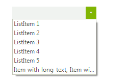 |
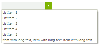 |
Displayed items
By default, RadDropDownList displays 6 items in the pop-up. In case you need to change this number you can set the DefaultItemsCountInDropDown property:
Figure 8: DefaultItemsCountInDropDown

DefaultItemsCountInDropDown
this.radDropDownList1.DropDownListElement.DefaultItemsCountInDropDown = 3;
Me.radDropDownList1.DropDownListElement.DefaultItemsCountInDropDown = 3