.NET MAUI Wrap Functionality for WrapLayout control
The WrapLayout is a layout container that lets you position items in rows or columns based on the Orientation property. When the space is filled, the container automatically wraps items onto a new row or column.
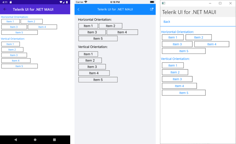
Orientation
The WrapLayout exposes the Orientation property, which specifies whether the child items will be wrapped in rows (horizontal orientation) or in columns (vertical orientation). By default, the WrapLayout wraps its items horizontally.
The following example demonstrates how to set both the "Horizontal" and "Vertical" orientation:
<VerticalStackLayout VerticalOptions="StartAndExpand" Margin="0,0,0,5">
    <Label Text="Horizontal Orientation:"/>
    <telerik:RadWrapLayout Orientation="Horizontal">
        <telerik:RadBorder Style="{StaticResource DefaultBorderStyle}" WidthRequest="100">
            <Label Text="Item 1" HorizontalOptions="Center" Margin="2"/>
        </telerik:RadBorder>
        <telerik:RadBorder Style="{StaticResource DefaultBorderStyle}" WidthRequest="120">
            <Label Text="Item 2" Style="{StaticResource DefaultLabelStyle}"/>
        </telerik:RadBorder>
        <telerik:RadBorder Style="{StaticResource DefaultBorderStyle}" WidthRequest="140">
            <Label Text="Item 3" Style="{StaticResource DefaultLabelStyle}"/>
        </telerik:RadBorder>
        <telerik:RadBorder Style="{StaticResource DefaultBorderStyle}" WidthRequest="160">
            <Label Text="Item 4" Style="{StaticResource DefaultLabelStyle}"/>
        </telerik:RadBorder>
        <telerik:RadBorder Style="{StaticResource DefaultBorderStyle}" WidthRequest="200">
            <Label Text="Item 5" Style="{StaticResource DefaultLabelStyle}"/>
        </telerik:RadBorder>
    </telerik:RadWrapLayout>

    <Label Text="Vertical Orientation:" Margin="0,10,0,5"/>
    <telerik:RadWrapLayout Orientation="Vertical">
        <telerik:RadBorder Style="{StaticResource DefaultBorderStyle}" WidthRequest="100">
            <Label Text="Item 1" HorizontalOptions="Center" Margin="2"/>
        </telerik:RadBorder>
        <telerik:RadBorder Style="{StaticResource DefaultBorderStyle}" WidthRequest="120">
            <Label Text="Item 2" Style="{StaticResource DefaultLabelStyle}"/>
        </telerik:RadBorder>
        <telerik:RadBorder Style="{StaticResource DefaultBorderStyle}" WidthRequest="140">
            <Label Text="Item 3" Style="{StaticResource DefaultLabelStyle}"/>
        </telerik:RadBorder>
        <telerik:RadBorder Style="{StaticResource DefaultBorderStyle}" WidthRequest="160">
            <Label Text="Item 4" Style="{StaticResource DefaultLabelStyle}"/>
        </telerik:RadBorder>
        <telerik:RadBorder Style="{StaticResource DefaultBorderStyle}" WidthRequest="200">
            <Label Text="Item 5" Style="{StaticResource DefaultLabelStyle}"/>
        </telerik:RadBorder>
    </telerik:RadWrapLayout>
</VerticalStackLayout>
And the resources for RadBorder and Label
<Style x:Key="DefaultBorderStyle" TargetType="telerik:RadBorder">
    <Setter Property="BorderColor" Value="Gray"/>
    <Setter Property="BorderThickness" Value="1"/>
    <Setter Property="Margin" Value="2"/>
</Style>
<Style x:Key="DefaultLabelStyle" TargetType="Label">
    <Setter Property="HorizontalOptions" Value="Center"/>
    <Setter Property="Margin" Value="2"/>
</Style>
In the example, telerik is defined like this:
xmlns:telerik="http://schemas.telerik.com/2022/xaml/maui"
The following image shows the end result on different platforms:
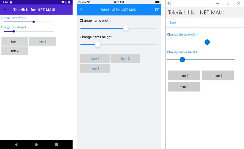
Item Size
The WrapLayout exposes the ItemWidth and ItemHeight properties, which define the layout area for each child element. By default, the available size for the items is not restricted.
Here is a quick sample of a WrapLayout with a specified item size:
<telerik:RadWrapLayout x:Name="wrapLayout" ItemHeight="50" ItemWidth="150" Margin="0,20,0,0">
    <telerik:RadButton BorderThickness="1" Text="Item 1" Margin="2"/>
    <telerik:RadButton BorderThickness="1" Text="Item 2" Margin="2"/>
    <telerik:RadButton BorderThickness="1" Text="Item 3" Margin="2"/>
</telerik:RadWrapLayout>
The following image shows the end result.
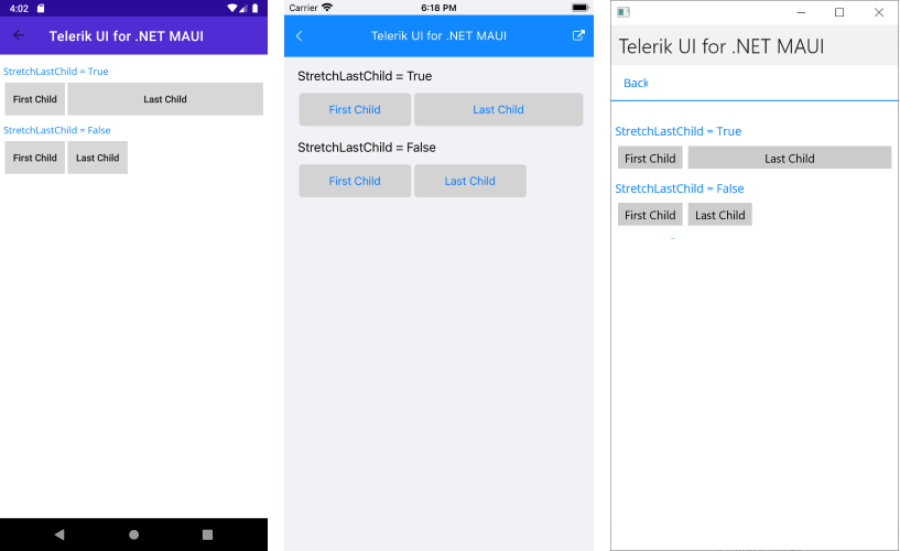
Positioning the Last Child Element
The WrapLayout exposes the StretchLastChild property, which enables you to control the position and layout of the last child item from the layout items collection. If set to True, the last element will stretch along the remaining space from the last row or column depending on the layout orientation.
The following example shows how StretchLastChild will work when set to both values:
<VerticalStackLayout VerticalOptions="Start">
    <Label Text="StretchLastChild = True" Margin="0,0,0,5"/>
    <telerik:RadWrapLayout StretchLastChild="True">
        <telerik:RadButton BorderThickness="1" Text="First Child" Margin="2"/>
        <telerik:RadButton BorderThickness="1" Text="Last Child" Margin="2"/>
    </telerik:RadWrapLayout>

    <Label Text="StretchLastChild = False" Margin="0,10,0,5"/>
    <telerik:RadWrapLayout StretchLastChild="False">
        <telerik:RadButton BorderThickness="1" Text="First Child" Margin="2"/>
        <telerik:RadButton BorderThickness="1" Text="Last Child" Margin="2"/>
    </telerik:RadWrapLayout>
</VerticalStackLayout>
The following image shows the end result.