.NET MAUI SideDrawer Transitions
Transitions are the animation effects applied to the side drawer while being opened and closed. The following properties are related to the SideDrawer transition:
-
DrawerTransitionDuration(double)—Defines the duration of the chosen transition. -
DrawerTransitionType(enum of typeTelerik.Maui.Controls.SideDrawerTransitionType)—Defines the transition of the component. This property can be set to one of the following values:-
Fade,Push,Reveal,ReverseSlideOut,ScaleUp,SlideAling,SlideInOnTop,Custom
-
DrawerTransitionFadeOpacity(double)—Defines the opacity of the fade layer of the component. This controls the fade layer opacity on Android and WinUI or the dim opacity on iOS and MacCatalyst. The opacity value is different on different platforms. Review the Making SideDrawer Opacity Consistent across Platforms how-to article for more details.
Built-in Transitions
The SideDrawer exposes predefined transitions. Set the transition type by using the DrawerTransitionType property of the SideDrawer.
DrawerTransitionType is enumeration and exposes the following members:
-
Push(the default one) FadeRevealReverseSlideOutScaleUpSlideAlongSlideInOnTopCustom
Here is a sample snippet on how you can set DrawerTransitionType property of RadSideDrawer:
Use the following namespace:
In addition to the transition type, you can also control the transition duration and opacity value through
DrawerTransitionDurationandDrawerTransitionFadeOpacityproperties, respectively. For more details on this go to Configuration topic.
Examples
Check below some of the predefined transitions of RadSideDrawer.
-
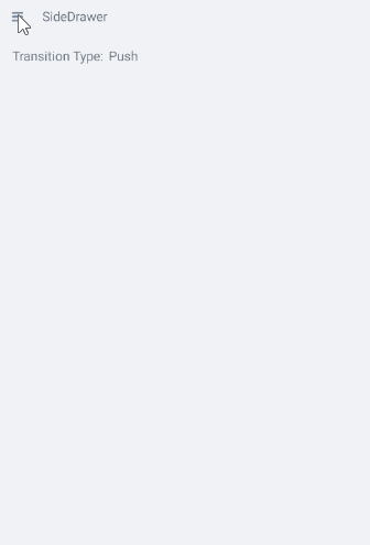
Default Push transition:
-
SlideInOnToptransition - the drawer goes over the main content: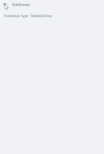
-
ReverseSlideOuttransition: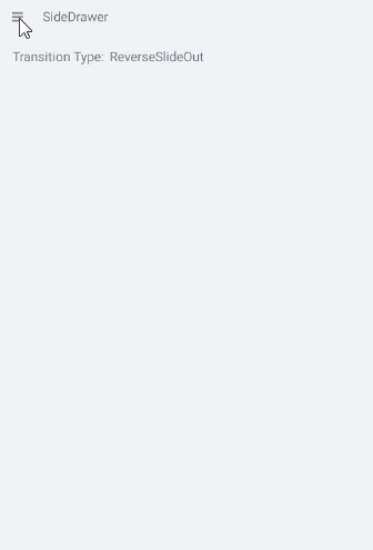
For a runnable example with the SideDrawer Transitions scenario, see the SDKBrowser Demo Application and go to SideDrawer > Features.