Configure the .NET MAUI SideDrawer
This article explains all configuration options that the SideDrawer control provides.
Content
Use the following properties to define content of the SideDrawer control:
-
DrawerContent(View)—Specifies the drawer (initially hidden) content. -
MainContent(View)—Specifies the (initially visible) content of the component.
Drawer Behavior
-
IsOpen(bool)—Specifies a value indicating if the drawer content is visible. -
DrawerLength(double)—Defines how much the drawer content is extended over the main content in opened position. -
DrawerLocation(SideDrawerLocation)—Specifies the location from which the drawer will be opened. The following options are available:-
Left RightTopBottom
-
AreGesturesEnabled(bool)—This is a mobile exclusive property which specifies ability for gestures to open and close the drawer.-
TouchTargetThreshold(double)—Defines the touchable area (number of pixels from the screen edges) that will allow to open theDrawerContent.
Keep Drawer Open and Main Content Area Active
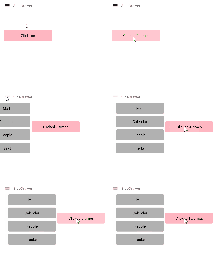
By default the SideDrawer drawer content closes when user clicks/taps outside of it. By setting the TapOutsideToClose(bool) to false, the drawer content remains open if the user taps/clicks outside of it and the main content area remains active. The default value of TapOutsideToClose is true.

For a runnable example with the SideDrawer Location scenario, see the SDKBrowser Demo Application and go to SideDrawer > Features.