New to Telerik UI for .NET MAUI? Start a free 30-day trial

Getting Started with the .NET MAUI SideDrawer

This guide provides the information you need to start using the Telerik UI for .NET MAUI SideDrawer by adding the control to your project.

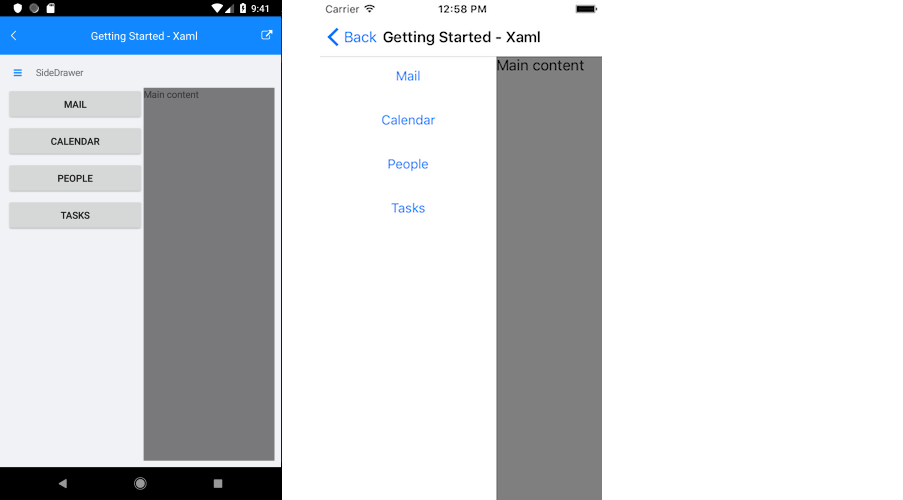
At the end, you will achieve the following result.

.NET MAUI SideDrawer Getting Started

Prerequisites

Before adding the SideDrawer, you need to:

  1. Set up your .NET MAUI application.

  2. Download Telerik UI for .NET MAUI.

  3. Install Telerik UI for .NET MAUI.

Define the Control

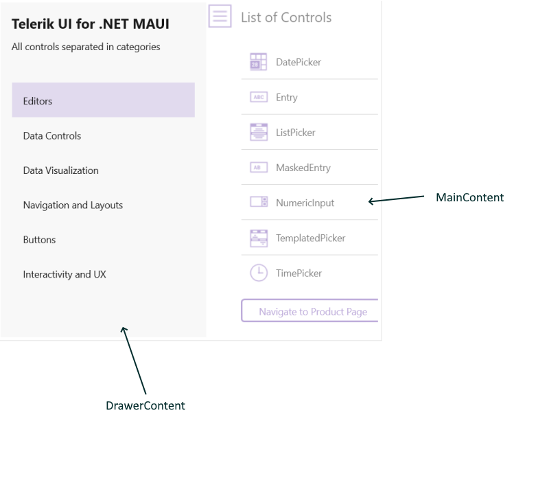
The SideDrawer control contains two views - MainContent and DrawerContent The DrawerContent represents the hidden view (in it you can place navigational UI, any common setting, etc), while the MainContent hosts the main View.

.NET MAUI SideDrawer Visual Structure

1. When your .NET MAUI application is set up, you are ready to add a SideDrawer control to your page. The following example demonstrates how to define the MainContent and DrawerContent of the control.

<telerik:RadSideDrawer x:Name="drawer" 
                       DrawerLength="200">
    <telerik:RadSideDrawer.MainContent>
        <Grid>
            <Label Text="Main content" />
        </Grid>
    </telerik:RadSideDrawer.MainContent>
    <telerik:RadSideDrawer.DrawerContent>
        <VerticalStackLayout Spacing="10"
                             Padding="10, 10, 0, 0">
            <Button Text="Mail"
                    Style="{StaticResource DefaultButtonStyle}" />
            <Button Text="Calendar"
                    Style="{StaticResource DefaultButtonStyle}" />
            <Button Text="People"
                    Style="{StaticResource DefaultButtonStyle}" />
            <Button Text="Tasks"
                    Style="{StaticResource DefaultButtonStyle}" />
        </VerticalStackLayout>
    </telerik:RadSideDrawer.DrawerContent>
</telerik:RadSideDrawer>

2. Add the following namespace:

xmlns:telerik="http://schemas.telerik.com/2022/xaml/maui" 

3. Add the DefaultButtonStyle to the VerticalStackLayout Resources.

 <ResourceDictionary>
    <Style x:Key="DefaultButtonStyle" TargetType="Button">
        <Setter Property="WidthRequest" Value="180" />
        <Setter Property="HeightRequest" Value="40" />
        <Setter Property="BackgroundColor" Value="#b1b1b1" />
        <Setter Property="TextColor" Value="Black" />
    </Style>
</ResourceDictionary>

4. Register the Telerik controls through the Telerik.Maui.Controls.Compatibility.UseTelerik extension method called inside the CreateMauiApp method of the MauiProgram.cs file of your project:

using Telerik.Maui.Controls.Compatibility;
public static class MauiProgram
{
    public static MauiApp CreateMauiApp()
    {
        var builder = MauiApp.CreateBuilder();
        builder
            .UseTelerik()
            .UseMauiApp<App>()
            .ConfigureFonts(fonts =>
            {
                fonts.AddFont("OpenSans-Regular.ttf", "OpenSansRegular");
            });

        return builder.Build();
    }
}           

Additional Resources

See Also

In this article