.NET MAUI Accordion Expand and Collapse States
The purpose of this help article is to show you the expanded/collapsed states of the Telerik .NET MAUI Accordion control.
Collapsed/Expanded States
In the Accordion control, each item provides a header that expands when clicked, showing more information. The control is designed in such a way that opening one AccordionItem automatically closes the previously displayed content.
There can be only one expanded item at a time indicated by IsExpanded property of the AccordionItem object.
Collapse All Items
Using the CanCollapseAllItems(bool) property you can collapse all Accordion items by tapping/clicking on the Accordion item header. The default value is false.
Expand Multiple Items
By using the CanExpandMultipleItems(bool) property, you can allow users to expand more than one item. The default value is false. If CanExpandMultipleItems is true, clicking on the header of a collapsed accordion item will expand it, regardless of how many items are expanded. If CanExpandMultipleItems is false, the expansion of one item causes the collapse of a previously expanded accordion item.
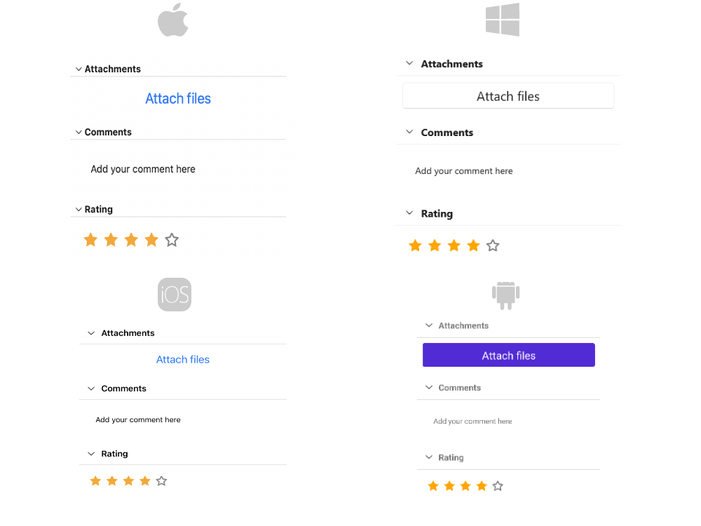
Example
The snippet below shows how the CanCollapseAllItems and CanExpandMultipleItems properties can be applied:
The image below shows the result after running the snippet:
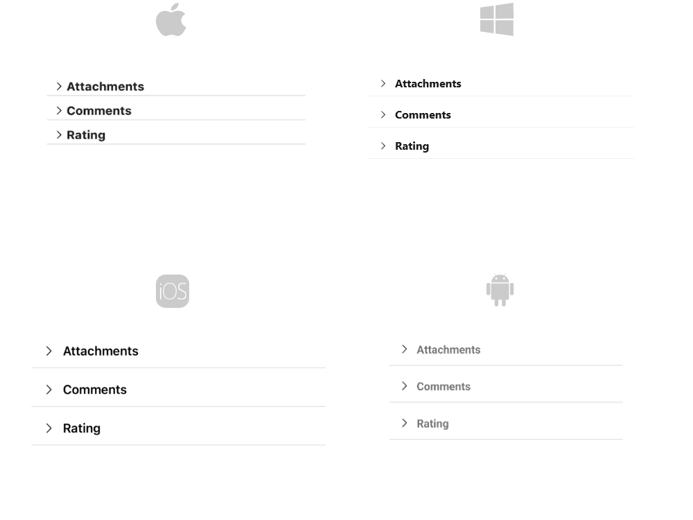
And the RadAccordion when all items are collapsed:
For the Accordion Expand and Collapse states example refer to the SDKBrowser Demo Application.