.NET MAUI AccordionItem
This articles explains the configuration options of the Accordion Item.
AccordionItem Header
You can either apply the HeaderText property or use the AccordionItemHeader content control which provides a set of useful properties for customizing the look & feel of the Header.
The indicator is the small triangle that is rotated depending on whether the AccordionItem control is expanded or collapsed. AccordionItemHeader provides various options for customizing the look of the indicator via the following properties:
-
IndicatorText—The indicator is represented by a string symbol that can be changed throughIndicatorTextproperty; -
IndicatorFontFamily—Specifies the indicator textFontFamily; -
IndicatorFontSize—Defines the indicator text font size; -
IndicatorColor—Specifies sets the color of the indicator; -
IndicatorLocation(ExpandCollapseIndicatorLocation)—Positions the indicator to the left or to the right inside the Header; -
IndicatorAnimationDuration—Specifies the duration of the rotation animation of the indicator; -
IndicatorAnimationEasing—Specifies the easing of the rotation animation of the indicator; -
IndicatorMargin(Thickness)—Specifies the margin applied to the indicator;
IsExpanded
Change the expanded state of the AccordionItem using the IsExpanded(bool)property.
Border Styles
Use the BorderColor, BorderThickness, and CornerRadius properties of RadAccordionItem to change the way the Border around the control looks.
The following snippet shows how to customize the AccordionItemHeader:
<telerik:AccordionItem IsExpanded="True"
                       HeaderText="Settings"
                       BorderColor="#CEBEE7"
                       BorderThickness="2"
                       CornerRadius="0, 0, 8, 8">
    <telerik:AccordionItem.Resources>
        <Style TargetType="telerik:AccordionItemHeader">
            <Setter Property="BackgroundColor" Value="#CEBEE7" />
            <Setter Property="BorderColor" Value="#CEBEE7" />
            <Setter Property="BorderThickness" Value="2" />
        </Style>
    </telerik:AccordionItem.Resources>
    <telerik:AccordionItem.Content>
        <VerticalStackLayout Margin="8, 12"
                             Spacing="8">
            <HorizontalStackLayout Spacing="8">
                <telerik:RadCheckBox />
                <Label Text="Make my profile private"
                       VerticalTextAlignment="Center" />
            </HorizontalStackLayout>
            <Grid ColumnDefinitions="Auto, *">
                <telerik:RadCheckBox />
                <Label Grid.Column="1"
                       Text="Only show my posts to people who follow me"
                       LineBreakMode="WordWrap"
                       VerticalTextAlignment="Center"
                       Margin="8, 0, 0, 0" />
            </Grid>
        </VerticalStackLayout>
    </telerik:AccordionItem.Content>
</telerik:AccordionItem>
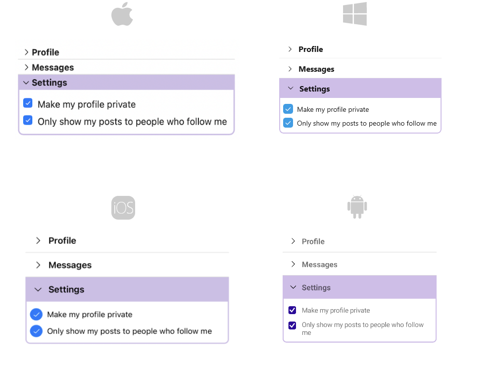
Next image displays how the RadAccordion looks with thus defined items:
For the AccordionItem example refer to the SDKBrowser Demo Application.