Getting Started
This article will guide you through the steps needed to add a basic RadSegmentedControl control in your application.
1. Setting up the app
Take a look at these articles and follow the instructions to setup your app:
2. Adding the required Telerik references
You have two options:
- Add the Telerik UI for Xamarin Nuget package following the instructions in Telerik NuGet package server topic.
If you don't want to add the all Telerik.UI.for.Xamarin nuget package, you have the option to add a separate nuget package. For RadSegmentedControl you have to install the Telerik.UI.for.Xamarin.Input nuget package. This nuget will automatically refer the Telerik.UI.for.Xamarin.Primitives, Telerik.UI.for.Xamarin.Common, and Telerik.UI.for.Xamarin.DataControls nuget packages.
- Add the references to Telerik assemblies manually, check the list below with the required assemblies for RadSegmentedControl component:
| Platform | Assemblies |
|---|---|
| Portable | Telerik.XamarinForms.Common.dll Telerik.XamarinForms.Input.dll |
| Android | Telerik.Xamarin.Android.Common.dll Telerik.Xamarin.Android.Input.dll Telerik.Xamarin.Android.Primitives.dll Telerik.Xamarin.Android.List.dll Telerik.Xamarin.Android.Data.dll Telerik.XamarinForms.Common.dll Telerik.XamarinForms.Input.dll |
| iOS | Telerik.Xamarin.iOS.dll Telerik.XamarinForms.Common.dll Telerik.XamarinForms.Input.dll |
| UWP | Telerik.Core.dll Telerik.Data.dll Telerik.UI.Xaml.Input.UWP.dll Telerik.UI.Xaml.Controls.Data.UWP.dll Telerik.UI.Xaml.Primitives.UWP.dll Telerik.XamarinForms.Common.dll Telerik.XamarinForms.Input.dll |
3. Adding RadSegmentedControl control
If your app is setup, you are ready to add a RadSegmentedControl control.
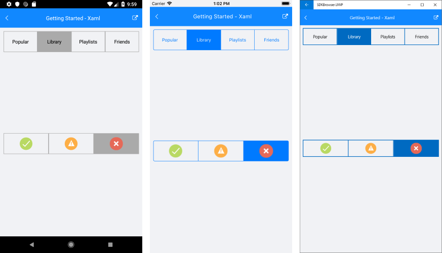
RadSegmentedControl allows you to work with two types of data - string and image. You can use the ItemsSource property of RadSegmentedControl to provide IEnumerable collection of strings or image sources. The control will display a segment for each item in the items source.
Populate with string data
Here is an example how to set the control's ItemsSource property and populate it with some data.
<telerikInput:RadSegmentedControl x:Name="segmentControlText"
                              HeightRequest="60"
                              VerticalOptions="Start">
    <telerikInput:RadSegmentedControl.ItemsSource>
        <x:Array Type="{x:Type x:String}">
            <x:String>Popular</x:String>
            <x:String>Library</x:String>
            <x:String>Playlists</x:String>
            <x:String>Friends</x:String>
        </x:Array>
    </telerikInput:RadSegmentedControl.ItemsSource>
</telerikInput:RadSegmentedControl>
RadSegmentedControl segmentControlText = new RadSegmentedControl()
{
    VerticalOptions = LayoutOptions.Start, HeightRequest = 60,
    ItemsSource = new List<string>() { "Popular", "Library", "Playlists", "Friends" },
};
You also have to add the following namespace:
xmlns:telerikInput="clr-namespace:Telerik.XamarinForms.Input;assembly=Telerik.XamarinForms.Input"
using Telerik.XamarinForms.Input;
Populate with image sources
<telerikInput:RadSegmentedControl x:Name="segmentControlImages"
                              HeightRequest="60"
                              VerticalOptions="Start" Grid.Row="1">
    <telerikInput:RadSegmentedControl.ItemsSource>
        <x:Array Type="{x:Type FileImageSource}">
            <FileImageSource>available.png</FileImageSource>
            <FileImageSource>away.png</FileImageSource>
            <FileImageSource>busy.png</FileImageSource>
        </x:Array>
    </telerikInput:RadSegmentedControl.ItemsSource>
</telerikInput:RadSegmentedControl>
RadSegmentedControl segmentControlImages = new RadSegmentedControl()
{
    VerticalOptions = LayoutOptions.Start,
    HeightRequest = 60,
    ItemsSource = new List<FileImageSource>() { "available.png", "away.png", "busy.png" },
};
This is the result:
4. Setting segment colors
You can set the background of the segments via the SegmentBackgroundColor property. The color will be applied to all segments except the selected one. To change the background of the selected item you can set the SelectedSegmentBackgroundColor
To set the text color of the strings in the items via the SegmentTextColor property. The color of the selected segment can be set via the SelectedSegmentTextColor property.
You can find an example with the selected color properties in the Selection article.
SDK Browser and QSF applications contain different examples that show RadSegmentedControl's main features. You can find the applications in the Examples and QSF folders of your local Telerik UI for Xamarin installation.