Customize Segment Colors
RadSegmentedControl has several properties which you can use to customize the text and background colors of the segments.
List of color properties
There are different colors applied to the segments in their different states. The control exposes the following properties:
- SegmentBackgroundColor: This is the background color applied to the unselected segments.
SegmentTextColor: This is the text color applied to the unselected segments.
SelectedSegmentBackgroundColor: This is the background color applied to the selected segment.
SelectedSegmentTextColor: This is the text color applied to the selected segment.
DisabledSegmentTextColor: This is the text color applied to the disabled segments.
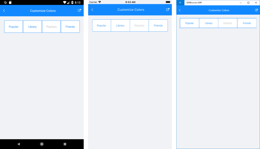
Example
This example shows setting the different segment colors.
<telerikInput:RadSegmentedControl x:Name="segmentControl"
                                  Margin="10"
                                  DisabledSegmentTextColor="#C2C3C9"
                                  HeightRequest="60"
                                  SegmentBackgroundColor="#FFFFFF"
                                  SegmentTextColor="#3A9BFD"
                                  SelectedSegmentBackgroundColor="#3A9BFD"
                                  SelectedSegmentTextColor="#FFFFFF"
                                  VerticalOptions="Start">
    <telerikInput:RadSegmentedControl.ItemsSource>
        <x:Array Type="{x:Type x:String}">
            <x:String>Popular</x:String>
            <x:String>Library</x:String>
            <x:String>Playlists</x:String>
            <x:String>Friends</x:String>
        </x:Array>
    </telerikInput:RadSegmentedControl.ItemsSource>
</telerikInput:RadSegmentedControl>
this.segmentControl.SetSegmentEnabled(2, false);
Figure 1: Customized segment colors