Selection
RadSegmentedControl control exposes few useful properties which can help you work with the items selection.
Setting the selected segment
The segment control has a SelectedIndex property which you can use to set the selected item.
Setting selection colors
You can define custom colors for the text and the background of the selected segment. You can do that via the the following properties of RadSegmentedControl:
- SelectedSegmentBackgroundColor
- SelectedSegmentTextColor
Selection changed
RadSegmentedControl exposes a SelectionChanged event which is fired when the selected item is updated.
-
SelectionChanged: Occurs when the selected item is changed programatically or due to user interaction. The SelectionChanged event handler receives two parameters:
- The sender argument which is of type object, but can be cast to the RadSegmentedControl type.
- A ValueChangedEventArgs<int> object which provides old and new value of the SelectedIndex.
Example
This example demonstrates how you could utilize the selection feature of RadSegmentedControl.
First, let's create a ViewModel class containing the SegmentedControl items and int property for defining the SelectedIndex:
public class ViewModel
{
    public ViewModel()
    {
        this.Categories = new ObservableCollection<string>() { "Popular", "Library", "Playlists", "Friends" };
        this.SelectedCategory = 2;
    }

    public ObservableCollection<string> Categories { get; set; }
    public int SelectedCategory { get; set; }
}
Then, add the SegmentedControl definition and apply ItemsSource, SelectedIndex as well as selection colors properties:
<telerikInput:RadSegmentedControl x:Name="segmentControl"
                                  ItemsSource="{Binding Categories}"
                                  SelectedIndex="{Binding SelectedCategory}"
                                  SelectedSegmentTextColor="White"
                                  SelectedSegmentBackgroundColor="CornflowerBlue"
                                  HeightRequest="60"
                                  VerticalOptions="Start">
</telerikInput:RadSegmentedControl>
Lastly, define the ViewModel as BindingContext of the control:
this.segmentControl.BindingContext = new ViewModel();
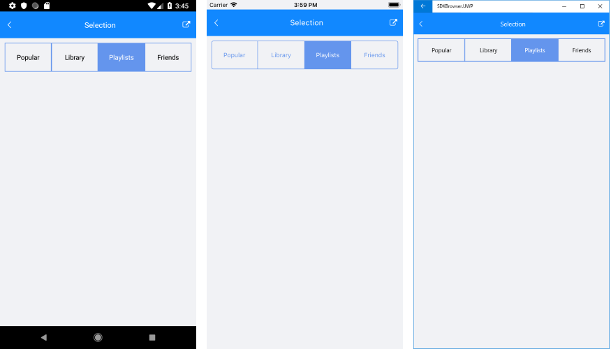
The screenshot below shows the result on different platforms: