VisualStudio2019 Theme
Inspired by the refreshed Visual Studio 2019 IDE, the VisualStudio2019 theme delivers a lot cleaner and smoother look and feel to your WPF apps. The team at Microsoft are well known for their eagerness to deliver the best possible user experience that we encounter every day and with the VisualStudio2019 theme you will be able to easily bring it to your own apps.
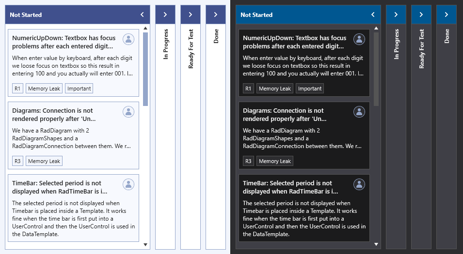
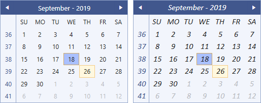
With the R2 2021 release of the UI for WPF suite, we have designed and delivered a brand new color variation of the VisualStudio2019 theme - the Dark one. In addition to it, the theme palette expanded its brushes collection with the AccentForegroundBrush and the DockingBackgroundBrush, which are available for both color variations.
Jump to the following topics to learn about the specifics of the theme's palette and features.
- Default Theme Colors
- Default Theme Brushes
- Changing Palette Colors
- Changing Theme Variation
- Changing Font Properties
- Using Glyphs
- Using Theme Helper
- Changing Opacity
Default Theme Colors
The VisualStudio2019 Theme is designed to be easily modified via the exposed colors in the theme palette. The default values of the brushes in the theme are listed below.
| Color name | Light | Dark | ||
|---|---|---|---|---|
| AccentColor | #F5CC84 | #007ACC | ||
| AccentDarkColor | #5F6FA4 | #006EB8 | ||
| AccentFocusedColor | #D2A85E | #33BBFF | ||
| AccentForegroundColor | #5F6FA4 | #98C5E3 | ||
| AccentMainColor | #AAC0FF | #3399FF | ||
| AccentMouseOverColor | #C4D5FF | #40AFFF | ||
| AccentSecondaryDarkColor | #40508D | #005791 | ||
| AlternativeColor | #F7F9FE | #1B1B1C | ||
| BasicColor | #94A6CA | #555555 | ||
| ComplementaryColor | #D9E0F8 | #434346 | ||
| DockingBackgroundColor | #5F6FA4 | #111112 | ||
| HeaderColor | #40568D | #2B71A0 | ||
| IconColor | #414141 | #F1F1F1 | ||
| MainColor | #FCFCFC | #252526 | ||
| MarkerColor | #1E1E1E | #F1F1F1 | ||
| MarkerInvertedColor | #FFFFFF | #FFFFFF | ||
| MouseOverColor | #FFF8DF | #3E3E40 | ||
| PrimaryColor | #F2F5FC | #2D2D30 | ||
| ReadOnlyBackgroundColor | #FCFCFC | #252526 | ||
| ReadOnlyBorderColor | #94A6CA | #555555 | ||
| SecondaryColor | #FFFFFF | #3F3F46 | ||
| SemiBasicColor | #C0CAE9 | #656565 | ||
| ValidationColor | #FF3333 | #E51400 |
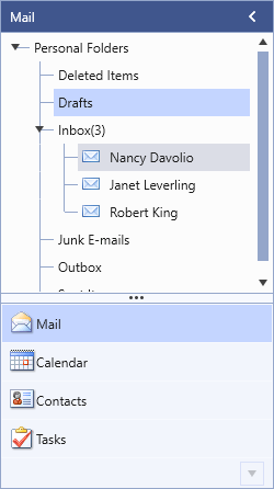
Theme colors represented in RadOutlookBar
Default Theme Brushes
Primary Brushes
-
PrimaryBrush—Used for background of inputs. -
MainBrush—Used for background of buttons. -
AlternativeBrush—Used for background of popups, windows, list boxes etc. -
BasicBrush—Used in the majority of the normal state borders and for the borders of windows as well. -
ComplementaryBrush—Slightly darker than the alternative in case of collisions. -
MarkerBrush—Used for the majority of foregrounds which are black. -
MarkerInvertedBrush—Used for interaction states - mainly where change of the foreground to white is required. -
IconBrush—Used for glyph and path icons.
Interaction State Brushes
-
AccentBrush—Used for borders of the hovered states of the elements as well as for backgrounds of toggled/checked buttons. -
AccentDarkBrush—Used in backgrounds for the pressed states of the elements. -
AccentFocusedBrush—Variation of the AccentBrush that is used for the focused states of the elements. -
AccentForegroundBrush—Variation of the AccentBrush that is used for the foreground of some elements that need to stand out - e.g., the headers of the Spreadsheet control's dialogs. -
AccentMainBrush—Used for the selected states of selected elements (e.g. menu items, dropdown items, list box items). -
AccentMouseOverBrush—Variation of AccentMainBrush that is used for the hovered states of the above mentioned selected elements. -
AccentSecondaryDarkBrush—Variation of AccentDarkBrush that is used for the foreground of the picker control buttons - DatePicker, DateTimePicker, CalculatorPicker, etc., as well as for the points in the data visualization controls - BulletGraph, Sparkline, etc. -
MouseOverBrush—Used for background of the hovered states of non-accent elements.
Special Brushes
-
DockingBackgroundBrush—A special brush used for the background of the Docking control - one of the most specific UI controls for the look and feel of the VisualStudio2019 theme. -
HeaderBrush—A dark blue brush that is used for the background of the header elements. -
ReadOnlyBackgroundBrush—A white brush that is used for the background of the read only state of the elements. -
ReadOnlyBorderBrush—A polo blue brush that is used for the border of the read only state of the elements. -
ValidationBrush—A bright red brush that is used for indicating validation errors - for the underline of the invalid control and as a border for the error tooltip, border for invalid rows and cells.
The
AccentFocusedBrushand theDockingBackgroundBrushare not available with versions prior to the R2 2021 release of the UI for WPF suite.
Changing Palette Colors
The VisualStudio2019 theme provides dynamic change of the palette colors responsible for the brushes used in our controls. Their defaults are stated above. This mechanism is used to modify the color variation of the theme.
The general naming convention is: VisualStudio2019Palette.Palette.[name]Color is responsible for [name]Brush – e.g. VisualStudio2019Palette.Palette.AccentColor sets the color for telerik:VisualStudio2019Resource ResourceKey=AccentBrush
Changing the colors can be achieved in code behind.
Setting palette colors
VisualStudio2019Palette.Palette.AccentColor = Color.FromRgb(255, 0, 0);
Other Properties
-
DisabledOpacity—Used for controls when they are in a disabled state. Backgrounds usually use theComplementaryBrushwhen disabled. -
ReadOnlyOpacity—Used for controls when they are in a read-only state.
Changing Theme Variation
Since the R2 2021 release of the UI for WPF suite the VisualStudio2019 theme offers two color variations. The Blue variation corresponds to the Visual Studio 2019 IDE's Blue theme, and the Dark - to the Dark theme. The following example demonstrates the ability to switch between the supported Blue and Dark color palettes by calling the LoadPreset method as shown below:
Changing the color variation of the theme
//default color variation
VisualStudio2019Palette.LoadPreset(VisualStudio2019Palette.ColorVariation.Blue);

//Dark color variation
VisualStudio2019Palette.LoadPreset(VisualStudio2019Palette.ColorVariation.Dark);
The
Darkvariation of the theme is designed with dark background in mind. It is recommended to use such a background in your application when working with it.
Changing Font Properties
When using the VisualStudio2019 theme you can dynamically change the FontSize and FontFamily properties of all components in the application the same way as you do in all other Available Themes which support ThemePalette.
The FontSize and FontFamily properties are public so you can easily modify the theme resources at a single point. The most commonly used font size in the theme is with value 12 and can be modified through the VisualStudio2019Palette.Palette.FontSize property in the same manner as in the other themes that support a theme palette.
The default font used in the theme is Segoe UI.
For complex scenarios we strongly recommend setting the
FontSizeproperties only before the application is initialized.
The following shows the default font sizes and families.
Default FontSize
VisualStudio2019Palette.Palette.FontSizeXS = 10;
VisualStudio2019Palette.Palette.FontSizeS = 11;
VisualStudio2019Palette.Palette.FontSize = 12;
VisualStudio2019Palette.Palette.FontSizeL = 13;
VisualStudio2019Palette.Palette.FontSizeXL = 20;
Changing the theme's FontSize and FontFamily
private void OnButtonChangeFontSizeClick(object sender, RoutedEventArgs e)
{
    VisualStudio2019Palette.Palette.FontSize = 16;
    VisualStudio2019Palette.Palette.FontFamily = new FontFamily("Calibri Italic");
}
Using Glyphs
The VisualStudio2019 theme also uses the Telerik Web UI font glyphs by default. The RadGlyph provides a lightweight, flexible and design-time-friendly implementation of our glyph font.
You can read more about the RadGlyph in the RadGlyph Overview article and about the range of the font glyphs in the Font Glyphs Overview article.
Using Theme Helper
The ThemeHelper class is used in the VisualStudio2019 theme. It exposes a set of attached properties and can be used to directly modify the appearance of a specific basic control without the need to alter its control template.
This example shows a RadToggleButton control with modified brushes for its different states through the ThemeHelper class:
Set RadToggleButton's visual appearance through the ThemeHelper class
<telerik:RadToggleButton Content="RadButton"
                         Margin="10"
                         xmlns:helpers="clr-namespace:Telerik.Windows.Controls.Theming.Helpers;assembly=Telerik.Windows.Controls"
                         helpers:ThemeHelper.MouseOverBrush="{telerik:VisualStudio2019Resource ResourceKey=AccentMouseOverBrush}"
                         helpers:ThemeHelper.PressedBrush="{telerik:VisualStudio2019Resource ResourceKey=ValidationBrush}"
                         helpers:ThemeHelper.CheckedBrush="{telerik:VisualStudio2019Resource ResourceKey=AccentMainBrush}"/>

Changing Opacity
If you need to change the opacity of the disabled and read-only elements, you can easily do so by using the DisabledOpacity and ReadOnlyOpacity properties of the VisualStudio2019Palette. The default values are 0.3 and 0.6 respectively.
Changing the opacity
VisualStudio2019Palette.Palette.DisabledOpacity = 0.5;
VisualStudio2019Palette.Palette.ReadOnlyOpacity = 0.5;
VisualStudio2019Palette.Palette.DisabledOpacity = 0.5
VisualStudio2019Palette.Palette.ReadOnlyOpacity = 0.5
Merging Modified Palette Resources With StyleManager Theming Approach
When modifying fonts, colors, or other resources from the VisualStudio2019Palette and StyleManager is used as theming mechanism, the theme's ResourceDictionary needs to be merged in App.xaml file to apply the changes.
Merging the theme's ResourceDictionary in App.xaml
<Application.Resources>
    <ResourceDictionary>
        <ResourceDictionary.MergedDictionaries>
            <telerik:VisualStudio2019ResourceDictionary/>
        </ResourceDictionary.MergedDictionaries>
    </ResourceDictionary>
</Application.Resources>